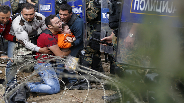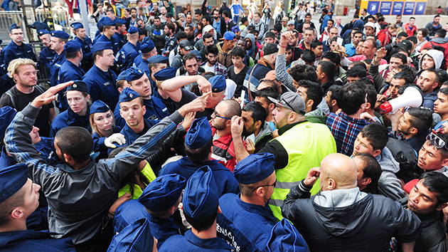
Syrian migrants clash with police as they wait for trains to Vienna and Munich at Keleti railway station on September 8.Lukasz Dejnarowicz/ZUMA
Europe has been the recent focus of attention on the plight of refugees fleeing war-torn countries in the Middle East, and the challenges faced by the countries attempting to accommodate them. But the world is teeming with refugees, and many countries have already welcomed them.
Using the most recent data from the UN High Commissioner for Refugees, data journalist Simon Rogers created a map showing where refugees now live and where they came from. The interactive map is at the bottom of this post.
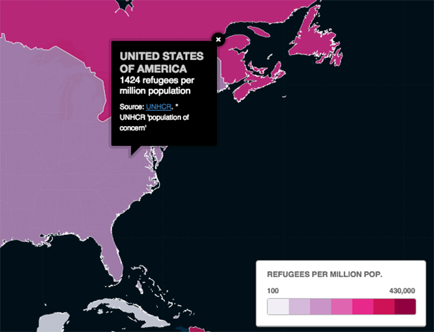
By selecting the “Refugee location” tab at the top left of the map, and then clicking on a country, you can see the number of refugees per 1 million inhabitants of a given country during 2014.
The “Refugee numbers” tab shows the raw numbers of refugees in each country. (Click on the circle to see the number.)
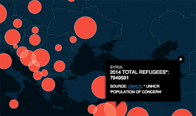
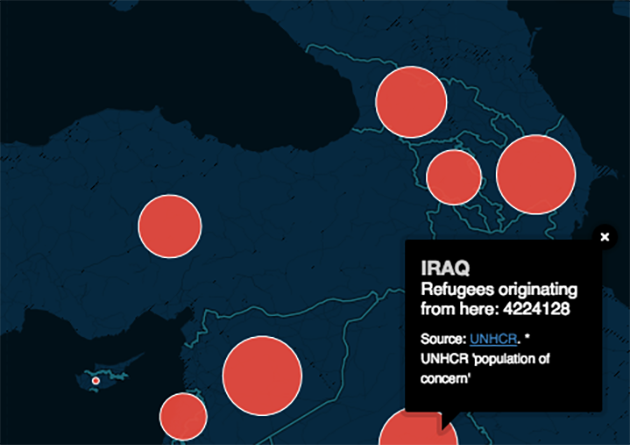
“Refugee origin” shows how many refugees emigrated from each country of origin in 2014.
See the full map here (click here for a full-screen version):

