• Health Update


    I visited my oncologist this morning and got the latest reading of my M-protein level. Basically, it’s stable: 0.61 last month, 0.58 this month. I know you all want this in chart form, so here it is.

    The bad news is that this is higher than we’d like. (We’d like it to be about 0.01.) The good news is that it corresponds to a pretty low level of cancerous cells in my bone marrow. Probably around 3-4 percent, which isn’t 
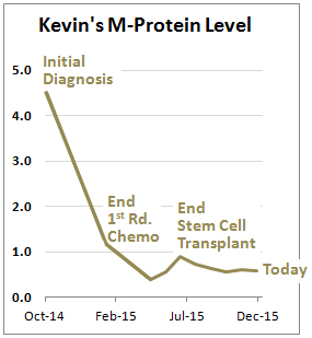
high enough to affect me in any serious way. If my maintenance med keeps me at this level, I could pretty much live forever. And the side effects have been pleasantly minimal. I feel fine in almost all respects.

    Still, if it’s really working well, it would get my M-protein level lower. So how long should I keep taking it before we start to think about alternative treatments? I tried once again to dredge an opinion out of my doctor, and as usual I failed. So I have no idea. I’ll just keep taking this stuff forever as long as my levels remain under control.

    On the other good news front, my back pain is finally almost completely gone. I still need to be careful, but this means I can start doing exercise more strenuous than walking. Hooray!

    On a related front, I have a piece in the latest issue of the magazine. I don’t know when it will go online, but you should buy a paper copy anyway. You know how teen magazines like Tiger Beat feature posters of teen idols? Well, the current issue of Mother Jones has one of me. Seriously. If you want a nearly life-size picture of my head to put on your refrigerator—and who doesn’t?—just tear out page 26. It’s only $6.99.1 Buy one for all your friends.

    1Which is actually pretty steep, isn’t it? Why not subscribe instead for 12 bucks a year? Or give gift subscriptions to all your loved ones? Or, if you already subscribe, donate some money to us. It’s tax deductible and it goes to a good cause!

  • Want Lower Health Care Costs? Encourage Competition.


    Regular readers of this blog should know that when it comes to the price of hospital care, it’s competition that matters, not insurance companies. In areas with only a single hospital, insurance companies have no leverage and have to accept whatever price the hospital charges. If there are lots of hospitals, they have to compete with each other to earn the insurance company’s business.

    But in case you’re still skeptical, a team of researchers has analyzed a huge database of health care claims in the US to check this out. They found enormous regional 
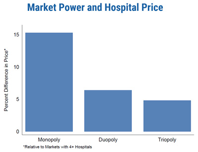
variation in hospital costs for the same procedure, and one of the biggest drivers of this variation was competition:

    Hospital market structure stands out as one of the most important factors associated with higher prices, even after controlling for costs and clinical quality. We find that hospitals located in monopoly markets have prices that are about 15.3 percent higher than hospitals located in markets with four or more providers. This result is robust across multiple measures of market structure and is consistent in states where the HCCI data contributors (and/or Blue Cross Blue Shield insurers) have high and low coverage rates.

    The researchers also discovered that there was little correlation between Medicare prices and private care prices. Thus, studies that focus on variation in Medicare pricing are missing a big part of the picture. They also may be focusing on the wrong regions: areas that have gotten a lot of attention for their low Medicare prices turn out to have unusually high spending on the privately insured. So what’s the answer?

    In terms of policy, our work suggests that vigorous antitrust enforcement is important and that hospital prices could be made more transparent. There is evidence that higher deductibles and cost sharing alone will not likely encourage shopping by patients….However, more information, such as recent efforts in Massachusetts to make hospitals’ prices public, could help patients and their agents make more informed choices over treatment and put downward price pressure on more expensive hospitals in a sector of the economy where consumers (patients) presently know almost nothing about what they or their insurer will pay for care.

    The study is based on data from the Health Care Pricing Project. You can read all about it here.

  • The EPA’s “Covert Propaganda” Campaign Explained


    The GAO has blown the whistle on the EPA:

    The Environmental Protection Agency engaged in “covert propaganda” and violated federal law when it blitzed social media to urge the public to back an Obama administration rule intended to better protect the nation’s streams and surface waters, congressional auditors have concluded….Federal laws prohibit agencies from engaging in lobbying and propaganda.

    That sounds bad. What on earth did the EPA do? Tap into people’s phones? Beam subliminal messages through their TV sets? Conduct giant rallies in Nuremburg?

    After months of investigation, it turns out that the GAO identified a grand total of two problems. One concerns a public affairs guy who wrote a blog post that linked to another blog post about surfing which in turn linked to yet another page which urged people to call their congressional rep. Apparently this counts as “lobbying Congress.” It’s obviously pretty trivial, though.

    The second violation is more interesting. As part of a social media campaign, the EPA sent out the following message on Thunderclap: “Clean water is important to me. I support EPA’s efforts to protect it for my health, my family and my community.” Thunderclap is sort of like Kickstarter for messages: you set a goal for people to resend your message, and if you reach your goal then the message is sent out at the same time by everyone who signed up.

    So what’s the problem? Well, the GAO acknowledges that “The page was visibly attributed to EPA, as it displayed the agency’s profile photo and, under the title, ‘by U.S. Environmental Protection Agency.'” But—when Thunderclap users resent the message, it might not have been clear that it was originally created by the EPA. Thus it’s “covert” propaganda.

    I have a hard time getting too exercised by this, but I guess it’s good for federal agencies to know the limits of social media promotion. Just keep this in mind when you start hearing dark stories about how the EPA engaged in lobbying and propaganda. These two things are what that means. Not exactly the dark arts practiced by Joseph Goebbels.

  • Why Is the Press Corps So Smitten With Donald Trump?


    Jack Shafer is unhappy about calls to stop giving Donald Trump the attention he so obviously craves:

    Ever since Donald Trump appeared on Campaign 2016’s horizon, journalists have been imploring other journalists not to cover him….The logic behind the Trump blackout proposals vary, but usually boils down to this: Any attention given to his retrograde “ideas” only end up giving his candidacy additional velocity. But just because Trump is a potential menace to society…why does that mean TV should give him the blind eye? The more hateful and demagogic a politician the more you should cover him, right?

    ….The working premise behind the Trump ban seems to be that journalists should avoid stories that have a potential to make things “worse” (i.e., increase Trump support) and instead produce stories that have a potential to make things “better” (i.e., a decrease in Trump support). But a journalist’s primary duty isn’t to produce stories that push history in the “correct” direction—whatever that is—or to self-censor anything that might possibly encourage a “bad” outcome. Sometimes newsgathering stimulates a happy result, but it’s not the only way to judge the worthiness of a story.

    In order to write this piece, Shafer needed someone to call for a ban on Trump coverage. And finally, a few days ago, someone did: former CNN anchor Campbell Brown wrote a piece suggesting a one-week boycott of Trump coverage. To my ears, Brown’s proposal sounded a bit Swiftian, but no matter. It gave Shafer the chance to write an easy column making the obvious case against banning Trump.

    But why write an easy column? Why not wrestle with the real issue: the fantastic overcoverage of Trump on cable news? I doubt that any candidate in history running in a genuinely contested primary has gotten the kind of lopsided coverage Trump has. In the past month, he’s gotten more coverage than every other Republican candidate combined. In the past week, he’s gotten an astonishing 3x the coverage of every other candidate combined. Forget about whether this is good for America. Doesn’t it demonstrate some seriously flawed news judgment within the press corps? As though news outlets are more interested in sensationalism and ratings than in reporting what’s genuinely newsworthy? That’s debatable, for sure, but it’s exactly the kind of debate a press critic should weigh in on.

    But Shafer cavalierly waves this off: “The notion that the press has dreadfully overcovered or tragically undercovered a topic is the idiot’s version of press criticism. No perfect dose of journalism can be prescribed for every subject. But if you still think that the TV news operations are overcovering Donald Trump, I have a simple suggestion. Unplug your television instead of asking the news channels to turn off their cameras.”

    Well, then, call me an idiot. Shafer is right that partisans routinely think their guy is undercovered and the other side’s guy is overcovered. In this case, though, the evidence is overwhelming that Trump is getting vastly more coverage than any serious assessment of his news value justifies. And turning off my TV doesn’t change this, any more than turning off my TV will end poverty or put ISIS out of business.

    Shafer is too sharp to waste his time on straw men. Instead, how about a look at why the press corps is so smitten with Trump? Is it because he’s a godsend for campaign reporters who love easy stories that save them from having to dive into tedious stuff like taxes and abortion and all the other chestnuts we argue fruitlessly about every four years? Is it because news directors crave ratings far more than news value? Or is it because Donald Trump somehow justifies the coverage he’s getting? If so, let’s hear the argument. I don’t know if this is likely to win the morning or not, but now that we’ve reached the point where Trump is getting 75 percent of all cable news coverage, isn’t it a question worth asking?

  • Today’s Dumbest Chart, Presented in Chart Form


    “Someone on the internet is wrong” isn’t a great mission statement for a blog. I get it. Really. But…National Review posted this in their Twitter feed a few minutes ago:

    This is so phenomenally stupid that I figured it had to be a joke of some kind. Or maybe some intern put it up, not understanding how dumb it was. But no. When I backtracked to the PowerLine post that it came from, it turns out that author Steven Hayward wasn’t trying to trick anyone. He was making an explicit argument that this is the right way to view climate change:

    When I make charts and graphs, I generally make it a practice to scale the vertical axis of a chart from zero (0) to the upper bound of the range. Compressing a chart’s vertical axis can be grossly misleading…The typical chart of the global average temperature is usually displayed this way [normal chart inserted]…But what if you display the same data with the axis starting not just from zero, but from the lower bound of the actual experienced temperature range of the earth?….A little hard to get worked up about this, isn’t it? In fact you can barely spot the warming…If this chart were published on the front page of newspapers the climate change crusaders would be out of business instantly.

    Hayward missed a bet by not using Kelvin and scaling the chart from absolute zero at the bottom to the temperature of molten lava at the top. Then the warming would really be invisible.

    We all post stupid stuff sometimes. But things are really going downhill at NR if they post charts like this even though the author explains exactly why he’s doing something so dopey. In case they still don’t get it, though, maybe the chart below will clear things up.

  • The American View of Terrorism In One Chart


    Courtesy of Gallup, this chart shows how Americans think of terrorism. It’s pretty simple: an attack on Americans produces a sizeable spike for a month or three. An attack on a European country produces a somewhat smaller reaction. An attack anywhere else is a yawn. The only possible exception is the Bali bombings of 2002, which is hard to untangle from the Beltway sniper hysteria, which happened at the same time.

    If history is any guide, the current spike will be gone by January or February. Then again, there’s an election season about to start. I guess there’s no telling how long people can be kept terrified if our presidential candidates really put their minds to it.

  • Today’s Completely Invented BuzzFeed Meme That’s Sweeping the World


    This is amazing. There’s a trending meme on social media that’s starting to gain steam on ordinary old media: Who should have been Sports Illustrated’s Sportsperson of the Year? Serena Williams or American Pharoah? The answer, of course, is Serena Williams, because SI has chosen human beings for this award for the past 60 years. Secretariat didn’t win it. Seattle Slew didn’t win it. Affirmed didn’t win it. And now, American Pharoah hasn’t won it. This is because they are horses, not human beings.

    So what’s the deal? Apparently BuzzFeed managed to start all this by publishing a piece noting that a few horse racing fans were upset that American Pharoah didn’t win. Not lots of fans. Just horse racing fans. And not even a lot of horse racing fans. Just a few. But some of them complained on Twitter! Maybe a few dozen or so. That’s about 0.00003 percent of the Twitter population.1

    In other words, BuzzFeed spun a piece out of almost literally nothing, and now the rest of the world is talking about it. Truly we live in a miraculous era.

    POSTSCRIPT: For those of you who aren’t tennis fans, trust me: Serena deserved this. Her record this year was almost beyond belief, and that’s at the age of 33, when most top tennis players are either retired or just barely holding on. And of course, that’s on top of a career that makes her a strong candidate for best tennis player of all time.

    1More or less. Actually, I just made up this number, since it doesn’t deserve the time it would take to come up with a real one.

  • Remember That Shot Fired a Few Months Ago in the Great Immigration vs. Wages War? Turns Out It Was a Dud.


    Does immigration depress wages? One of the seminal studies of this was done by David Card in 1990. He studied the Mariel boatlift of 1980, which swamped Miami with new immigrants, and concluded that there was little effect on wages. A few months ago, George Borjas took a fresh look at the data, and concluded there was an effect, but it was 
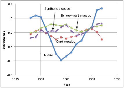
restricted to those without a high school diploma. Among high school dropouts, wages dropped 10-30 percent for about six years.

    The key chart is on the right. Click here for more detail, but the nickel version is that the blue line shows the wages of Miami’s dropout population compared to other cities. I wrote about this at the time, and noted an oddity: “Before 1980 and after 1990, the wages of high school dropouts in Miami are above zero, which means dropouts earned more than high school grads. That seems very peculiar, and none of the control cities show the same effect. Does this suggest there’s something wrong with the Miami data?”

    Yes it does! A pair of researchers at UC Davis tried to recreate Borjas’s conclusions, but they couldn’t do it. “Significant noise exists in many samples,” they say, “but we never find significant negative effects especially right after the Boatlift, when they should have been the strongest.”

    So what’s up? Where did Borjas get his huge effect? Well, it turns out that his Miami data was indeed suspect:

    We find that the main reason is the use of a small sub-sample within the group of the high school dropouts, obtained by eliminating from the sample women, non-Cuban Hispanics and selecting a short age range (25-59). All three of these restrictions are problematic and, in particular, the last two as they eliminate groups on which the effect of Mariel should have been particularly strong (Hispanic and young workers). We can replicate Borjas’ results when using this small sub-sample and the smaller March CPS, rather than the larger May-ORG CPS used by all other studies of the Boatlift. The drastic sample restrictions described above leave Borjas with only 17 to 25 observations per year to calculate average wage of high school dropouts in Miami.

    So Borjas used a small March census sample, and then left out several groups that should have shown a strong response to the wave of immigration. As a result, his sample size is so small as to be useless. Tweaking his data even slightly removes the wage effect entirely.

    Borjas does mention sample-size problems in his paper, but never really addresses it or makes it clear just how tiny his sample is. I’ll be curious to hear Borjas’s reaction to this, but given the questions I already had about his paper, this reappraisal of his data puts it pretty firmly in the category of unlikely to be true. For now, it appears that even a massive influx of new immigrants over a period of just a few weeks has almost no effect on wages at all.

    Does this mean that immigration in general also has no effect on wages? Nope. But it certainly suggests that the effect is probably pretty small if it exists at all. In any case, the Borjas paper doesn’t seem to prove anything one way or the other.

  • Iowa Republicans Are Swooning Over Ted Cruz


    The highly-respected Des Moines Register poll has great news for Ted Cruz: he’s gained 21 points of support over the past couple of months. Ben Carson has cratered, and everyone else is treading water.

    The usual thing at this point is to say that we still have six weeks until the caucuses are held, and anything could happen. And sure enough, only 43 percent of Cruz supporters say their minds are made up. The rest say they could still be persuaded to vote for someone else. What’s more, if you figure that most people vastly underestimate their own ability to be swayed by advertising, Cruz’s actual level of firm support is probably no more than a third or so. For the moment, this is a pretty tenuous lead.

    Still, it’s always better to be ahead than behind. Unless that just makes you a target, of course. And Donald Trump apparently still enjoys a commanding lead nationally. Stay tuned for a fun January.