Google has just put online perhaps the greatest timewaster in the history of the internet. For a certain kind of person, that is. Which I know many of you are.
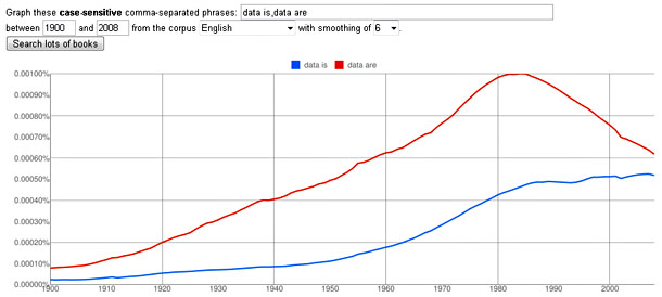
It’s the Ngram Viewer, which lets you graph and compare phrases over time, “showing how their usage has waxed and waned over the years.” (Ngram is not a very small weight, it’s a techie term for a sequence of letters. A digram is two letters, a trigram is three letters, and an ngram is a sequence of any length. UPDATE: Actually, ngrams can be sequences of letters or words, and word ngrams are more common. Google’s reference is probably to word ngrams.) The dataset consists of 500 billion words from 5.2 million books scanned as part of the Google Books project. For example, here’s a chart showing usage of data is vs. data are over the past century:

As you can see, data are reached a peak in the early 80s and then began a precipitous nosedive. By the mid-aughts, I’m delighted to report, data is was nearly as widely used and looks to be on course to overtake the obnoxious data are sometime in the next decade. Hooray! (As you’ve probably guessed, I’m a longtime proponent of data is as the proper modern usage.)
Anyway, I’m sure you can immediately see the potential here for timewasting disguised as scholarly research. Go ahead and give it your best shot.


