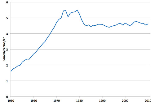
Well, actually, it’s been here for three decades. The chart below, from Stuart Staniford, shows oil use per person on a global basis, and as you can see, it peaked around 1973, took a dive around 1980, and has been at a steady plateau ever since.
There’s nothing astonishing about this chart. It’s just another way of saying that it takes less oil to produce a dollar of GDP than it used to — and the ratio has been dropping ever since the oil shocks of the 70s. Still, this is a strikingly simple presentation that, oddly enough, I’ve never seen before in exactly this form. But it’s an interesting and dramatic way of looking at it.


