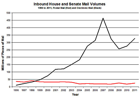
This is mostly in the pointless frivolity category, but the chart below from Matt Glassman shows total annual volume of email received by Congress since 1996. Matt has a few observations about what this all means, which you should read, but what I’m curious about is the huge drop in 2008-09. What happened? Matt says it’s a technical artifact: “The large peak in 2007 and the drop-off following it are almost certainly due to the explosion of more intelligent spam and the corresponding adoption of powerful new and improved spam filters in both chambers that year.”
If that’s true — and corroboration would be welcome from anyone with working knowledge of this stuff — it’s an object lesson in statistical analysis. Land mines are everywhere! If you saw this chart and concluded, say, that the financial crisis had somehow wiped out people’s desire to email their congresscritters, and then built an elaborate theory around that guess, you’d be totally wrong. It would be a perfectly reasonable theory, but it would be wrong. In reality, nothing interesting happened at all. Caveat emptor.


