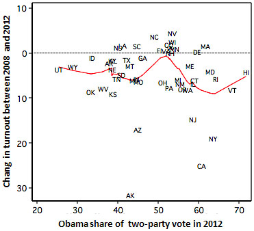
 Here’s a pretty interesting chart from Seth Masket showing how much voter turnout changed between 2008 and 2012. Some of the outliers are obvious: Arizona and Alaska went down because they didn’t have candidates on the ticket this year. New York and New Jersey went down because of Hurricane Sandy. California is a mystery.
What’s more interesting, though, is the pattern. I’m just eyeballing this, but it looks like there really was an enthusiasm gap. Obviously three big Obama states were way below their 2008 levels. Beyond that, though lots of states at or below the red line were also Obama states in 2008 (Ohio, Pennsylvania, Oregon, Vermont, etc.). Conversely, lots of states above the red line were McCain states (South Carolina, Idaho, Texas, Georgia, etc.). There are plenty of exceptions, so I might be off base here, but my quick read of this data is that if state-by-state turnout had stayed at 2008 levels, Obama would have won the popular vote by nearly as much as he did four years ago. I imagine it would be easy for someone with the raw data to stick it in a spreadsheet and find out for sure.