• Room Service Dying a Well-Deserved Death in New York


    The New York Hilton Midtown plans to stop offering room service in August. Why? It’s a money loser:

    The decision to jettison room service at the New York Hilton, reported by Crain’s New York Business, comes as other large hotels have cut back menus or reduced hours in recent years, and many newer boutique hotels have opened without offering it at all. Some hotels have even made arrangements with nearby restaurants to act as surrogate kitchens and deliver food to their hotel rooms.

    John Fox, a consultant for the hotel industry, said nearly all hotels lost money on room service, which requires maintaining a staff of waiters and kitchen workers throughout the day, even though orders typically dwindle after breakfast and come in sporadically afterward. “Everybody’s doing what they can to engineer their properties to make more profit while still supplying the services their guests demand,” he said.

    I guess if you work in the hotel biz, this is common knowledge. But I didn’t know this. I figured big hotels with in-house restaurants already had kitchens, so offering room service didn’t cost that much as an add-on. Not so, apparently. In any case, this explains the fact that a small breakfast will run you something like $40 all-in at a New York hotel. That always seemed kind of crazy to me, but it makes sense if room service is really such an expensive operation to maintain.

    I rarely ever used room service myself, and certainly not in New York, where decent food is never more than a block or two away. I won’t miss it when it goes away completely.

  • We Pay a Lot More for Health Care Than Other Countries


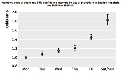
    The graphic on the right won’t come as a surprise to anyone who’s read this blog over the years. It comes from the New York Times today, and it illustrates the fact that medical procedures cost 
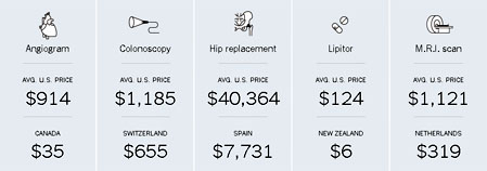
way, way more in the United States than in other countries. But why?

    In the case of prescription drugs, the answer is supposedly that other countries are free riding off of us. If everyone paid $6 for Lipitor, then Pfizer never would have developed it in the first place. It wouldn’t have been worth it. It’s only the fact that Americans pay full market value for Lipitor that allows other countries to artificially force down the cost for their residents.

    There may or may not be something to this, but at least it’s an explanation. What about MRI scans, though? MRI machines cost the same in the Netherlands as they do here, and they’re utilized just as heavily in both countries. So why the higher price in America? Some of the answer is in the cost of the personnel: we pay doctors and technicians more than most countries do, and that all goes into the price charged for diagnostic procedures. But does that explain a 4x price difference? Or the stunning 26x price difference in an angiogram between the U.S. and Canada?

    Probably not. So Times reporter Elisabeth Rosenthal decided to dive into one particular procedure: colonoscopies. Why are they more expensive in the U.S. than elsewhere?

    Largely an office procedure when widespread screening was first recommended, colonoscopies have moved into surgery centers — which were created as a step down from costly hospital care but are now often a lucrative step up from doctors’ examining rooms — where they are billed like a quasi operation. They are often prescribed and performed more frequently than medical guidelines recommend.

    The high price paid for colonoscopies mostly results not from top-notch patient care, according to interviews with health care experts and economists, but from business plans seeking to maximize revenue; haggling between hospitals and insurers that have no relation to the actual costs of performing the procedure; and lobbying, marketing and turf battles among specialists that increase patient fees.

    While several cheaper and less invasive tests to screen for colon cancer are recommended as equally effective by the federal government’s expert panel on preventive care — and are commonly used in other countries — colonoscopy has become the go-to procedure in the United States. “We’ve defaulted to by far the most expensive option, without much if any data to support it,” said Dr. H. Gilbert Welch, a professor of medicine at the Dartmouth Institute for Health Policy and Clinical Practice.

    The “turf battles” mentioned above are about the routine use of anesthesiologists in colonoscopies, even though most aren’t done under a general anesthetic. This drives the price way up:

    In Austria, where colonoscopies are also used widely for cancer screening, the procedure is performed, with sedation, in the office by a doctor and a nurse and “is very safe that way,” said Dr. Monika Ferlitsch, a gastroenterologist and professor at the Medical University of Vienna, who directs the national program on quality assurance.

    ….Dr. Cesare Hassan, an Italian gastroenterologist who is the chairman of the Guidelines Committee of the European Society of Gastrointestinal Endoscopy, noted that studies in Europe had estimated that the procedure cost about $400 to $800 to perform, including biopsies and sedation. “The U.S. is paying way too much for too little — it leads to opportunistic colonoscopies,” done for profit rather than health, he said.

    Bottom line: if a colonoscopy is performed in a doctor’s office without an anesthesiologist, the price is cut in half—maybe more. Cut the number of colonoscopies and increase the use of other tests that are frequently just as good, and the average cost of colon cancer screening in America might drop by three-quarters.

    But don’t expect this to happen anytime soon. After all, one man’s outrageous costs are another man’s Mercedes Benz. Welcome to the best health care in the world, baby.

  • Liberals and Lightbulbs


    A few weeks ago, in a post that was mainly a response to Jonah Goldberg’s dismissive attitude toward renewable energy, I mentioned a recent study showing that although liberals and conservatives were about equally likely to buy an energy efficient CFL lightbulb even if it cost more than an old-school bulb, conservatives were less likely to buy the bulb if the packaging included the message “Protect the Environment.”

    That’s what the abstract of the article said, anyway: “Conservative individuals were less likely to purchase a more expensive energy-efficient light bulb when it was labeled with an environmental message than when it was unlabeled.” But Tim Carney points out that there’s a little more to it than that:

    Most of the coverage of this made it sound like only conservatives were turned off by the label, and that it was clearly for petty reasons. While really, most people, including generally liberal people, became less likely to buy the bulbs with the label.

    The green line in the chart shows how likely people are to buy the bulb with the environmental message. And Carney is right: It crosses below the gray line at an ideology score of -0.6, right in the middle of the liberal spectrum. Just about everyone was turned off by the message except hardcore liberals.

    That’s actually kind of interesting. And it also shows the danger of relying on a journal abstract when you don’t have access to the full paper. It’s not that the abstract was wrong—increased conservatism was associated with increased resistance to the message—but there’s more to the story.

  • Friday Cat Blogging – 31 May 2013


    Today we’re back to quiltblogging. The quilter-in-chief is helping out with the photography by waving a finger in the general direction of the catbloggee-in-chief.

    This is a Mystery Quilt. Here’s how this works. Apparently you get instructions for making it a bit at a time. First, you get instructions on what fabric to buy. Then you’re told to do some cutting. Then some other cutting. And some stitching. Then some other stuff. Eventually, when you get to the final page of instructions, it all comes together.

    Now, it seems to me that it’s fine to call this a mystery quilt while it’s being pieced together. But once it’s done, shouldn’t it be something else? When you receive the final page of instructions, shouldn’t you slap your head and say Aha! That’s what it is! I guess not.

    In any case, this is a Debbie Caffrey pattern, machine pieced and hand quilted using 1930s reproduction fabrics. It was done some time ago, back when Marian still preferred hand quilting. No longer, though. Machine quilting, I’m told, has improved dramatically in recent years, and anyway, some time back Marian found a machine quilter she adores who now does all our quilting for us. She’s really good (and has the backlog to prove it).

    In other news, Grumpy Cat has landed a film deal. Seriously.

  • Internal Polling Proves It: That First Debate Was a Disaster For Obama


    As you may recall, last year Obama’s poll numbers fell off a cliff after his first debate performance. However, I wrote a couple of posts suggesting that Obama’s problems actually started about a week earlier: “In the ten days before the debate, Pollster shows Romney gaining 2.4 points and RCP shows Romney gaining 1.8 points.”

    However, although Romney’s numbers started to improve before the debate, Obama’s numbers didn’t start to fall until after the debate. Today, Josh Green gets his hands on internal Obama campaign polling that shows just how dramatic the drop was. The Obama organization surveyed 10,000 people per night in swing states, so their polling was far more accurate than the smaller tracking polls of outfits like Gallup. There are four main turning points:

    • Romney’s selection of Paul Ryan as his running mate (or perhaps something else around the same time) produced a monthlong slide in Obama’s numbers, capped by a small but sharp drop during the Republican convention.
    • The Democratic convention produced a sharp uptick.
    • The 47 percent video produced a sharp uptick.
    • The first debate was a disaster, wiping out nearly all the gains from the convention and the video.

    In the end, though, what you see is a lot of regression to the mean. In June, Obama stood at about 52 percent in swing state polling. Things went up and down after that, and by early October he was back to 52 percent, where he stayed for the final month. It kinda makes you think we could have saved ourselves a lot of time and angst by not even having a campaign, doesn’t it?

  • Social Security Report: Nothing Much Has Changed This Year


    The previous post covered the latest actuarial report on Medicare finances. So how’s Social Security doing this year? Answer: about the same. Last year the trustees projected that the Social Security trust fund would be exhausted in 2033. This year they project that it will be exhausted in 2033. The long-term actuarial deficit actually increased slightly, mostly due to changes in demographic assumptions, but the change was so small that it had no impact on medium-term projections.

    Given the inherent uncertainty in this kind of stuff, it’s wise not to dive too deeply into these numbers. The bottom line is that SSA is projecting slightly higher long-term costs than last year, but not enough to really affect anything over the next few decades.

    UPDATE: This post originally said the long-term deficit increased slightly due to changes in economic assumptions. Apparently I dropped a line when I read Table II.D2. It was mostly changes in demographic assumptions that drove the higher expense rate. In particular, the 75-year window moved out a year. Sorry for the error. I’ve corrected the text.

  • Medicare’s Future Looks a Little Better This Year


    Today we get new reports on the health of Social Security and Medicare. Here’s the bottom line on Medicare:

    For the 75-year projection period, the HI actuarial deficit has decreased from 1.35 percent of taxable payroll, as shown in last year’s report, to 1.11 percent of taxable payroll. The more favorable outlook is primarily due to (i) lower projected spending….(ii) lower projected Medicare Advantage program costs….and (iii) a refinement in projection methods that reduces assumed per beneficiary cost growth.

    I wouldn’t make too much of this, since year-to-year changes are pretty sensitive to economic assumptions and to current law, which can change. In fact, the chart on the right shows just how much future projections rely on planned reductions in the Sustainable Growth Rate formula for payments to doctors, as well as other cost savings mandated by Obamacare. If we stick to our guns on these things, Medicare spending looks fairly restrained in the future. If we don’t, it doesn’t.

  • That Story You Knew Was Bullshit? Yeah, It Was Bullshit.


    If you have a life, you may have missed Wednesday’s blockbuster Daily Caller story about IRS commissioner Doug Shulman’s 157 visits to the Obama White House. The number of White House visits over the past four years, the Caller reported breathlessly, “strongly suggests coordination by White House officials in the campaign against the president’s political opponents.”

    You may have noticed that I didn’t bother blogging about this in real time. I was too busy trying to decide whether to slit my wrists or jump off a tall building, so I didn’t have time. The story was obvious bullshit,1 of the kind the Caller specializes in, but who’s got the time to figure out exactly how and why it’s bullshit? And who was going to volunteer to spend a day of their lives they’d never get back debunking it?

    Well, the answer turns out to be Garance Franke-Ruta. And the explanation for all those entries in the White House log, roughly speaking, is (a) the fact that Shulman was cleared for a meeting doesn’t mean he actually attended a meeting, (b) nearly all of Shulman’s meetings were related to a biweekly group working on healthcare reform, and (c) virtually all of the meetings took place in buildings other than the White House.

    Is it worth clicking the link and reading the details? On the one hand, no, of course not. Are you serious? On the other hand, Franke-Ruta deserves to have her heroic efforts get some love. It’s your call.

    1I am, needless to say, using this word in its technically correct sense. But you knew that already, didn’t you?

  • Hands, Ears, Brain Dominance, and Cell Phone Use


    Austin Frakt, who apparently has a better memory for my blog than I do, emails today to draw my attention to a new study, “Hemispheric Dominance and Cell Phone Use,” which is designed to figure out which ear we use when we’re talking on cell phones. I was hoping this study would confirm that we left-eared folks are more charming and intelligent than the rest of you lot who use your right ears, but no such luck. In fact, the authors didn’t really conclude much of anything. They found that 68 percent of right-handed people use their right ear and 72 percent of left-handed people use their left ear.

    And, um, that was about it. As you probably know, right-handed people generally use the left side of their brains for language processing, and vice-versa for lefties. [Nope. See update below.] So the researchers wanted to find out if auditory hemispheric dominance (AHD) matched up with language hemispheric dominance (LHD). It doesn’t: “Our study suggests that AHD may differ from LHD owing to the difference in handedness and cell phone ear use.”

    Alternatively, most people don’t really care much which ear they use, and lefties use their left ear because they’re more comfortable holding their phones in the left hands. Ditto in reverse for righties. All in all, I have to say that this study doesn’t really tell us much, but I figured it was worth a follow-up. Original discussion here.

    UPDATE: A meddling neuroscientist emails to tell me I’m a victim of old wives tales. Most people, including most lefties, process language on the left side of their brains. Right-brain language processing is a little more common among lefties, but it’s still a small minority.

  • Chart of the Day: Don’t Get Your Knee Replaced on Friday


    Via Andrew Sullivan, the chart on the right shows the relative odds of dying after elective surgery depending on the day of the week the surgery was done. Apparently doctors and staff are bright-eyed and bushy-tailed on Monday, but not so much on Friday. Or maybe it has to do with staffing levels. The authors conclude that it’s all very mysterious: “The reasons behind this remain unknown, but we know that serious complications are more likely to occur within the first 48 hours after an operation, and a failure to rescue the patient could be due to well known issues relating to reduced and/or locum staffing (expressed as number and level of experience) and poorer availability of services over a weekend.”

    Anyway, this is just England. There’s nothing to worry about here in America, I’m sure. All the same, maybe you want to schedule your next knee replacement for a nice lazy Tuesday, eh?