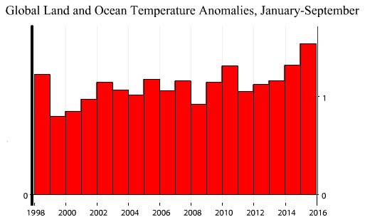
One of the favorite topics in the climate change denial community is the “global warming pause.” It’s based on the fact that 1998 was an unusually warm year, so if you begin a climate chart in 1998 it will look as if nothing much has happened since. I made fun of this last week, but it occurs to me that we might genuinely have seen the last of that famous chart.
Why? Because it’s no good anymore. David Roberts tells me today that Republicans are incensed over a recent NOAA paper that suggests the “pause” is due to mismeasurements of ocean temperatures, but who even needs that anymore? Just look at the basic numbers in the chart below. Even if you start in 1998, you can see obvious evidence of warming.
Bottom line: Even the famously deceptive 1998 chart doesn’t work anymore. I suspect that we’re going to see a sudden lack of interest in 1998 charts from the denialists. They’ll have to move on to swindling the rubes with something else.

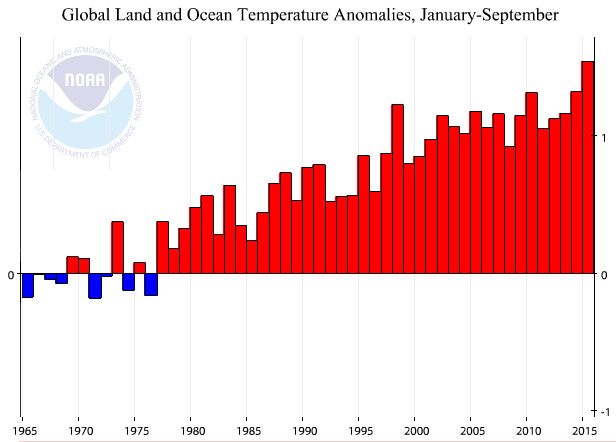
And if you’re curious, here’s an honest, plain-Jane chart of the past 50 years. The 1998 outlier is pretty obvious here, and the evidence of steady warming is pretty obvious too.


