CORRECTION: My “corrected” chart is all wrong. Click here for both an explanation and the proper chart.
Katherine Hempstead of the Robert Wood Johnson Foundation is optimistic about the growth of health care spending:
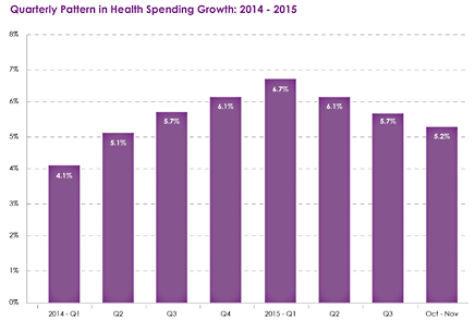
The quarterly trend in overall health spending growth using the Altarum Health Spending Economic Indicators series shows a clear peak in Q1 2015 at 6.7 percent, with subsequent declines every quarter. Partial data for Q4 (October and November) show a spending growth rate of 5.2 percent.
While overall spending growth in 2015 will clearly exceed that of 2014, a reduction appears to be underway.
As near as I can tell, this spending data hasn’t been adjusted for inflation. When you do that you get the chart at the bottom, which tells a different story. There was indeed a peak in the first quarter of 2015 followed by a sharp drop, but spending growth has gone up since then.
In the long term, I’m fairly optimistic about the trajectory of health care spending. As Hempstead says, it makes sense that we saw some large increases when Obamacare was first implemented, since it brought a lot of new people into the health care system. But after the first year or two, that will flatten out and long-term trends should continue to dominate.
That said, you still need to look at this stuff in real terms. And when you do that, we’re not quite seeing the steady downward march that Hempstead suggests.
UPDATE: I originally used overall CPI to adjust the health spending numbers, but it’s probably better to use just the medical component of CPI. I’ve modified the chart to reflect this.


