While Hillary Clinton and Bernie Sanders are finishing up their lovefest in New Hampshire, how about another chart comparing retirement in America to retirement in other rich countries? Don’t lie: you know you want it.
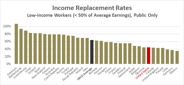
Here’s one that makes the US look a little worse than yesterday’s charts. It shows income replacement rates in all OECD countries: that is, the amount of income that retirees get compared to how much they earned when they were working. This is a very tricky number to compute because there are lots of different ways you can do it, and the OECD pension report spends several pages just outlining the various assumptions you can use. That said, here are their estimates for low-income workers when you include only public pensions like Social Security:

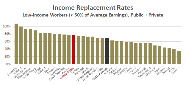
And here’s the same chart including all pension income, both public and private:

Once again, the United States relies more on private spending than most other countries. When you count only Social Security, the US looks pretty stingy, ranking seventh from the bottom for low-income workers. But when you include all sources of pension income, we look better than a majority of OECD counties—including famously generous ones like Belgium, France, and Germany.
Now, as I said, these numbers are tricky to compute, and in this case I’m fairly skeptical of them. The replacement rate for Social Security in the top chart looks way too low to me. Conversely, the replacement rate for all sources of pension income in the US looks too high. Neither number matches up to figures for low-income workers from places like the Congressional Budget Office and the Social Security Administration. But that may simply be because the OECD made different assumptions in their calculations.
In any case, this gives you a decent idea of how we stack up using simple income replacement rates as your metric.


