Speaking of cherry-picked statistics, Brad DeLong is unhappy with John Cogan, Glenn Hubbard, John Taylor, and Kevin Warsh, who insist that Donald Trump might very well produce sustained economic growth of 3 percent. They back up their view with this chart of labor productivity:
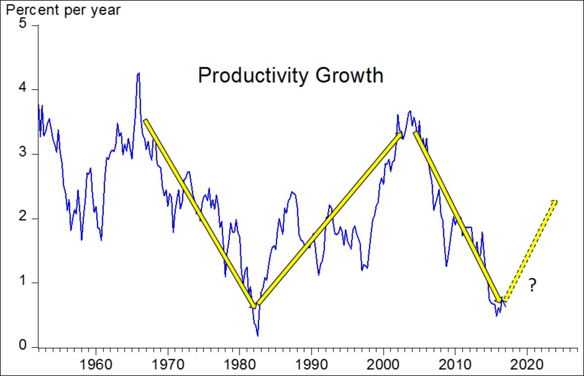
Aside from looking like something a first-grader would put together, real economists don’t just draw miscellaneous arrows through data. DeLong shows how it’s done correctly, drawing a nonparametric smoothed lowess trend through a scatterplot. However, he admits that us amateurs could show the same thing using a standard-issue curve fitted by Excel. Here it is:
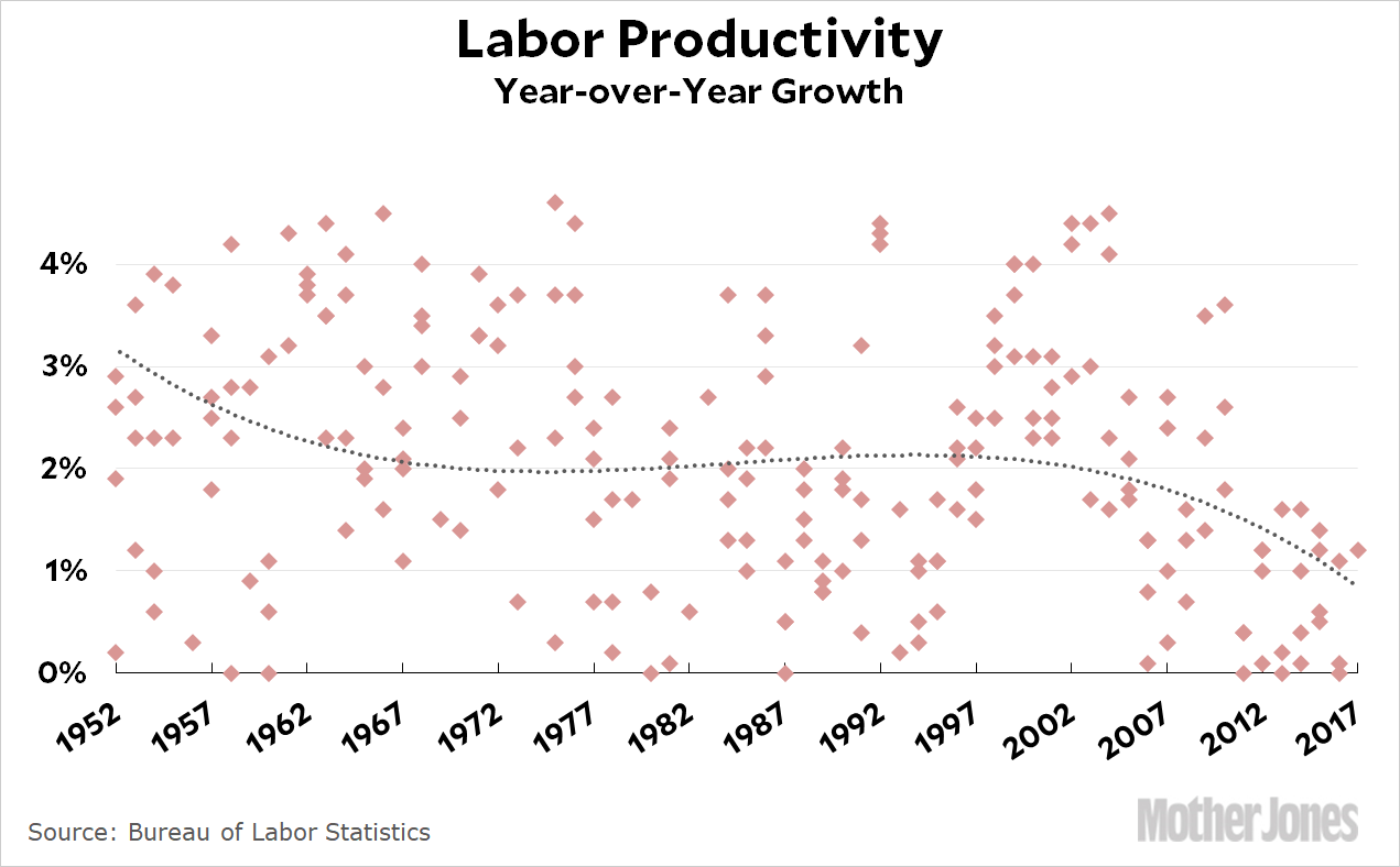
Hmmm. When it’s plotted with no particular bias to produce a specific result, it looks like productivity has been on a steady downward trend for the past 65 years, with a brief and modest uptick during the 90s.
Is it possible that tax cuts for the rich will produce a sudden, gigantic surge in productivity and therefore a sudden, gigantic surge in economic growth? Sure. Tax cuts for the rich have never produced this before, but anything is possible. Should you bet on it based on a crude chart drawn by folks who have an axe to grind? Well, it’s your money.