Yesterday I wrote a post criticizing the Washington Post for the way it reported some new statistics on family wealth. After a Twitter conversation with the reporter and editor, I promised to analyze the raw data myself and report back. I’ve now done that.
The Post reported that the share of white millionaires (by wealth) has increased from 7 percent in 1992 to 15 percent in 2016. This looked to me like a case of not adjusting for inflation, but I was wrong. After crunching the numbers myself, I got the same result: even after adjusting for inflation, the percentage of whites with a net worth over $1 million has indeed doubled. My apologies for the error.
But at the risk of sounding grudging, I still have several issues with the story. Here they are:
- The whole frame of “how many whites are millionaires?” is a peculiar choice. It makes for a dramatic headline, I suppose, but why not just report the basic data on the level and growth of net worth?
- If you are going to use the “millionaire” frame, then you need to report the figures for blacks and Hispanics too. The story says, “The percentage of black and Hispanic households worth more than $1 million has remained around or below 2 percent since 1992,” and the accompanying chart confirms this visually. The numbers are so low that growth does indeed seem flat unless you look carefully at the labels. In fact, though, the share of black millionaires has tripled from 0.64 percent in 1992 to 1.9 percent in 2016. The share of Hispanic millionaires has gone up by half, from 1.53 percent to 2.26 percent.
- All of us seem to agree that the right way to report average wealth is to use median values. But for some reason, white wealth is reported as a mean: $930,000. Only in a parenthetical is the reader told that median white wealth is $171,000. If medians are the right way to report this, why not use that as your primary number? Why report the mean at all? It seems like a cheap attempt to make average white wealth look a lot higher than it is.
- In the tenth paragraph, an increase of white wealth since 2013 is interpreted as showing “a recovery from the Great Recession.” Black and Hispanic wealth also rose, “but remained below 2007 values.” This is a misleading way of presenting the data, since everyone saw their wealth rise compared to 2013 and everyone was still below 2007 values. In fact, black and Hispanic wealth grew faster than white wealth over the past three years. In the longer term, families of every race are still about 10 percent below their 2007 wealth.
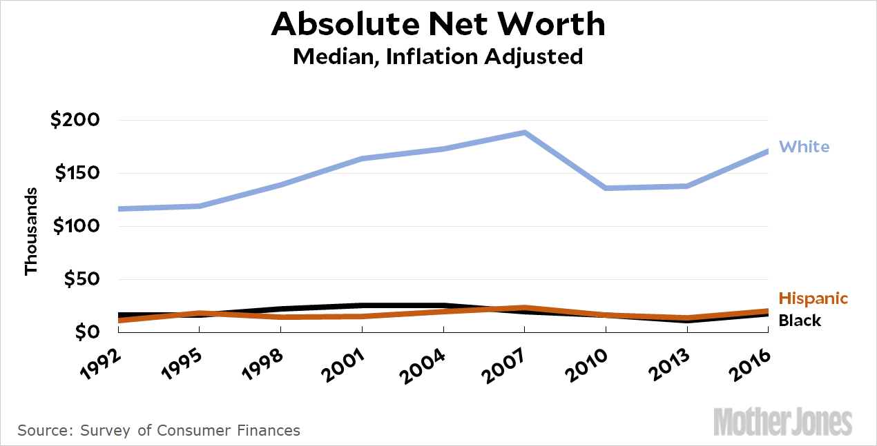
None of this was necessary. I’ll repost the basic chart on net worth that that I put up yesterday:

The numbers for black and Hispanic wealth are so low that this would be the primary story no matter what. There’s no reason to spin things to make it look even worse.


