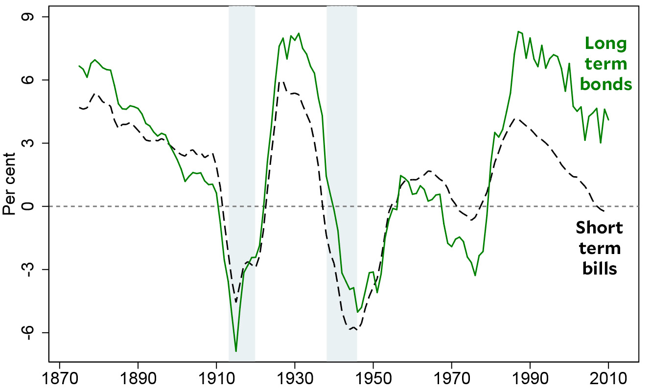
This has nothing to do with politics of any kind at the moment, but Tyler Cowen pointed me to a new paper that’s pretty interesting. The authors have compiled a massive new database that shows the returns on treasury bills, treasury bonds, stocks, and housing for 16 different countries over the past 150 years. The countries covered include the United States, Japan, and 14 major European economies, and that allows the paper to show us average returns for advanced economies worldwide, rather than just a single country with its idiosyncratic features. Here, for example is the average real rate of return for governments bills and bonds:¹

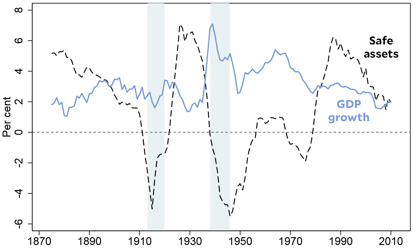
These are both safe assets, but their returns are surprisingly volatile. In wartime, returns plummet, but even in peacetime they range from -3 percent to 8 percent. And another thing: until 1990, returns on bills and bonds were pretty close, usually within about 1 percentage point of each other. But since 1990, they’ve diverged considerably. For the past 30 years, long-term bonds have consistently returned about 4 percentage points more than short-term bills. It’s not clear why this is, although presumably it means that investors have had expectations of declining inflation for quite a long time. Here’s a chart that combines all safe assets to provide a clearer view of the volatility of returns:

Even not counting wartime, the return on safe assets has roller coastered between -2 percent and 7 percent. As you can see, there’s no apparent relationship with economic growth, and the authors point out that the average return on safe assets over the past 150 years is roughly 2 percent, about what it is today. This suggests that current returns on government bonds are nothing out of the ordinary.
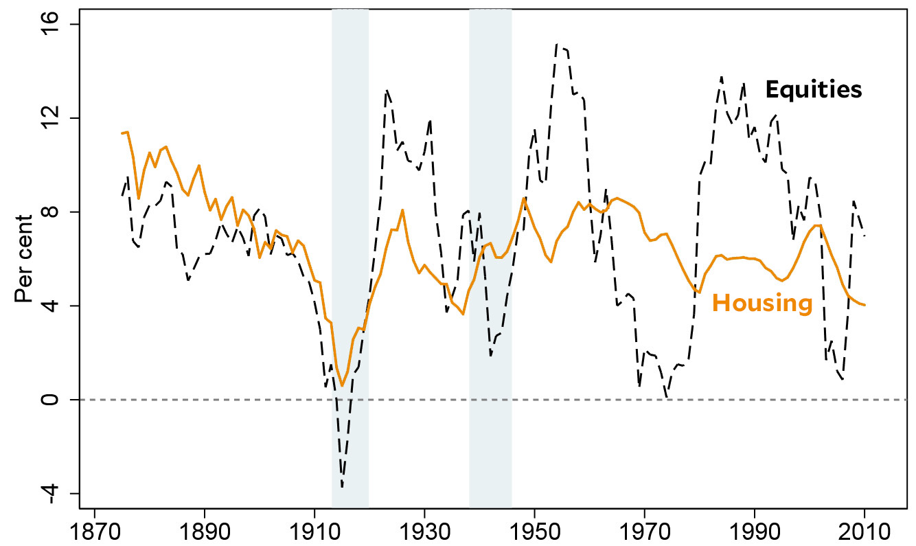
But what about risky investments? Here are returns on housing and on stocks:

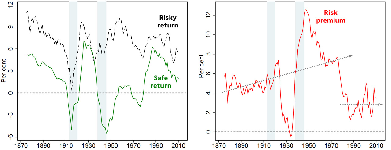
With the exception of World War I, housing returns have been remarkably stable. With only a couple of exceptions, the return has been between 5 percent and 8 percent year in and year out.² Equities do about as well on average, but are far more volatile, ranging from 0 percent to 15 percent depending on the strength of the economy. If we then take a look at both risky and safe assets together, we can see the evolution of the risk premium over time. Here it is:

With the exception of the huge change during the Depression and World War II, the trend is fairly clear. From 1870 to 1970, the risk premium gradually rose from about 4 percent to 7 percent. Then there was a big drop, and ever since the mid-80s the risk premium has hovered around 2-4 percent. For the better part of a century, investors required a premium of 4-7 percent to entice them to invest in equities instead of treasury bonds. But following the collapse of the Bretton Woods regime in the 70s and the global financial deregulation of the 80s, investors have required a premium of only 2-4 percent. This is, presumably, because the neoliberal revolution prompted investors to have greater confidence in steady economic growth and therefore in steady corporate growth.
I don’t have any big conclusions to offer about all this. Mainly, it’s just interesting raw data, something to provide context when we discuss things like flight to safety or the equity premium puzzle. As this data shows, real returns on both safe and risky assets bounce around a lot, so it’s usually best not to overreact to changes that, in historical context, might not be as dramatic we think.
¹The data throughout these charts is for real rates of returns. That is, everything has been adjusted for changes in the inflation rate.
²All of these charts show 10-year averages, which is why the great housing boom of the early aughts looks less impressive than you’d think. The stratospheric period of the housing boom lasted only a few years, so the point at 2001 (an average of 1996-2006), which represents its peak, includes only about three years of enormous returns averaged with seven years of merely high returns.


