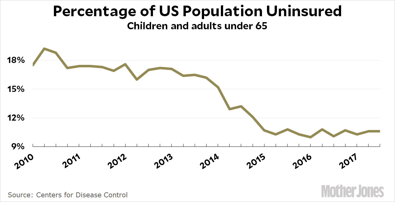
The CDC released its latest quarterly estimate of the uninsured today, which covers the period up through Q3 of 2017:

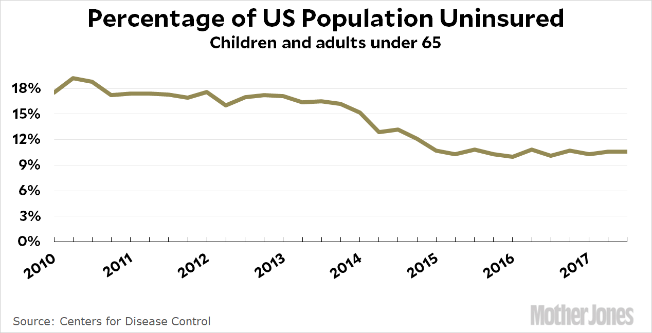
UPDATE: I’ve been publishing this chart for years, but suddenly everyone thinks it’s misleading because it starts at 9 percent. I will have more to say about this later, but here’s the same chart with a y-axis that starts at zero:

Is this better? I’m not so sure. END UPDATE
Since 2015, the CDC’s estimate of the uninsured has been stable at 10-11 percent. This is pretty obviously the final steady-state result of Obamacare, and it represents a drop of 6 percentage points since 2013, or about 17 million people. We only have 28 million to go to get everyone covered.
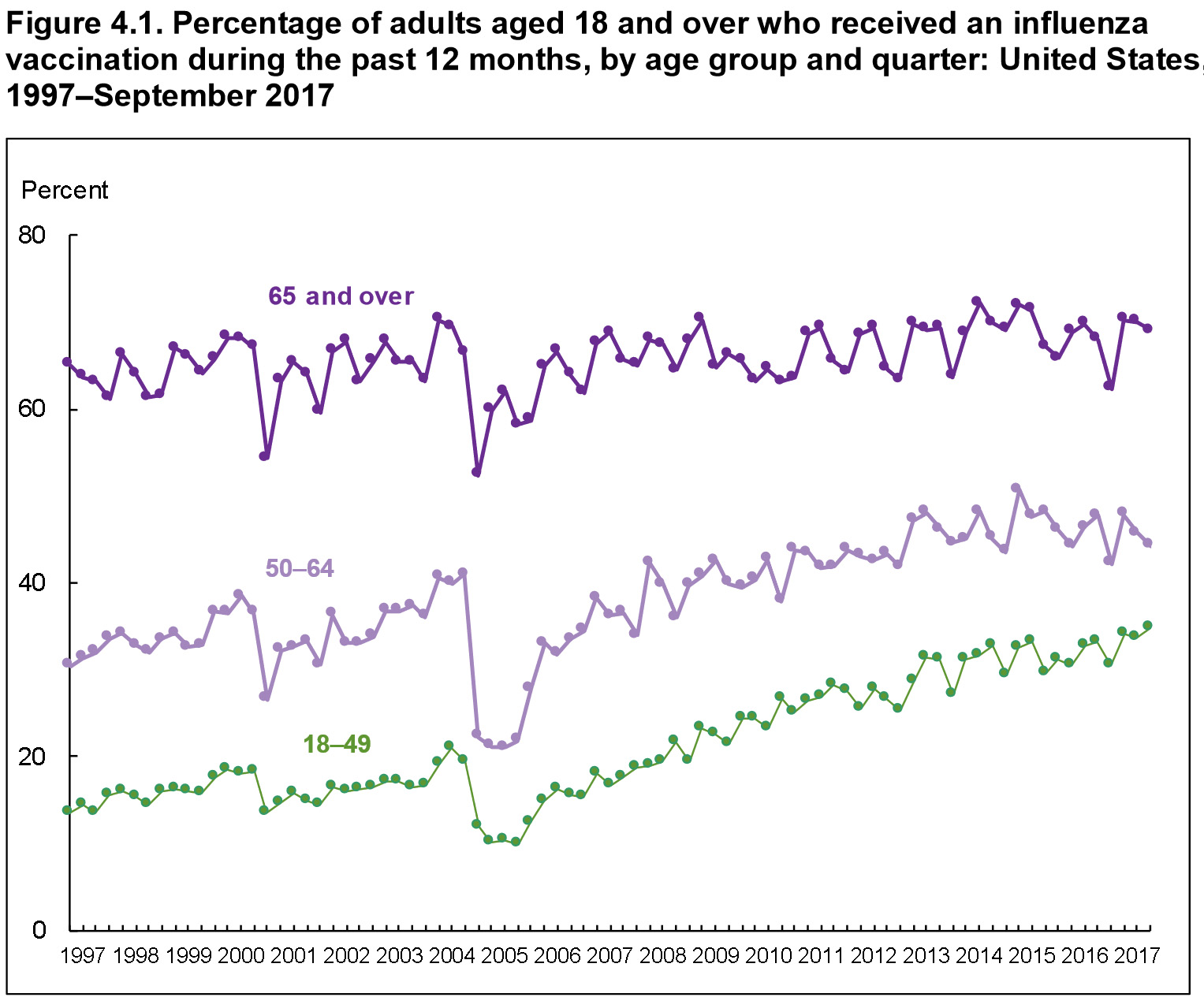
And as long as we’re on the subject of CDC stats, here’s one showing the rise in the number of people getting flu shots every year:

I’m a little surprised the number is so low for the non-elderly, though I’m not one to talk. It was only a few years ago that I ever bothered to get one. I wonder what the big dropoff in 2004 was all about? Ah, wait: according to the technical notes there was a flu vaccine shortage that year. The funny thing is that it seemed to have a surprisingly long-term effect. Just by eyeball, it looks like it took about five years for the number of people getting a flu shot to catch up to its old trendline.


