• Are People Dropping Health Insurance Because the Obamacare Fine Is Gone?

    The LA Times tells us the story of a California woman who decided to go without insurance this year:

    Without an Obamacare penalty, many are planning to drop health plans. The consequences could be dire

    Dana Farrell’s car insurance is due. So is her homeowner’s insurance — plus her property taxes. It’s also time to re-up her health coverage. But that’s where Farrell, a 54-year-old former social worker, is drawing the line.

    I’ve been retired two years and my savings is gone. I’m at my wit’s end,” said the Murrieta resident. So Farrell plans — reluctantly — to drop her health coverage next year because the Affordable Care Act tax penalty for not having insurance is going away.

    ….Farrell is among millions of people likely to dump their health insurance because of a provision in last year’s Republican tax bill that repeals the Obamacare tax penalty, starting in 2019, by zeroing out the fines….Some people who from the start hated the Affordable Care Act, or Obamacare as it is often called, will drop their coverage as a political statement. For people such as Farrell, it’s simply an issue of affordability.

    Since Farrell started buying her own insurance through the open market in 2016, her monthly premium has swelled by about $200, she says, and she bears the entire cost of her premium because she doesn’t qualify for federal ACA tax credits. Next year, she says, her premium would have jumped to about $600 a month.

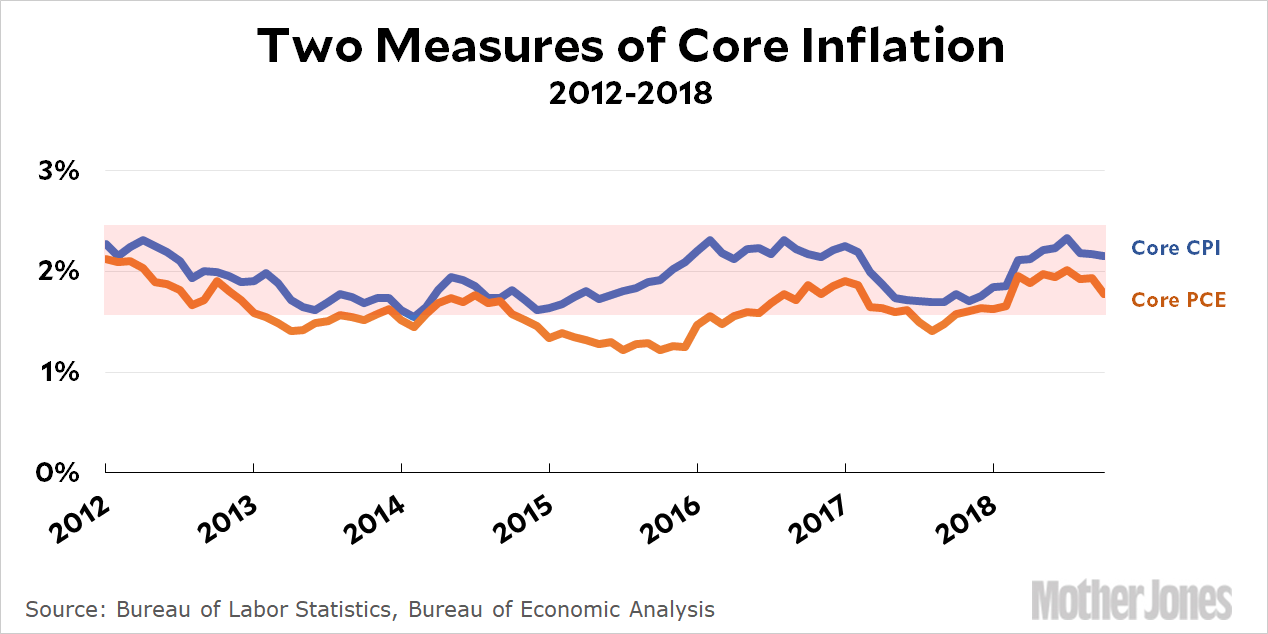
    Obamacare’s individual mandate forced everyone to buy insurance. If you didn’t, you had to pay a fine of about $800. Republicans reduced the fine to zero, which means—presumably—that lots of people who were buying insurance solely to avoid the fine will probably skip it this year.

    But how many? The Congressional Budget Office predicted 4 million people would drop insurance. Based on enrollment figures so far, that’s obviously way too high. Obamacare enrollment this year looks like it will end up maybe a million less than 2018, and that’s not all due to the mandate going away. Some of it because of the improving economy and some of it is for miscellaneous other reasons. Still, the end of the mandate is clearly having an effect.

    But this particular story also includes one of the usual mysteries of Obamacare reporting. Dana Farrell says she’s retired and her savings are gone. She’s at her “wit’s end.” And yet, she doesn’t qualify for Obamacare subsidies. What’s up with that? You can qualify for subsidies with an income up to about $50,000. The story doesn’t say, but presumably this means she’s a victim of the Obamacare subsidy cliff: she has a pension of around $60,000 or so, which is just above the subsidy cutoff, and therefore has to pay the full freight on a premium of $7,000 per year. That’s a big chunk of money.

    And it’s almost certainly why she’s foregoing insurance. The Obamacare penalty of $800 had nothing to do with it. I’m willing to bet both my cats that this is a story of the subsidy cliff and a savings account that ran dry, not the individual mandate fine.

  • Raw Data: Inflation and Expected Inflation

    How are we doing on inflation these days? Should the Fed be worried enough about it to raise interest rates even further?

    It sure doesn’t seem like it. Here are two charts. The first one shows core inflation (inflation less food and energy), the preferred measure of the Fed. It’s been hovering around their target rate of 2 percent for more than six years, and both of the major measures of inflation are currently within a few tenths of a point of 2 percent.

    The future looks equally placid. Expectations of future inflation have been pretty steady for the past six years, and are currently within a few tenths of a point of 2 percent.

    In neither case is there any sense of acceleration, nor even of upward movement. Core inflation itself has been bobbling around 2 percent for years, while inflationary expectations have been declining steadily. If there’s any reason to be fearful of accelerating inflation in the near future, it sure isn’t visible in the numbers themselves.

  • Foodborne Illnesses Were Up Last Year. They May Be Up Again in 2018.

    There have been a bunch of food scares this year, culiminating in a warning of E. coli in romaine lettuce announced last week—the second one in 2018. So what’s going on? Is our food getting worse? Jack Denton of Pacific Standard says, not really:

    When there’s an increase in outbreaks without a rise in individual illnesses, it means that technology and epidemiologists have gotten better at identifying why people are getting sick—that more illnesses which might have been considered sporadic in past years are now successfully linked to a common source. And the CDC’s latest available charting of foodborne illness rates shows that they are not on the rise in the U.S. Between 2008 and 2015, E. coli infections dropped by 30 percent, and most foodborne illnesses saw no change.

    Accordingly, any increase in identified outbreaks is good, likely the result of two major technological changes in roughly the last two decades that have led to scores more outbreaks being successfully identified. In 1996, the CDC began using Pulsenet, a system that tracks foodborne illnesses across the country by comparing the DNA fingerprint of discovered pathogens to see if they are similar….Starting in 2008, the public-health community began using a new method of DNA fingerprinting called whole genome sequencing, which has led to a large spike in detected outbreaks. “I get leery because I don’t think we can compare pre-2008 to today, because we measure things differently,” Chapman says. “We’re getting better at detecting the outbreaks, and there are better-trained public-health individuals now looking to solve foodborne illness outbreaks than we’ve ever had.”

    This got me curious, but it turns out the CDC makes it surprisingly difficult to find and summarize annual outbreaks of foodborne illnesses. But not impossible! Assuming I copied the numbers correctly and then did the arithmetic right, here’s the overall incidence of foodborne illnesses in the US since 1996:

    E. coli may be down between 2008 and 2015, but overall foodborne illnesses spiked upward in 2017, and that’s using the same new technology the CDC put in place in 2008. Numbers for 2018 aren’t available yet, so we don’t know if things have gotten even worse since the 2017 spike.

    In any case, I’m not really sure why we put up with this. I’ve probably mentioned this before, but a big part of the answer to food poisoning is simple: irradiation. It’s simple, safe, and it’s old technology with years of use behind it. It won’t do anything for foodborne illnesses introduced during prep—Chipotle can’t run your tacos through an irraditation machine on the way to the cash register—but it would be a boon to the packaged food industry. For all practical purposes, if it were made mandatory it would entirely eliminate foodborne illnesses in raw commercial and packaged foods.

    But it’s opposed by conservatives because it’s a regulation that would save lives, and who wants that? And to make things worse, it’s also opposed by many liberals, who view it as a Frankenfood sort of thing that would destroy their precious organic labels. In fact, it would do no such thing. It doesn’t leave any radiation behind, it doesn’t kill off vitamins, and it doesn’t affect the taste of food. It just kills off pathogens, the same as pasteurizing milk.

    Why, even lefty rags like Mother Jones think it’s a good idea. You can read all about it here.

    NOTE: The CDC monitors all reported foodborne infections in a surveillance area that includes ten states. These states are hopefully representative of the whole nation, but you never know. For that reason, the numbers in the chart have a higher uncertainty than usual.

    Also, there are far more cases of foodborne infection that are never reported. This includes the 24-hour bugs and so forth that we all get but never bother seeing a doctor about. CDC estimates the total number of foodborne illnesses in the US at about 50 million per year.

  • Most Studies of Social Interventions Are Pretty Worthless

    Last year, Eva Vivalt of the Australian National University wrote a paper analyzing the results of international development programs like microloans, deworming, cash transfers, and so forth. This chart shows the basic results:

    There are two things to notice. First, there’s not a lot of clustering. For nearly all these programs, the results are pretty widely dispersed. Second, where there is clustering, it’s right around zero, where the results are the least meaningful. A few months after Vivalt published her paper, Robert Wiblin described it this way:

    The typical study result differs from the average effect found in similar studies so far by almost 100%. That is to say, if all existing studies of an education program find that it improves test scores by 0.5 standard deviations — the next result is as likely to be negative or greater than 1 standard deviation, as it is to be between 0-1 standard deviations….She also observed that results from smaller studies conducted by NGOs — often pilot studies — would often look promising. But when governments tried to implement scaled-up versions of those programs, their performance would drop considerably.

    Last week, a charity announced a dramatic specific confirmation of Vivalt’s general results. Kelsey Piper provides the details:

    No Lean Season is an innovative program that was created to help poor families in rural Bangladesh during the period between planting and harvesting (typically September to November). During that period, there are no jobs and no income, and families go hungry….No Lean Season aimed to solve that by giving small subsidies to workers so they could migrate to urban areas, where there are job opportunities, for the months before the harvest. In small trials, it worked great.

    ….Evidence Action wanted more data to assess the program’s effectiveness, so it participated in a rigorous randomized controlled trial (RCT) — the gold standard for effectiveness research for interventions like these — of the program’s benefits at scale. Last week, the results from the study finally came in — and they were disappointing. In a blog post, Evidence Action wrote: “An RCT-at-scale found that the [No Lean Season] program did not have the desired impact on inducing migration, and consequently did not increase income or consumption.” (The emphasis is in the original blog post.)

    This admission was a big deal in development circles. Here’s why: It is exceptionally rare for a charity to participate in research, conclude that the research suggests its program as implemented doesn’t work, and publicize those results in a major announcement to donors.

    I’m writing about this as much as a warning to myself as a warning to everyone else. In one sense, this is just part of the recent replicability crisis in the social sciences, but it really goes back farther than that. It’s been pretty well known for a very long time that the biggest problem with interventions like these is scalability. Pilot studies have the luxury of being (relatively) easy to fund since they’re small; being able to choose sites where everyone is excited about the program and buys into it; not having to account for long-term feedback caused by the existence of the program itself (i.e., people get accustomed to the program as a baseline rather than as an interesting new thing); and generally having to deal with less diversity in their sample population, which makes a simple one-size-fits-all program easier to implement and less likely to have to deal with community pushback.

    Needless to say, this wide dispersion of results from small studies makes it really easy to cherry pick them to demonstrate whatever point you feel like making. I try to be tolerably honest in my reporting, but it’s nearly impossible not to fall prey to this from time to time.

    There’s not a lot more to say about this except to make a few brief points:

    • Be skeptical of small studies. “This is just a single study” isn’t merely boilerplate. It’s a real warning.
    • Be very skeptical of claims that small programs are likely to scale well to state or national size. They might, but you should demand real evidence of this.
    • Researchers with the means should be far more willing to follow up pilots with large-scale programs, and far more willing to admit when they don’t work.

    This is not a counsel of despair. The truth is that most social interventions at scale just don’t work all that well. This is hard stuff! Still, small pilot studies are the only means we have to provide direction for further research, and large programs that provide even a modest benefit should be considered worthwhile. In other words, we should probably be more demanding of small studies, but less demanding in our expectations for large programs.

  • Anecdotes, Data, and the 300 Million Rule

    Here’s an interesting tweet:

    I’ve heard this same thing over and over, and it doesn’t surprise me. It’s an example of the “300 million rule”—which I admit is a bit outdated now, but I made it up back when the US population was pretty close to 300 million. In a nutshell, this rule says that in a big country you can find examples of practically anything, no matter how crazy, on a daily or at least weekly basis. So can you find plenty of examples of university students demanding trigger warnings or safe spaces in the most irritating way possible? Sure, of course you can. Does it seem like there’s a lot of this going on? If you hear about it a dozen or so times a year, of course it does. On a personal basis, anything that happens a dozen times a year seems like a lot. And since most people are functionally innumerate, they simply don’t realize at a gut level that a dozen examples is actually a tiny number when you compare it to the number of university students in America (about 13 million). It’s hardly any wonder that individual professors run across it rarely if at all.

    Needless to say, this has become exponentially worse in the era of social media. Incidents that used to be little college molehills, reported in the local media if at all, now routinely get spread via viral mobs on social media and then used as fodder to build cable TV mountains. Also needless to say, the folks who promote this stuff have no incentive to tell us if they’re merely reporting a few examples out of thousands, or if these dozens are all they have.

    And this goes for liberals as well as conservatives. If you follow liberal media, you’ll hear weekly examples of racist behavior on college campuses. Is that a lot? See above.

    None of this means that stuff like this isn’t widespread. What it means is that anecdotes need to be accompanied by data. Unfortunately, there’s this:

    Here’s a quiz for you. Which of these articles about, say, starving children in Africa is likely to get the widest readership?

    1. A piece that tells the story via description and personal anecdotes.
    2. A piece that tells the story via facts and numbers.
    3. A piece that combines the two.

    Some of us respond to numbers, while some of us respond to stories about people, so the common-sense answer is option C. That should rope in everyone.

    In fact, it turns out that C is the worst possible option. Nobody likes it. The numbers people get tired of all the personal stuff, while the tender-hearted people are put off by all the numbers. It turns out that you have to pick one or the other and just accept that you won’t reach everyone.

    This kind of sucks. Sadly, though, my personal experience suggests it’s true: I get really tired of stories full of personal anecdotes. Yes, this guy had it really bad. I get it. Now give me the facts. At the same time, there’s a hoary old journalism truism that you lose 10 percent of your readers for every number you put in a story. God only knows how many readers you lose if you include a chart.

    To the extent that spinning this stuff as part of a culture war agenda is deliberate, there’s not much we can do about it. Unfortunately, to the extent that it’s because most people actively dislike data, there’s not a whole lot we can do about it either. I’ve spent years pondering this off and on, and I’ve come up with nada. Anyone else have anything?¹

    ¹And me being me, I don’t want random speculation. I want data.

  • Insecure Men Were a Big Trump Demographic in 2016

    This map from the Washington Post made the gleeful rounds of liberal Twitter yesterday:

    What’s not to like? It shows that all those supposedly manly Southern men aren’t so manly after all. In fact, they’re desperately searching Google for ways to make themselves more manly, and it’s hard for us lefties not to get a chuckle out of that. To make it even better, the accompanying study also showed that all these insecure men voted for Donald Trump in large numbers.

    But it seemed sort of dumb to me and I had no plans to write about it: the fact that Southern men voted for Trump in large numbers is hardly news, after all. But then, thanks to the Evil Dex, I had lots of time on my hand and I read the whole piece. It’s written by Eric Knowles and Sarah DiMuccio, who conducted the research:

    We found that support for Trump in the 2016 election was higher in areas that had more searches for topics such as “erectile dysfunction.” Moreover, this relationship persisted after accounting for demographic attributes in media markets, such as education levels and racial composition, as well as searches for topics unrelated to fragile masculinity, such as “breast augmentation” and “menopause.”

    OK. Not surprising so far. Tell me more.

    In contrast, fragile masculinity was not associated with support for Mitt Romney in 2012 or support for John McCain in 2008 — suggesting that the correlation of fragile masculinity and voting in presidential elections was distinctively stronger in 2016.

    The same finding emerged in 2018….In the more than 390 House elections pitting a Republican candidate against a Democratic candidate, support for the Republican candidate was higher in districts that, based on Google search data, had higher levels of fragile masculinity. However, there was no significant relationship between fragile masculinity and voting in the 2014 or 2016 congressional elections. This suggests that fragile masculinity has now become a stronger predictor of voting behavior.

    Huh. I was uninterested at first because I figured the Trump effect was really just a Republican effect. But no. Insecure men voted in unusually large numbers for the Republican candidate only when that candidate was Trump. And two years later, the effect was still there in a midterm election that was heavily dominated by Trump’s presence.

    If this holds up, it suggests that Trump really did appeal to a kind of toxic masculinity in a way that other Republicans haven’t. I suppose that’s not entirely surprising either, but it was just something we all assumed. We’ve not had real evidence of it before.

    And it’s interesting in a non-snarky way, too. There’s something about it that’s sort of a mirror image of this whole “deaths of despair” theory, which is mostly driven by rural whites.¹ If it’s true, it’s quite possible that it’s galvanized mostly by factors that affect the self-image of men who have grown up thinking that stereotypical manliness was a core part of who they had to be. Inability to be a good breadwinner would certainly be part of that. Being the “losers” of the feminist movement would be part of it. Being forced to give up their traditional control of family and sex—no more demands, no more casual harassment—would be part of it. A candidate who explicitly appealed to this frustration and promised to fix it—which neither Romney nor McCain did—would attract their votes. Especially if he were running against that shrill harpy Hillary Clinton.

    Long story short, this is interesting to the extent that it shows who Trump specifically appealed to above and beyond normal Republican candidates. It’s also something for Democrats to give some serious thought to, even if, like Trump, they currently have few real solutions to offer. I’m not sure what a “real” solution might be, but it’s worth noting that one thing it’s not is an insistence on nominating a man in 2020. Although the authors found that insecure men might like Trump, they held no grudge against women running for office: “Notably, fragile masculinity was unrelated to support for female candidates in the 2018 elections.” That means we can feel free to nominate anyone we want. It just needs to be someone who knows how to talk to insecure men.

    ¹I’m not entirely sold on the deaths-of-depair theory, but there’s certainly some evidence for it

  • The Russia Investigation Has Gotten So Bad It’s Forced Trump to Tell the Truth. Sort Of.

    Brian Cahn/Zuma Press

    Donald Trump has apparently forgotten that his previous story about Russia was very simple: he had no business ties at all, not in any way, shape, or form.

    Ah yes, just some light looking around. “Somewhere” in Russia.

    The New York Times has a good roundup of just how non-light Trump’s interest in a Moscow version of Trump Tower has been over the years. It’s still not treason, and probably not even illegal, but it’s sure not a good look for someone who was running for president. Trump now claims that “everyone knew” all along about his pursuit of a Russia deal, but the truth is that he did everything possible to keep it secret during the campaign. Robert Mackey provides the real story:

    The existence of such a project, which was being negotiated in secret during the entire span of the Republican primary campaign — from at least October 2015, when Trump signed a letter of intent with a Russian developer, through January 2016, when [Trump lawyer Michael Cohen] called an aide to Putin’s spokesman, until some time after Trump secured the nomination in June — was not known about or reported at the time. There was no indication in the outline of Cohen’s confession sketched out by Special Counsel Robert Mueller on Thursday as to why the proposed deal was dropped, but the timeline might offer a clue. Cohen suddenly backed out of a trip to Russia arranged by the Kremlin on the afternoon of June 14, 2016 — about three hours after the Washington Post revealed that Russian hackers had penetrated the servers of the Democratic National Committee and stolen documents related to the election.

    Cohen, of course, has admitted to lying to Congress when he said that Trump’s involvement with any kind of Russia deal had ended by January 2016—before the Iowa caucuses. In reality, his involvement continued throughout the entire primary. Thursday’s news also provided us with this bizarro tidbit reported by BuzzFeed:

    President Donald Trump’s company planned to give a $50 million penthouse at Trump Tower Moscow to Russian President Vladimir Putin as the company negotiated the luxury real estate development during the 2016 campaign, according to four people, one of them the originator of the plan.

    There’s no telling if Trump himself had any idea this was being discussed, or if it was just a meathead idea ginned up by Trump’s friends. My own personal guess is this: Trump himself had very little to do with any of this. What’s more, he was smart enough never to do anything illegal. His idiot son Don Jr., however, is a different story. Legal stuff becomes illegal when you lie about it to, say, Congress or the FBI, and I wouldn’t be at all surprised if Don Jr. did that. This accounts for a big part of why Trump is so frantic about this whole thing. Aside from the obvious political poison of it, he’s afraid—or perhaps even knows—that Mueller has the goods on his boy.

    This whole affair is both tragedy and farce at the same time. Either way, though, it seems like it’s finally nearing a climax. Stay tuned—though I doubt that’s advice anyone needs at this point.

  • Yes, California Really Did Kick Ass in the November Election

    On November 7 I reported that voter turnout in California had been lousy this year. On November 9 I reported that I had screwed up: voter turnout had actually been pretty great. Using estimates from David Dayen, I figured that total turnout would turn out to be about 12.7 million, or 50.4 percent of eligible voters. Today the Sacramento Bee provided us with nearly final numbers:

    More than 25 million Californians were eligible to vote in the election, and nearly 19.7 million of them were registered — both record-highs. About 12.7 million Californians are expected to have voted in the November elections — the highest number in a general election midterm cycle in state history.

    That was a pretty good estimate from David! Let this be a lesson to everyone: it takes a long time to count votes in California, so don’t jump to conclusions unless you really know what you’re talking about.

    ALSO: We flipped seven seats from Republican to Democratic, 18 percent of the national total. That’s kicking ass.

  • Puzzle of the Day: Trump Admits Michael Cohen Is Right, But Also Says He’s a Liar

    I would normally be at lunch when Lunchtime Photo is scheduled to appear—thus the name—but today is Darzalex day and I’m stuck at the infusion center for a while. So I’m skimming the news and it turns out that Trump fixer Michael Cohen has pleaded guilty to lying to Congress. That’s actually a crime! Who knew? But I’ve got a poser for you:

    1. Cohen now admits that he worked on a Trump Tower project in Moscow all the way through June 2016, as Trump was running for president.
    2. Trump says this is correct, and it’s what he told Mueller’s investigators last week.
    3. He also says Cohen is a liar, making stuff up to get a reduced sentence.

    How can this all be true at once? Is it like one of those puzzle-book things where Trump turns out to be his own mother? Who can figure out this stumper for us?¹

    ¹Aside from the obvious answer that Trump is a goon who automatically calls everyone he doesn’t like a liar. That answer is way too boring. I want something better.