There’s been a little confusion on Twitter about the meaning of the chart I posted yesterday that compared working-class men’s and women’s hourly wages. I showed women’s wages increasing as a percentage of men’s wages, but what does that mean about actual women’s wages? To get at that you have to look at absolute dollar wages. The only non-confusing way to do this is with a separate chart for each age group, so here you go:
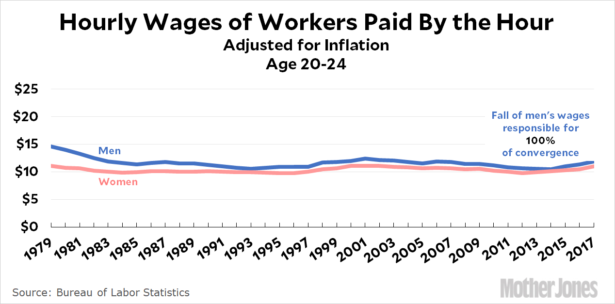
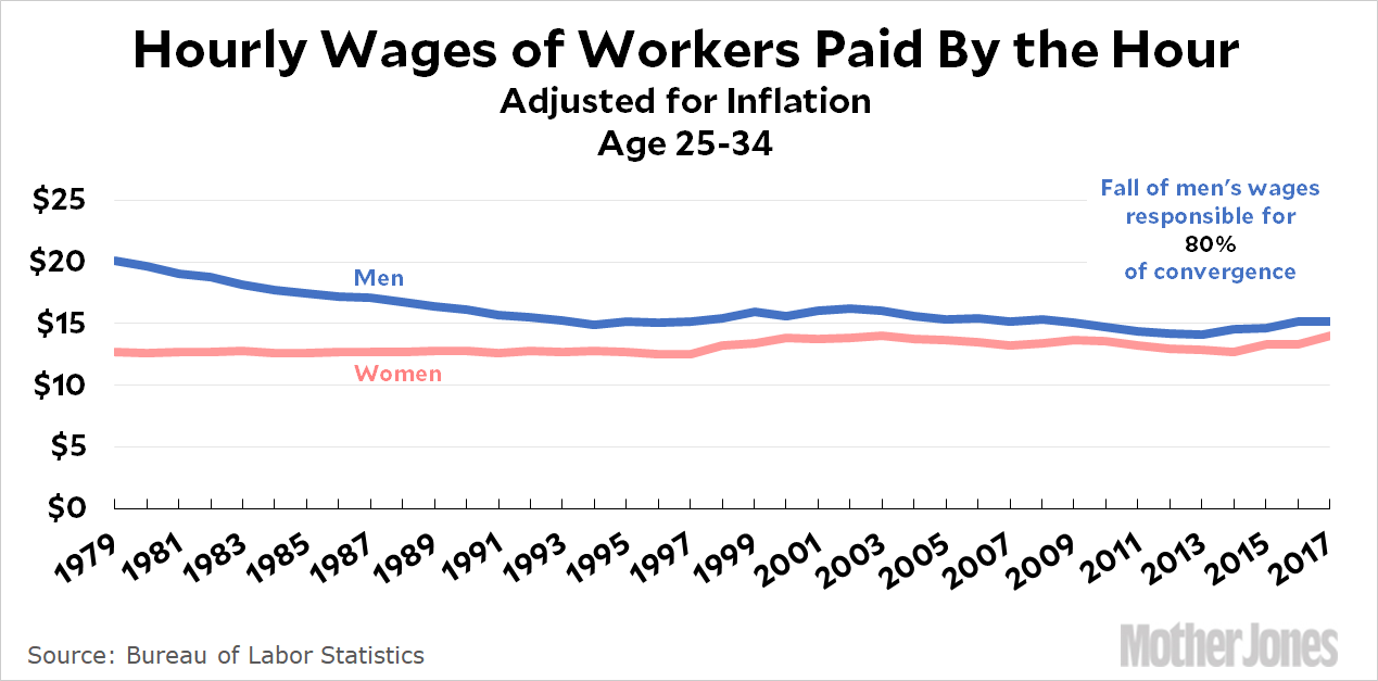
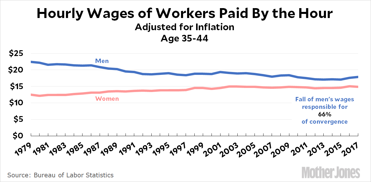
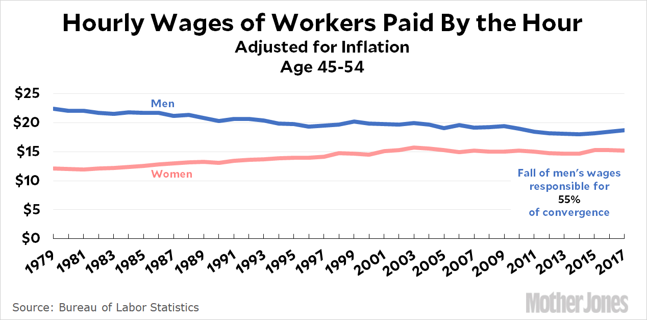
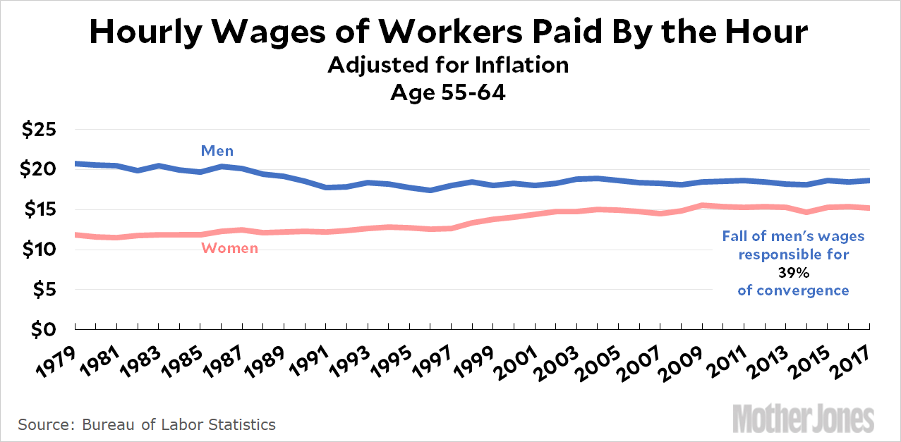
Keep in mind that these are hourly wages only for workers who are paid by the hour, which accounts for about half of all workers. These charts show several things clearly:
- Men’s and women’s wages are converging. That’s the good news.
- The bad news is that the main reason for the convergence is that men’s wages have declined. For the youngest age group, the decline of men’s wages is responsible for 100 percent of the convergence. The decline of men’s wages remains responsible for the bulk of the convergence until you get to the very oldest age group, where the increase in women’s wages is responsible for most of the convergence.
- The absolute difference in wages widens as workers get older. As before, I assume that this is due to women being cumulatively more likely to have children as they get older.
Aside from this I don’t have any special comment to make. I just wanted to provide some of the detail behind yesterday’s chart.


