
Just look at all this wasted land in the middle of the city that could be used for more housing.Kevin Drum
Are you all rested up from the July 4th holiday? Great! Let’s start out the week with a fascinating subject: how much does it cost to live in New York City? Are costs skyrocketing because so many people want to live there? There’s no such thing as definitive, smoking-gun evidence on this score, but I can provide you with a whole bunch of fragmentary evidence that should allow us to draw tentative conclusions.
Three words of warning. First, this post has a ton of charts. But don’t worry, we’re going to blow through them pretty quickly. Second, all figures have been adjusted for income growth over the years. I used the Census Bureau numbers for household income in the northeast US. Third, all of these charts have flaws. I’m going to point them out as we go along.
First up is a HUD housing report:
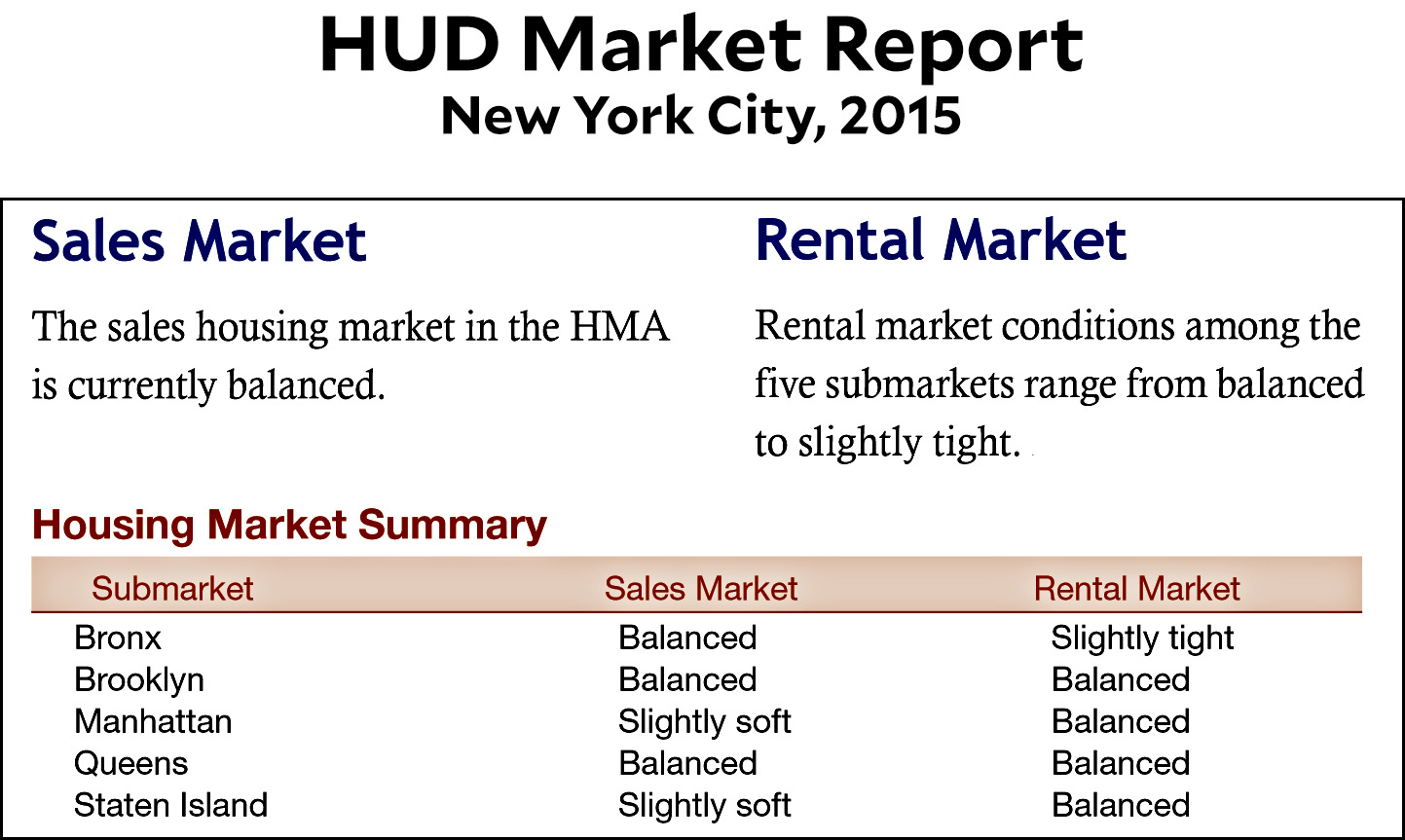
This suggests that demand for housing is not abnormally high. The problem is that this report is from 2015, which is the most recent year that HUD has looked at New York City. However, there’s also this:
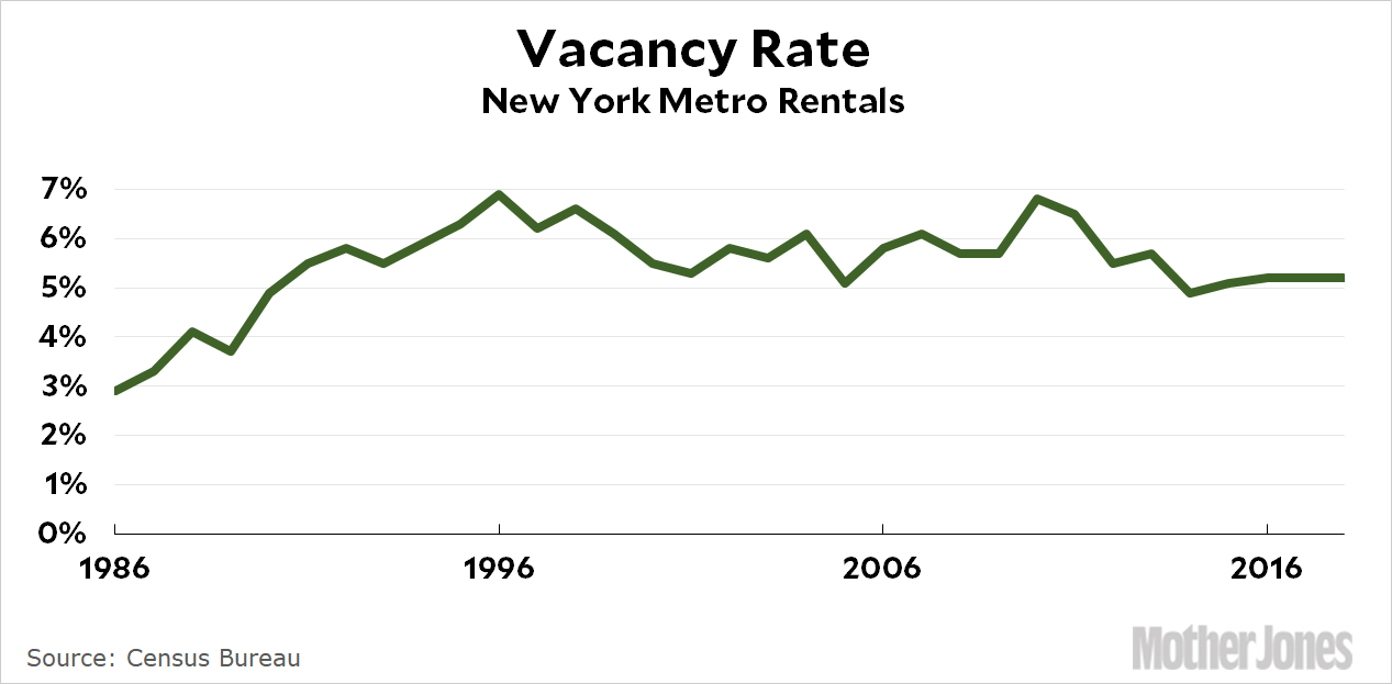
Back in the ’80s, demand was high and that drove the vacancy rate down. For the past 20 years, however, it’s been pretty steady at around 5-6 percent. That doesn’t suggest a super tight housing market. Now let’s look at prices:
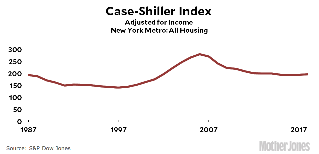
This is for home sales, not apartment rents, but rents generally follow sales prices. Over the long term, this provides us with a fairly reliable look at one piece of the market, and it shows that prices are at about 1987 levels. One problem is that this index includes all housing, but it’s the cheaper places that have seen the biggest increases. Luckily, there’s a Case-Shiller series for that too:
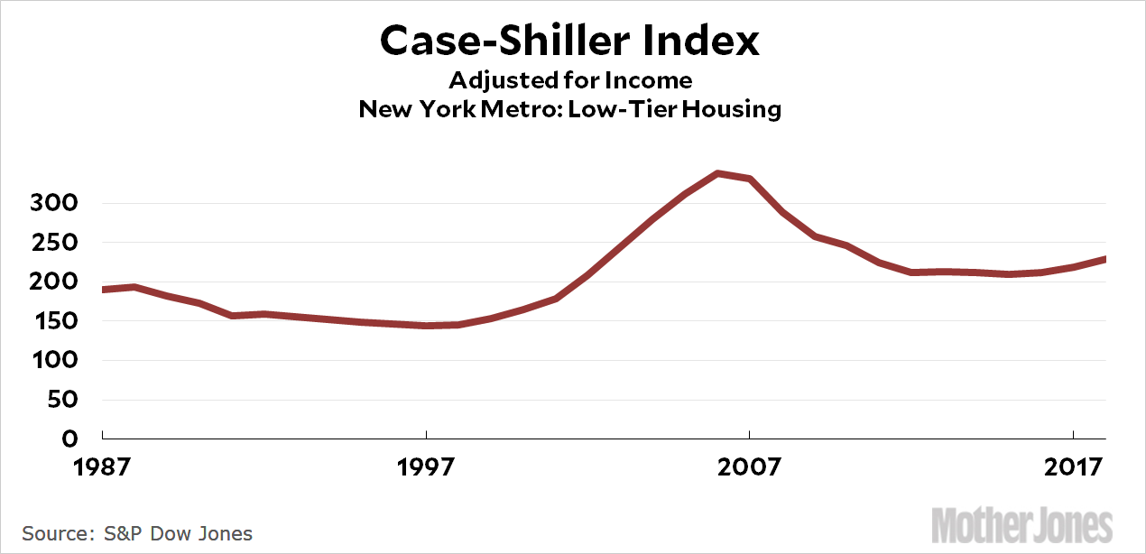
Cheap housing was also at 1987 levels until a couple of years ago. It’s now about 15 percent higher. However, like the previous chart, this one covers the entire New York metro area, which includes Long Island and northern New Jersey. There’s nothing we can do about that, but here’s a look at condo pricing:
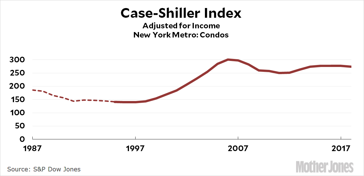
It’s reasonable to guess that the condo market is heavily weighted toward New York City, and this suggests that prices have gone up 40 percent or so since 1987, mostly thanks to a huge boom in the aughts. Now let’s take a look at an estimate of rents just for the five boroughs:
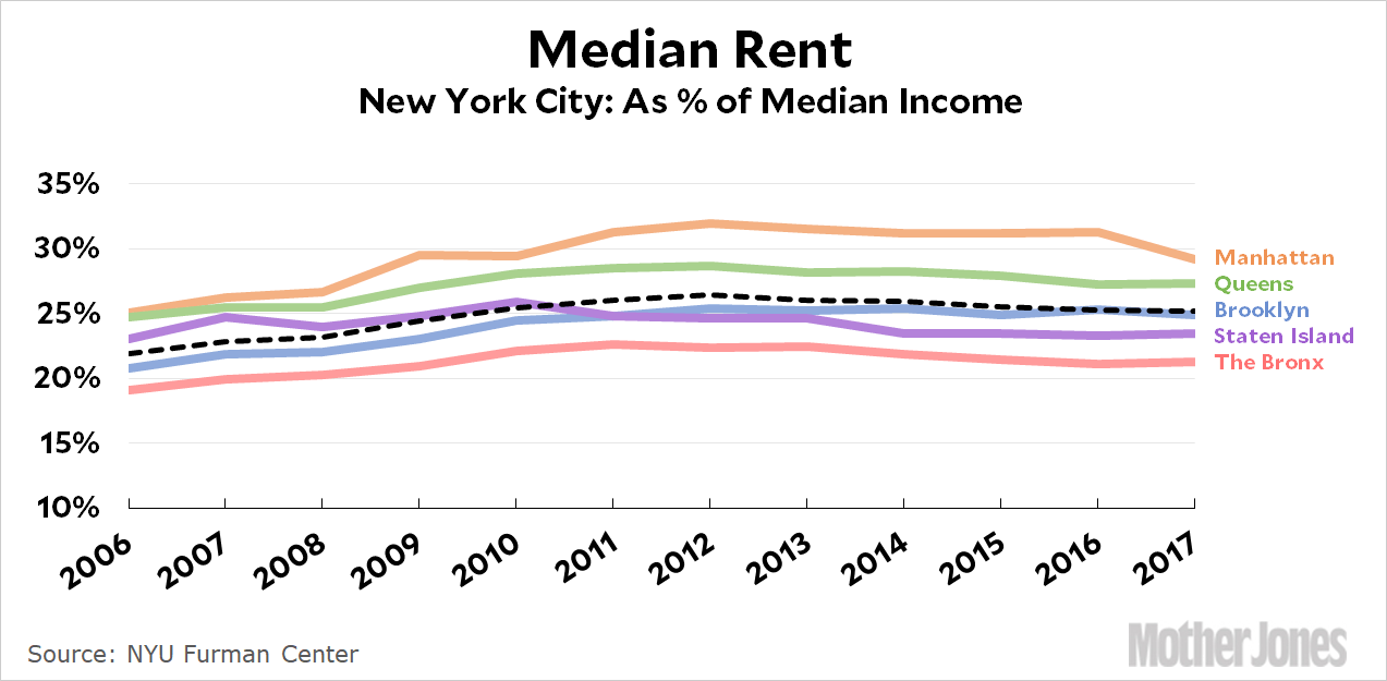
Don’t worry about the absolute numbers here, which strike me as low. What we’re interested in is the growth rate, and aside from Staten Island this shows increases of 10-20 percent. The problem with this chart is the short time frame: it shows us what’s happened since 2006, but not before that. Here are some other short-term estimates:
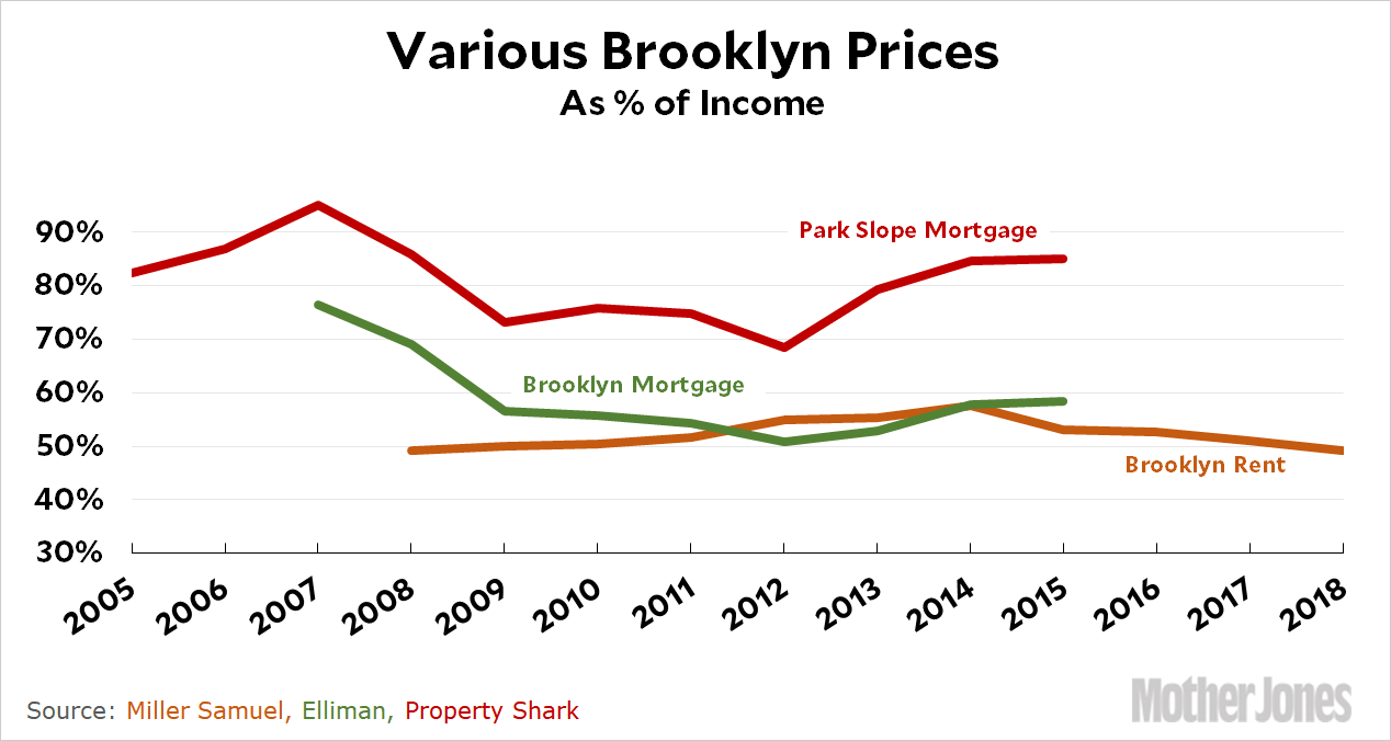
One of these is for rents, and the other two are average mortgage payments based on price and interest rates. All of them suggest recent flatness in the Brooklyn market.
And now for one final chart. Here it is:
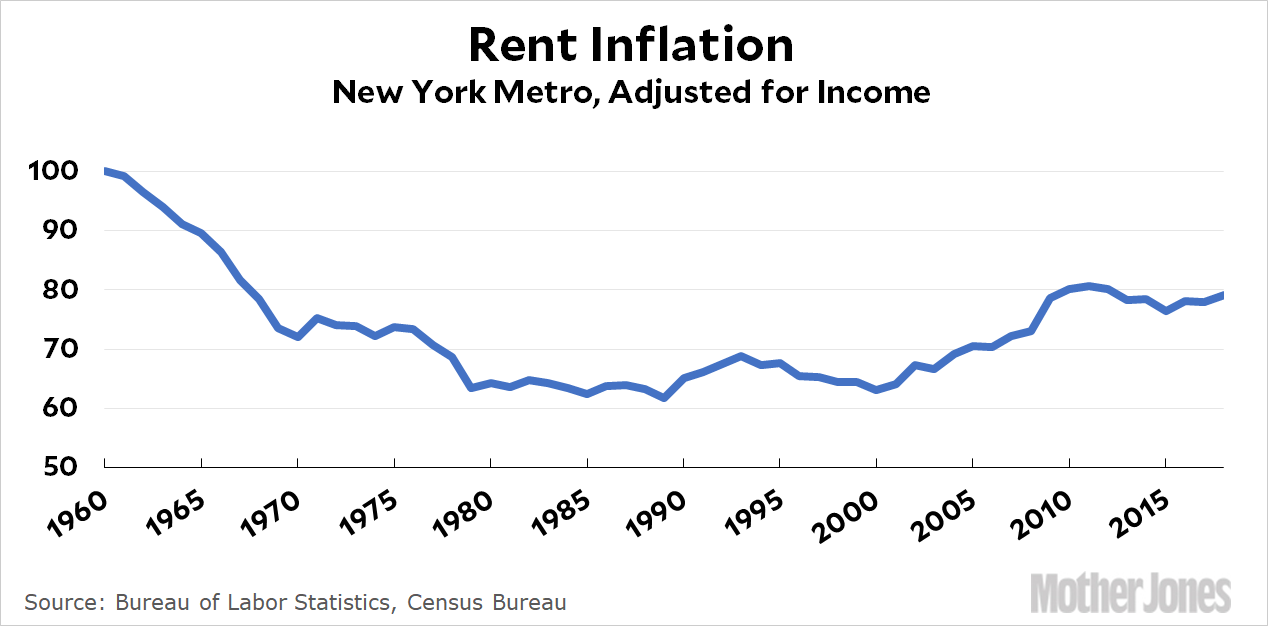
This is the BLS estimate of rent inflation. It covers the entire metro area, but that doesn’t seem to be a problem: it mostly matches up with everything else we know. In other words, despite the fact that this is the statistic I would have trusted the least going into this exercise, it’s probably actually the best. It seems to be fairly accurate, and it goes back a long way. What it shows is that average rents in New York are currently higher than 1995 levels; about the same as 1970 levels, and lower than 1960 levels.
In generational terms, this means that if you’re hunting for an apartment right now you’re worse off than Gen X at the same age; about the same as boomers; and better off than the Silent Generation.
If I had to choose one single measure that best represents NYC housing, this would probably be it. At various times you’ll find differences between classes of housing (luxury vs. median), between types of buildings (co-ops vs. condos), and between areas (Manhattan vs. Brooklyn, Tribeca vs. Dumbo). Sometimes one of these is the hot market, other times it’s one of the others. So if you’re focused on a specific kind of place in a specific area, this might not represent your personal experience. On average, however, it’s a pretty good guide.
POSTSCRIPT: One problem that all of these charts have in common is rent control. Since many apartments in New York City are rent stabilized, it means the estimates shown here are an average of places that are and aren’t rent controlled. Thus, they probably overstate the price growth of mid-range apartments that are rent controlled and understate the price growth of higher-end apartments that aren’t. Beyond that there’s not too much to say. There’s no telling what market rent growth would be like if rent control weren’t around, and anyway, it doesn’t really matter. Rent control is around, and it affects the real-world prices that apartment dwellers pay in New York.


