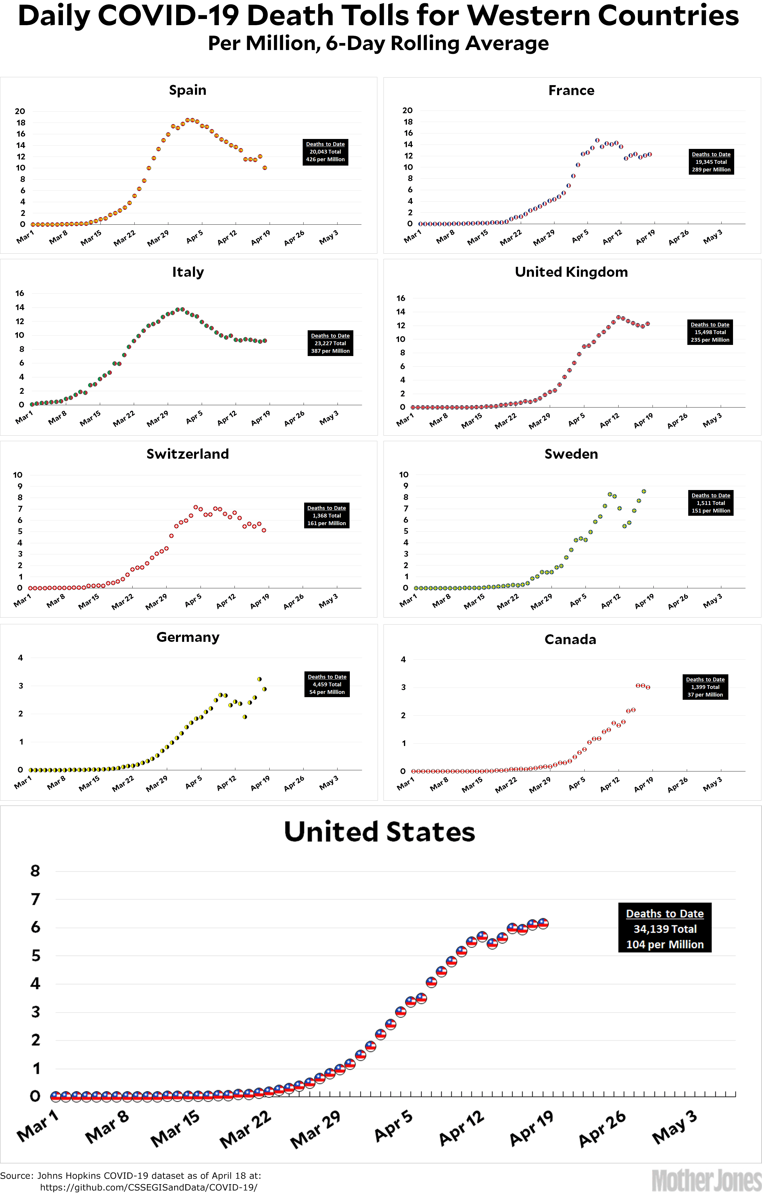
Here’s the coronavirus death toll through April 18. I’ve decided the time has come to switch chart formats again. We’re now far enough into the pandemic that the raw mortality numbers are starting to give us some idea of whether this wave of the virus has peaked, and that’s what we’re all most interested in right now. So the new charts, which I introduced yesterday, simply track the daily death toll per million population. Easy peasy.
Sharp eyed readers will notice that the charts look slightly different than they did yesterday. That’s because I had an arithmetic error that I didn’t catch. I’ve gone over the data pretty carefully for today’s official debut, however, and I’m pretty sure the charts are all accurate now.
The raw data from Johns Hopkins is here.


