Chart Trivia: Which Is Better, Log or Linear?

Back when I first started charting the spread of coronavirus I decided not to use a logarithmic scale. I figured that log scales were fine for communicating with other professionals, but most laymen have no clue what a log scale is and have difficulty interpreting it even when they’re given an explanation.

Naturally, then, I’m thrilled to pass along a study from the LSE School of Public Policy that confirms I was right. They showed people the following two charts:

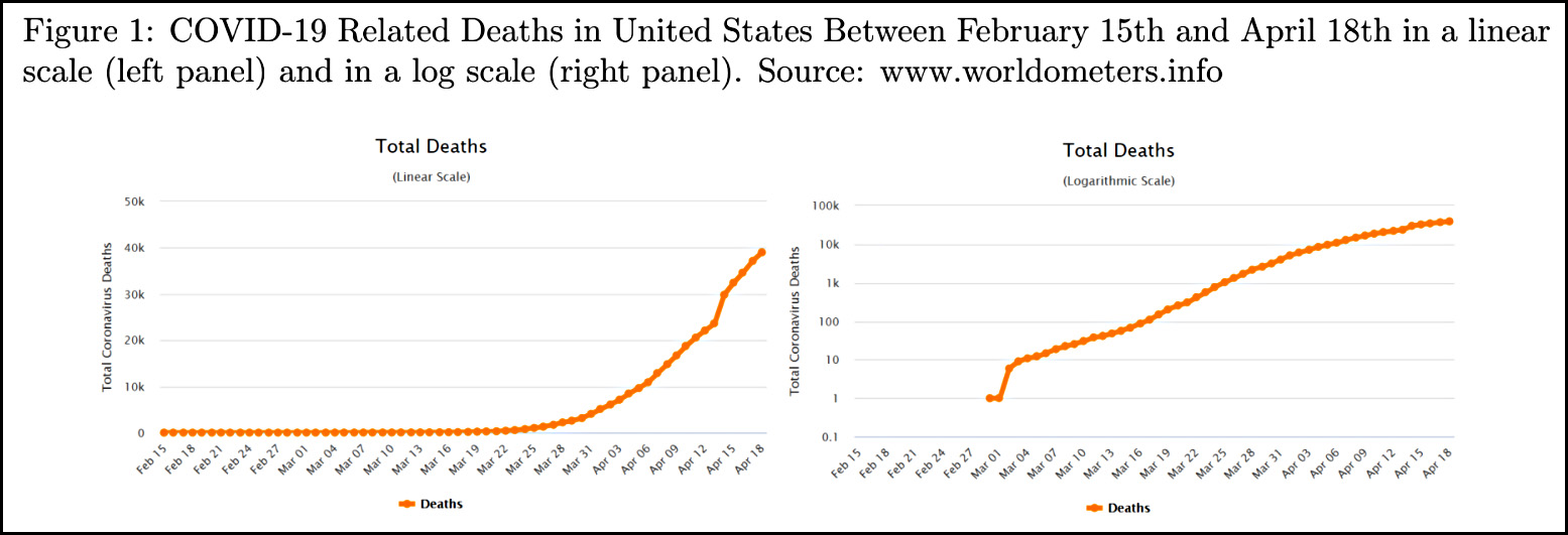
I think they put their finger on the scale by starting the y-axis of the log chart at 0.1, but I don’t suppose many people actually noticed that. In any case, here are the results:

We find that the group who read the information on a logarithmic scale has a much lower level of comprehension of the graph: only 40.66% of them could respond correctly to a basic question about the graph (whether there were more deaths in one week or another), contrasted to 83.79% of respondents on the linear scale. Moreover, people in the logarithmic group also proved to be worse at making predictions on the evolution of the pandemic: they predicted, on average, 71,250 deaths for a week after the experiment was taken, whereas the linear group predicted 63,429.

The first finding here is peculiar: since both charts feature lines that are steadily increasing, why would anyone have trouble saying if there were more deaths in one week vs. another? The later week will always have more. That’s odd.

The second finding, however, is the key weakness of a log chart: people have a hard time interpreting the scale. In the log chart, the final dot looks like it’s at around 60-70,000 deaths or so. It’s not, of course, because the the distance between 10K and 100K increases on a log scale just like the rest of the chart. But most people simply don’t understand that. The linear chart, by contrast, shows clearly that the final dot is at 40K and the death rate is growing quickly.

So how does this affect attitudes toward the COVID-19 pandemic?

First, we find that despite predicting a higher number of deaths, people who were shown the logarithmic scale chart declare to be less worried about the health crisis caused by the coronavirus.

Divergences, however, don’t stop there. The scale of the graph they see affects people’s responses concerning their policy preferences and stated behaviours. Ceteris paribus, respondents who see the information on the linear scale graphs support less strongly the policy of keeping non-essential businesses closed than those who look at the logarithmic one — although they also favour reopening them later. At the same time, those who see the linear graph are more willing to support a hypothetical state-level tax aimed at providing citizens with masks.

It’s not surprising that people shown the log chart are less worried about the virus. The log trendline simply doesn’t look like it’s growing that fast. It’s peculiar, though, that folks shown the linear chart are less supportive of keeping non-essential businesses closed. That’s hard to explain. In any case, I guess I’d like to see a complete breakout of the policy stuff so that it’s clearer how strong the effects are.

Bottom line: Ditch the log charts if you’re writing for a non-professional audience. They leave a seriously misleading impression.

WE'LL BE BLUNT.

We have a considerable $390,000 gap in our online fundraising budget that we have to close by June 30. There is no wiggle room, we've already cut everything we can, and we urgently need more readers to pitch in—especially from this specific blurb you're reading right now.

We'll also be quite transparent and level-headed with you about this.

In "News Never Pays," our fearless CEO, Monika Bauerlein, connects the dots on several concerning media trends that, taken together, expose the fallacy behind the tragic state of journalism right now: That the marketplace will take care of providing the free and independent press citizens in a democracy need, and the Next New Thing to invest millions in will fix the problem. Bottom line: Journalism that serves the people needs the support of the people. That's the Next New Thing.

And it's what MoJo and our community of readers have been doing for 47 years now.

But staying afloat is harder than ever.

In "This Is Not a Crisis. It's The New Normal," we explain, as matter-of-factly as we can, what exactly our finances look like, why this moment is particularly urgent, and how we can best communicate that without screaming OMG PLEASE HELP over and over. We also touch on our history and how our nonprofit model makes Mother Jones different than most of the news out there: Letting us go deep, focus on underreported beats, and bring unique perspectives to the day's news.

You're here for reporting like that, not fundraising, but one cannot exist without the other, and it's vitally important that we hit our intimidating $390,000 number in online donations by June 30.

And we hope you might consider pitching in before moving on to whatever it is you're about to do next. It's going to be a nail-biter, and we really need to see donations from this specific ask coming in strong if we're going to get there.

payment methods

We Recommend

Latest

Sign up for our free newsletter

Subscribe to the Mother Jones Daily to have our top stories delivered directly to your inbox.

Get our award-winning magazine

Save big on a full year of investigations, ideas, and insights.

Subscribe

Support our journalism

Help Mother Jones' reporters dig deep with a tax-deductible donation.

Donate