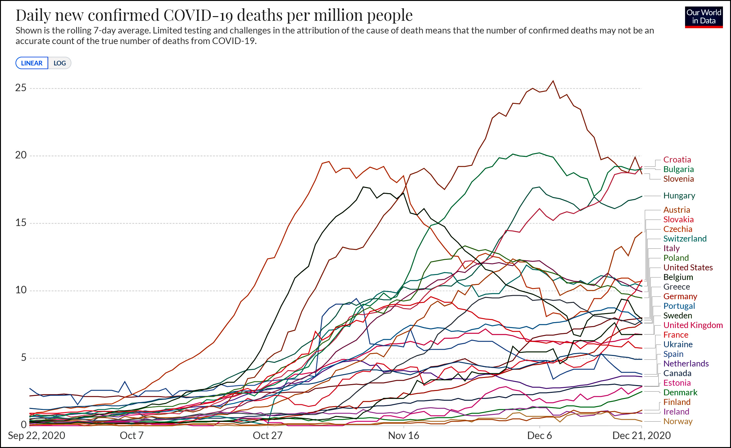
I don’t have any special reason for posting the following two charts, but I’m doing it anyway. The top one shows new COVID-19 deaths for the United States and every European country bigger than a few million people. The bottom one shows the same thing, but it’s cumulative deaths.
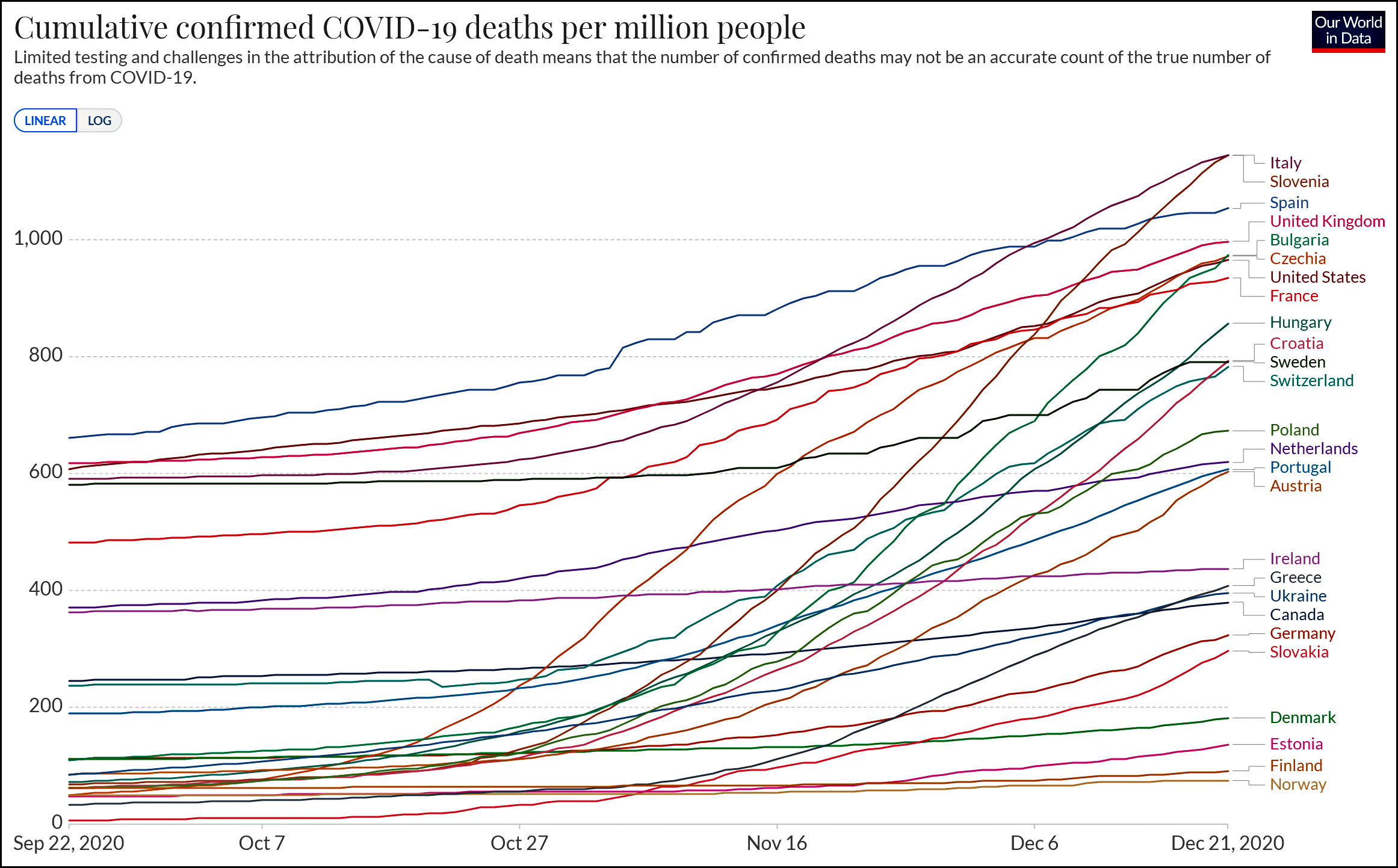
(In the bottom chart I omitted Belgium because who the hell knows what’s going on there? In any case, their numbers are allegedly so high that it wrecks the scale for everyone else. They are currently at about 1,600 deaths per million.)
Anyway, I suppose I do have a reason for posting these charts after all: to show you roughly where the United States stands on COVID-19 mortality compared to its peer countries in Europe. The answer, generally speaking, is that we’re high but not wildly high. It’s fashionable to pretend that the US response to COVID-19 has been disastrously, unconscionably bad, but that’s really not true. We could have and should have done better, but we’re not really all that different from other similar rich countries.
(Cases are a different matter. The US really does lead in the number of COVID-19 cases, but we also have a very low case fatality rate, which is why our death rate is not too far above the average. Is this because we test more people and therefore include more marginal cases? Is it because our health care is better? Is it because we skew younger than most European countries? Inquiring minds want to know.)
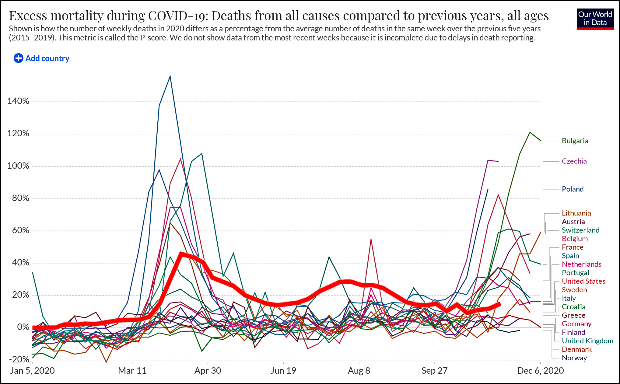
UPDATE: A reader emails to suggest that “confirmed deaths” might not be an accurate measure. The truth is that nothing is a completely accurate measure, and you can go down an endless rabbit hole trying to slice and dice the data. However, in this case we also have a measure called excess deaths, which is a calculation of how many deaths above normal various countries have recorded this year. As you can see, the US is no great shakes, especially during the summer, but generally speaking it’s still in the middle of the pack.
