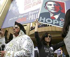
 I’ve already mentioned how Obama’s got the best font of all the presidential contenders (and, thanks to an unusually lucid commenter, we now know it’s called Gotham, a typeface featured in the great little documentary Helvetica), and now he’s got some of the best posters of all time. First of all, anybody watching the Los Angeles debate between Obama and Clinton might have seen these, seemingly-homemade orange-and-black posters out front:
(photo at left from the LA Times, photo below from the NY Times)
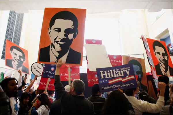
No idea who made them, but a) really cool use of the stencil-shadow effect, and b) orange is a nice political color, although the last time it got a lot of use, the orange candidate got poisoned.
Designer Shepherd Fairey (of Obey Giant fame) has come up with a pretty stunning set of posters for Obama, featuring the words “progress” and “hope”:
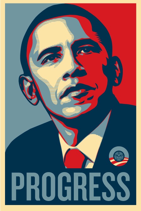
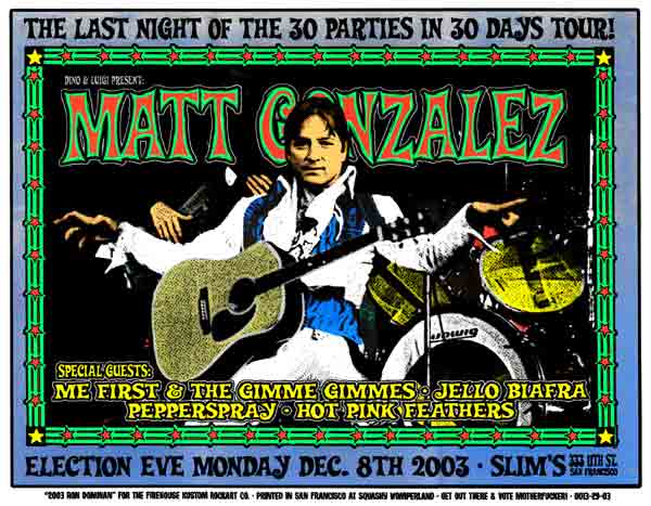
So, these are neat, but their neatness creeps me out a little. Putting aside for the moment the perhaps troubling issue of how the use of a politician’s face in their posters often seems to correlate with how much of a cult of personality has grown up around them, and the explicit (ironic?) references to Communist-style propaganda in Fairey’s previous work, I can find an even more basic reason for Obama supporters (like myself) to feel weird about this: candidates with cool posters never win. For example, Green Party upstart candidate Matt Gonzalez’ campaign for mayor of San Francisco was accompanied by some awesome rock-style posters, and we all know how that turned out.
I know, I know, maybe a “different kind of candidate” can have a different kind of poster, but I can’t help but wonder if appropriating the monster-truck style of the Bush-Cheney campaign logo wouldn’t throw a couple percentage points Obama’s way in the general? Don’t forget, Bush certainly won the font battle in ’04:
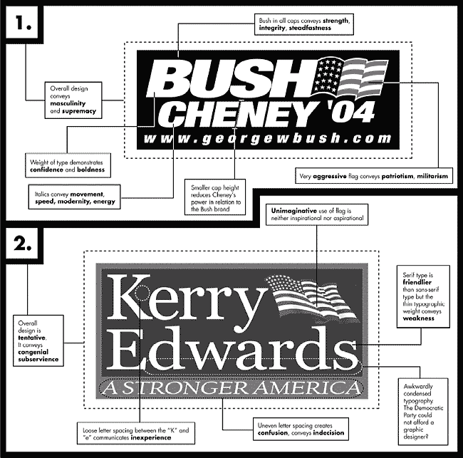
(graphic by Paula Scher of the NY Times)