Chart of the Day: Being Rich in America

Get your news from a source that’s not owned and controlled by oligarchs. Sign up for the free Mother Jones Daily.

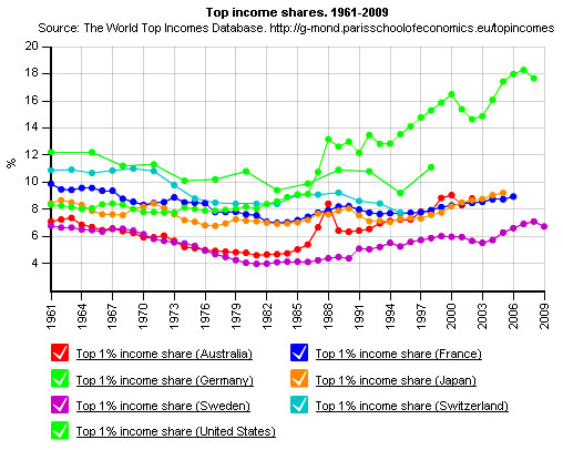
Via Felix Salmon, here’s a fun new tool to play around with: the World Top Incomes Database. For example, here’s a chart showing how the top 1% are doing in America vs. six other rich economies from around the world. Pretty good job, rich Americans!

You can create your own charts too. Just click here and then click on “Graphics.” It’s fun for the whole family — assuming your family is really wealthy, anyway. For the rest of us, at least it’s free.

HERE’S WHERE YOU COME IN

We’ll say it loud and clear: No one gets to tell Mother Jones what to publish or not publish, because no one owns our fiercely independent newsroom. But that also means we need to directly raise the resources it takes to keep our journalism alive. There’s only one way for that to happen, and it’s readers like you stepping up. Please help with a donation today if you can—even a few bucks will make a real difference. A monthly gift would be incredible.

We Recommend

Latest

Sign up for our free newsletter

Subscribe to the Mother Jones Daily to have our top stories delivered directly to your inbox.

Get our award-winning magazine

Save big on a full year of investigations, ideas, and insights.

Subscribe

Support our journalism

Help Mother Jones' reporters dig deep with a tax-deductible donation.

Donate