Chart of the Day: Employment by Gender

Get your news from a source that’s not owned and controlled by oligarchs. Sign up for the free Mother Jones Daily.

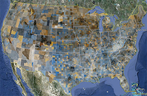
This comes from Stuart Staniford, and it’s an employment map of the United States by county. Dark areas have high employment and light areas have low employment. Bluish area have relatively high male employment and brownish areas have relatively high female employment.

What does it all mean? Beats me. Basically, it’s just data geekery. But kind of interesting anyway, no? Stuart has more speculation over at his place.

HERE’S WHERE YOU COME IN

We’ll say it loud and clear: No one gets to tell Mother Jones what to publish or not publish, because no one owns our fiercely independent newsroom. But that also means we need to directly raise the resources it takes to keep our journalism alive. There’s only one way for that to happen, and it’s readers like you stepping up. Please help with a donation today if you can—even a few bucks will make a real difference. A monthly gift would be incredible.

We Recommend

Latest

Sign up for our free newsletter

Subscribe to the Mother Jones Daily to have our top stories delivered directly to your inbox.

Get our award-winning magazine

Save big on a full year of investigations, ideas, and insights.

Subscribe

Support our journalism

Help Mother Jones' reporters dig deep with a tax-deductible donation.

Donate