Everything You Need to Know About California Climate Change in One Chart


You’ve heard a lot about California’s current historic drought. But the state is also experiencing some of the hottest temperatures on record, and the latest data from the National Oceanic and Atmospheric Administration show just how warm the past couple of years have been. In the graph below, courtesy of a tweet from the Pacific Institute’s Peter Gleick, each dot represents the average temperature over the course of a year, from September of one year to August of the following.
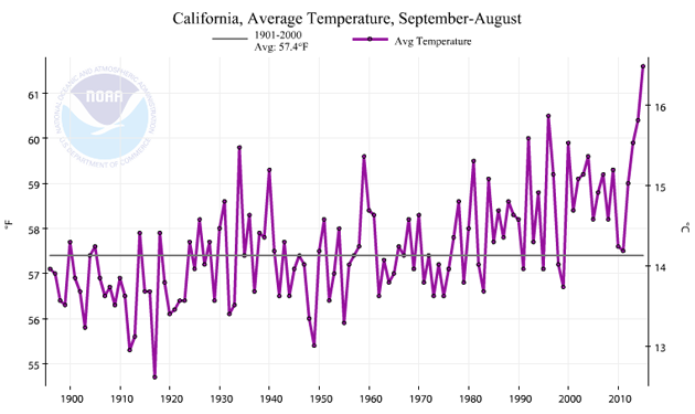
NOAA

Keep us relentless, independent, and free to read.

For 50 years, Mother Jones has offered honest, investigative reporting you can rely on:

    • Relentless in the pursuit of truth, unafraid to hold the powerful to account

    • Independent from influence or agenda from oligarchs and corporations

    • Freely accessible to every reader, never behind a paywall

But we can’t do any of this without you. Reader support powers our newsroom to stay nimble and fearless, ready for whatever story comes next. If you can, make a donation today.

Keep us relentless, independent, and free to read.

For 50 years, Mother Jones has offered honest, investigative reporting you can rely on:

    • Relentless in the pursuit of truth, unafraid to hold the powerful to account

    • Independent from influence or agenda from oligarchs and corporations

    • Freely accessible to every reader, never behind a paywall

But we can’t do any of this without you. Reader support powers our newsroom to stay nimble and fearless, ready for whatever story comes next. If you can, make a donation today.

We Recommend

Latest

Sign up for our free newsletter

Subscribe to the Mother Jones Daily to have our top stories delivered directly to your inbox.

Get our award-winning magazine

Save big on a full year of investigations, ideas, and insights.

Subscribe

Support our journalism

Help Mother Jones' reporters dig deep with a tax-deductible donation.

Donate