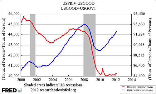
I don’t even quite know what to make of this chart from Karl Smith, but here it is anyway for everyone to ponder. The red line represents employment by the government and by goods-producing sectors. Kablooey! The blue line represents employment by everyone else. Not bad!
Karl’s take is that this demonstrates that the economy is still highly sensitive to credit conditions:
We are largely talking about construction workers, metal and automotive workers, and school teachers. These workers are massively influenced by credit constraints. One cannot build a building without credit. One cannot buy a vehicle without credit and state and local governments have very little credit room by statute.
So what we need for job growth to really hit its stride is for construction to come back, cars to come back and school teachers to come back….Because these sectors respond so much to liquidity the job recovery is still fragile.
I’m not sure I buy the idea that government as a whole is sensitive to credit constraints. Obviously the federal government isn’t, and states are constrained by balanced-budget requirements at all times. But perhaps the ease of issuing state and municipal bonds has plummeted during the recession? I’m not sure.
Generally speaking, I suspect this chart says more about the housing/construction market in particular than it does about broader capital goods, which I think have rebounded fairly decently over the past year or two. It also says something about reduced state and local spending, though I don’t think it’s fair to call that a credit issue. It’s more a statutory problem combined with bad austerity policy at the federal level. Further thoughts welcome, though.