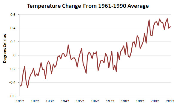
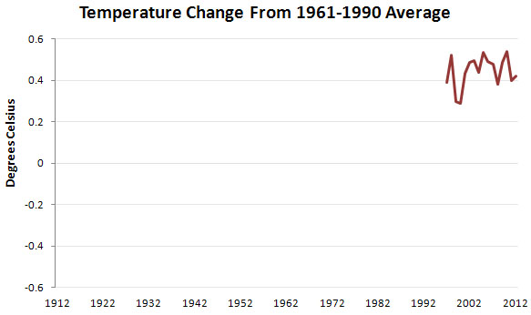
The Daily Mail, which has something of a specialty in climate denial, apparently discovered this weekend that Britain’s Met Office has updated its long-term global temperature series. This happened several months ago, and the changes from the HadCRUT3 series to the HadCRUT4 series were fairly minor, but I guess anything is a good excuse to rerun one of their oldest wheezes: a colorful chart that starts with the unusual temperature spike of 1997-98 to make it look like global warming has stopped. Here’s my version of the chart in their story:
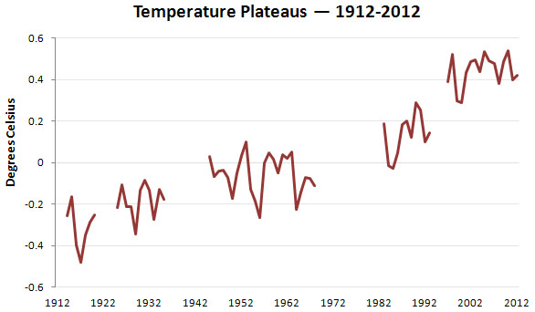
You know the rest of this story, right? It’s a noisy data series, and if you choose any other starting point — 1996 or 1999 will do fine — the trendline looks quite different. A chart that includes the entire past century is below, and as you can see, it’s easy to find several decade-long plateaus if you cherry pick the data just the right way. But if you look at the entire series, it’s pretty obvious that the world is still heating up. Be sure to let your Daily Mail-loving friends know.
BONUS CHART: If you want to see all the other times that global warming has “stopped” during the past century, just click here and scroll down.