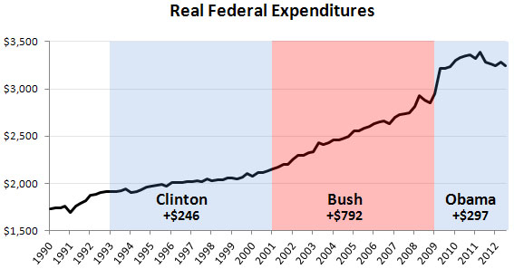
Last night I posted a chart showing government expenditures per capita over the past two decades. I guess somebody must have linked to it, because my Twitter stream is suddenly full of conservatives claiming that it’s all a fake because I showed total government spending (state+local+federal) and then adjusted it for population growth. That’s actually the right measure of the total impact of government spending, but apparently my critics want to see just federal spending, and with none of this “per capita” trickery.
I aim to please, so here it is. I assume no one objects to adjusting for inflation? (I used the GDP deflator, in case anyone cares.) As you can see, the chart is a little different from the previous one, but not by that much. Spending spiked up at the beginning of the Obama administration thanks to increased federal aid to people who were thrown out of work by the Great Recession, but since 2011 spending has slowly been sliding back down. Federal spending has stayed somewhat elevated to make up for declining state and local expenditures, which is as it should be during a weak economy, but not by that much. Given our current trajectory, it’s safe to say that even by 2016 the biggest increase in spending, by far, will have come during the Bush years.


