Everyone Loves Charts! Except For Those Who Don’t.

Fight disinformation: Sign up for the free Mother Jones Daily newsletter and follow the news that matters.


This post is going to end up being insufferably nerdly, so bear with me. It comes via Justin Wolfers, who tells us about a new study showing that if you present information, it’s more persuasive if it includes a chart. Since my Wikipedia entry says I’m known for “offering original statistical and graphical analysis,” this is thrilling news—especially since I’ve never really believed that my charts have influenced anyone who didn’t already believe what I was saying in the first place.

So let’s go to the source. First off, I love the title of the paper:

Blinded with science: Trivial graphs and formulas increase ad persuasiveness and belief in product efficacy

Trivial graphs! Roger that. And sure enough, the researchers’ first experiment suggests that if you tell people a drug reduces illness by 40 percent, they’re more likely to believe it if you include a bar chart that shows one bar 40 percent lower than the other. Unfortunately, this conclusion comes via a tiny, non-random sample, and the responses are weirdly contradictory. On a scale of 1-9, the chart group rates the drug only slightly more effective than the non-chart group. But on a question that directly asks if the drug works, the chart group is far more positive. What’s up with that?

But this isn’t yet the truly nerdly part. I’m just picking the usual statistical nits. Next up, the researchers tried to find out if the chart group is more persuaded simply because the chart helps them remember the information better. Long story short, that’s not the case. Everyone remembers the information about equally well. But wait: this group is even worse: it’s a tiny, non-random sample of university freshman lab rats, who are very much not typical of the population, especially when it comes to assessing quantitative information. What’s more, assuming I’m interpreting the typo-laden concluding sentence correctly, the chart group displays 79 percent retention vs. 70 percent for the non-chart group. That sure sounds like a possibly significant difference. It’s only the tiny sample size that makes it worthless. But frankly, the tiny sample size probably makes this whole study worthless.

But this still isn’t the truly nerdly part. Here it is, and I’m going to excerpt directly from the study:

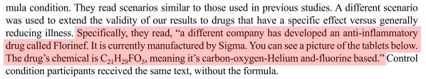
Say what? This molecule allegedly has 29 (!) helium atoms? Come on, man. I took one look at that and just laughed. Then I looked at the fake chemical formula, and they got it wrong. It’s got 29 hydrogen atoms. Or does it? Who knows. Now, it’s true that the group for this study was recruited at a shopping mall, and I’ll grant that your average mall rat isn’t too likely to notice this. Still. WTF? That’s at least two typos; a ridiculously small and non-random sample; and contradictory results depending on how the participants were queried.

I’m going to keep using charts because they convey a lot of information efficiently to people who like charts. Plus, I like charts. But are these charts actually persuading anyone of anything? I’m unpersuaded.

THE FACTS SPEAK FOR THEMSELVES.

At least we hope they will, because that’s our approach to raising the $350,000 in online donations we need right now—during our high-stakes December fundraising push.

It’s the most important month of the year for our fundraising, with upward of 15 percent of our annual online total coming in during the final week—and there’s a lot to say about why Mother Jones’ journalism, and thus hitting that big number, matters tremendously right now.

But you told us fundraising is annoying—with the gimmicks, overwrought tone, manipulative language, and sheer volume of urgent URGENT URGENT!!! content we’re all bombarded with. It sure can be.

So we’re going to try making this as un-annoying as possible. In “Let the Facts Speak for Themselves” we give it our best shot, answering three questions that most any fundraising should try to speak to: Why us, why now, why does it matter?

The upshot? Mother Jones does journalism you don’t find elsewhere: in-depth, time-intensive, ahead-of-the-curve reporting on underreported beats. We operate on razor-thin margins in an unfathomably hard news business, and can’t afford to come up short on these online goals. And given everything, reporting like ours is vital right now.

If you can afford to part with a few bucks, please support the reporting you get from Mother Jones with a much-needed year-end donation. And please do it now, while you’re thinking about it—with fewer people paying attention to the news like you are, we need everyone with us to get there.

payment methods

We Recommend

Latest

Sign up for our free newsletter

Subscribe to the Mother Jones Daily to have our top stories delivered directly to your inbox.

Get our award-winning magazine

Save big on a full year of investigations, ideas, and insights.

Subscribe

Support our journalism

Help Mother Jones' reporters dig deep with a tax-deductible donation.

Donate