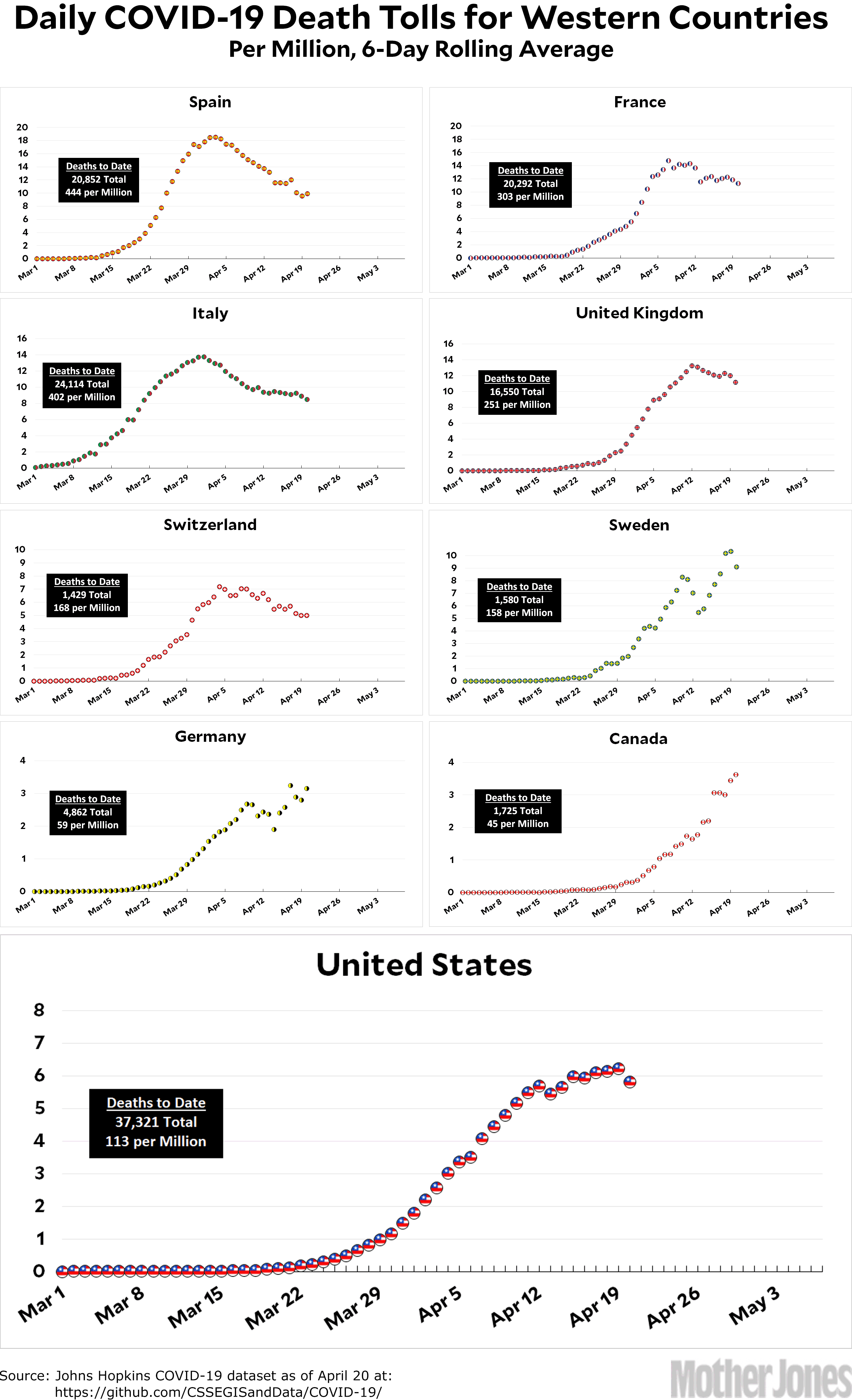
Here’s the coronavirus death toll through April 20. Please keep in mind that each dot represents a 6-day rolling average. Spain, for example, recorded 399 deaths on Monday, or 8.5 deaths per million. However, the average over the past six days is 9.9 deaths per million. This is why the dots in my charts don’t match up precisely with charts that simply use the daily numbers.
(And why use a 6-day rolling average? Two reasons. First, there’s so much noise in the daily numbers that it’s often hard to detect much of a trend. Averaging helps to make the trend more visible. Second, it’s a bad idea to overreact to a single day’s worth of data. Using a 6-day average prevents you from staring endlessly at the daily data trying to suss out something that might represent a glimmer of a start to an inflection in the trendline. Please don’t do this. I guarantee it’s a mug’s game.)
By the way, I continue to get loads of email from Sweden. I absolutely love this, and even though I don’t answer much of it I want to assure my Swedish fans that I read all of it. The latest news is that (apparently) Johns Hopkins records deaths on the day they get the data. However, the Swedish authorities record deaths on the day the death actually happened. If you use the Swedish data, it looks a little more like Sweden might be close to peaking.
This puts me in a bind. On the one hand, I want to use the best data. On the other hand, I also want to use data that’s comparable from country to country, and simply using the JH data is the best way to do that. I’m already using a different source for the US data¹ thanks to New York City’s newly changed data reporting, and I don’t want to get in the habit of doing stuff like this for everyone. For now, then, I’m going to stick with the Johns Hopkins data. I’ll mention caveats in text if they seem important.
The raw data from Johns Hopkins is here.
¹From the COVID Tracking Project.


