Fight disinformation: Sign up for the free Mother Jones Daily newsletter and follow the news that matters.
Namely, that they are all the same.
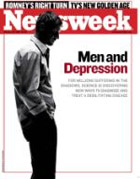
The most recent cover of Newsweek has a single figure on a white background, with a coverline in heavy black text and a single word printed in red for emphasis. Don’t think that this stark look — with its solitary figure and harsh colors — was chosen because it makes sense for a story on depression amongst American men. It was chosen because Newsweek has used the same look on roughly 50% of its covers in the last three months.
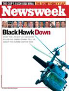
Take a look below. They clearly have research that tells them exactly how to sell magazines.