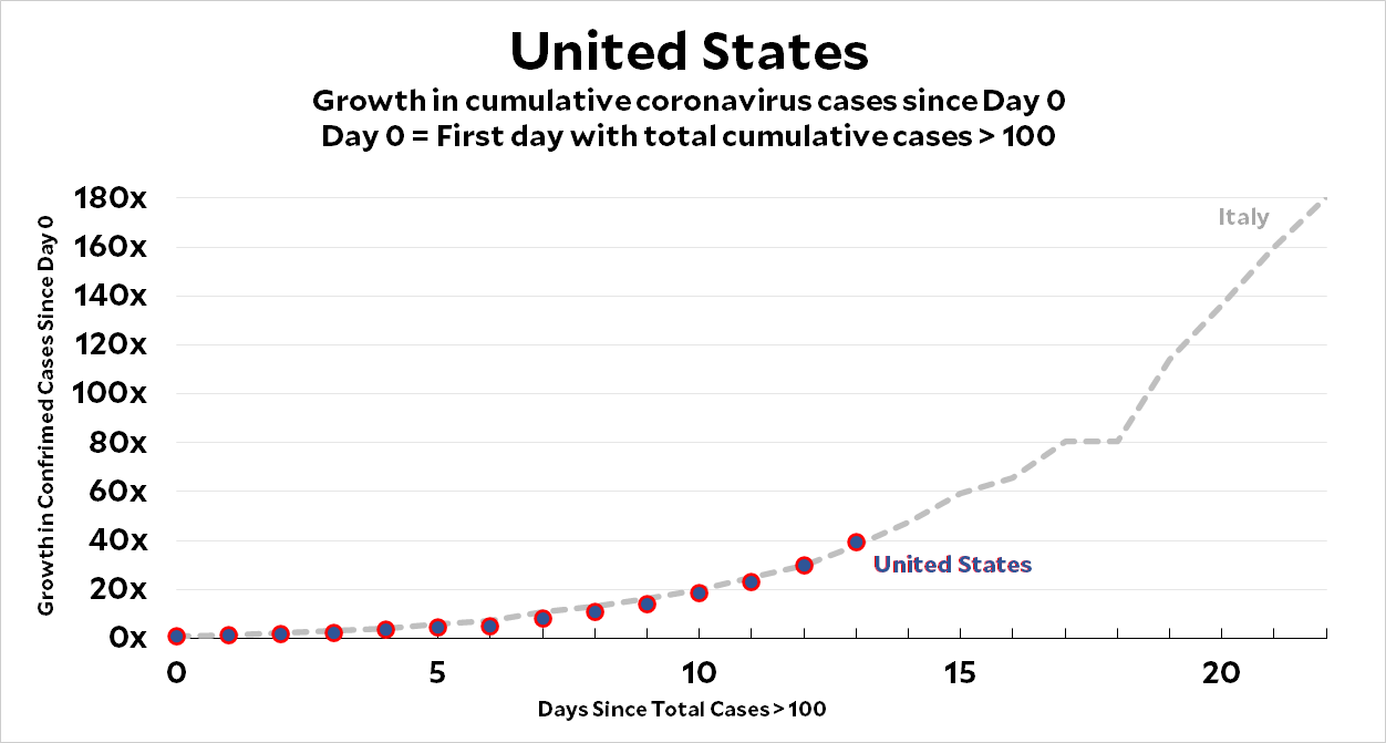
I’ve gotten some questions about my daily coronavirus charts that are worth answering. To refresh your memory, here’s an enlarged version of the chart for the United States:

The gray line is Italy. The red and blue circles are the United States. Italy is the baseline for comparison because it was the first Western country to confirm more than 100 cases of coronavirus infection, so it’s the farthest along the growth curve.
For every country, Day 0 is the first day that it recorded more than 100 confirmed cases. For Italy, this was February 23, when they recorded 155 cases. For the US, it was March 3, when we recorded 118 cases. We are nine days behind Italy. Since we seem to be following their path very closely, this means that in nine days we’ll probably be where Italy is today.
Now for the questions:
Q: What does the y-axis mean?
A: It’s the growth since Day 0. Since Day 0 is always pretty close to 100, you can just multiply by 100 to get the raw number of cases. The US, for example, was at 40x yesterday, which means about 4,000 confirmed cases.
Q: Why not just show the number of cases instead of making us calculate it?
A: Because the growth rate is more important. We should be thinking a lot more about growth rate than number of cases.
Q: But what about country size? Sure, the US has 4,000 cases, but that’s out of a much bigger population than Italy. Wouldn’t it be better to show the number of cases per million, or something like that?
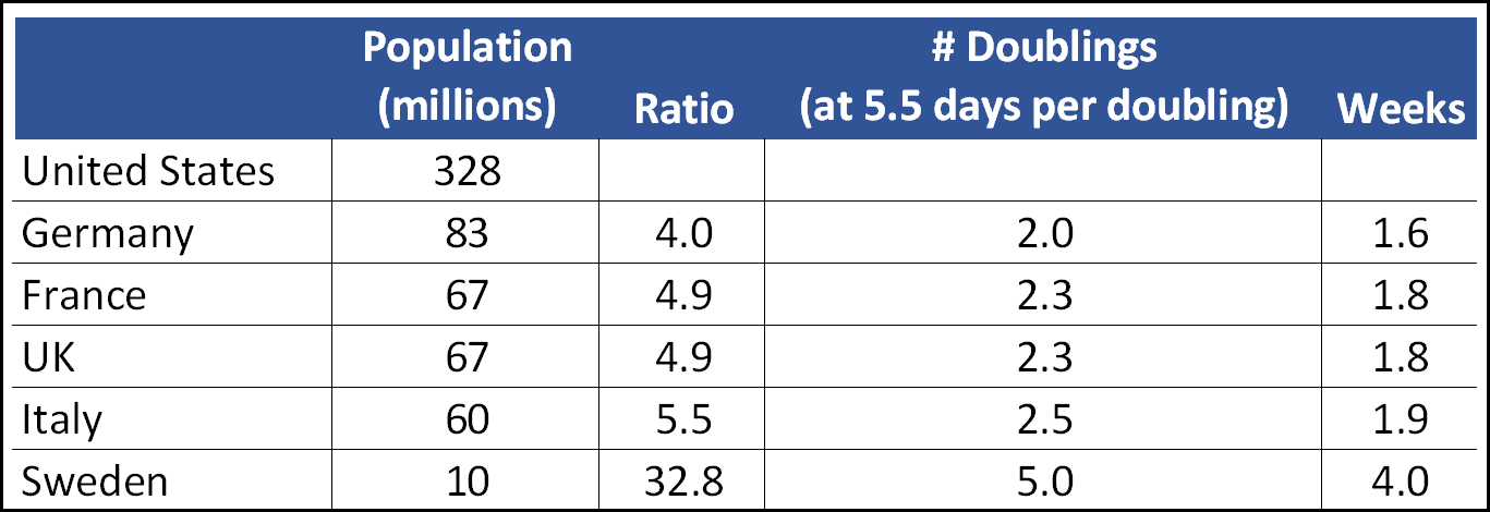
A: No. Take a look at the populations of the largest European countries:

Take a look at the line for Germany. It has a population of 83 million. The United States is four times as big. That sounds like a lot, but it’s really nothing. We’re only two doublings bigger than Germany, and at the current doubling time for the spread of coronavirus this represents only about 1.6 weeks. What this means is that raw size barely matters. When we hit Germany’s level of confirmed cases, it’s only a week and a half until we hit their level on a per-capita basis.
So don’t worry too much about raw size. The coronavirus grows on an exponential basis, which means the growth rate swamps any raw number in a matter of days or weeks. Think growth, not levels.
Q: How reliable are these numbers, anyway?
A: Probably fairly reliable, though not perfect. In the case of the US, they’d probably be higher if we had done more testing, but since the numbers are small in the early days it’s not clear that we missed much due to lack of testing. In any case, remember doubling! Even if we were off by 100 percent, that means we were off by 5.5 days. That’s not really very much.
Q: Can you show the point at which various countries adopted strict lockdowns, quarantines, etc.?
A: Sure, but that would require that we define our terms pretty precisely since every country has adopted different kinds of measures. If somebody with an expert knowledge of this stuff produces an index that measures “severity of countermeasures” or somesuch, I will be happy to add it to the charts. But it’s not really something I can do on my own.
Q: Why are you only charting Western countries? What about China and South Korea?
A: Our experience so far suggests very strongly that Asian populations are willing to tolerate far more severe countermeasures than us freewheeling types in the West. China is the best example of this, but it’s true of Singapore, South Korea, and Japan as well. Since the United States is my main interest, I want to make comparisons that help us understand the trend that we’re most likely to be on. This means comparing ourselves to countries that are similar to us in their tolerance for things like social distancing, quarantines, and so forth.
Q: What’s the point of all this, anyway? Are you just trying to scare people?
A: I’m trying to do my best to show the trend we’re on so that we have a better idea of where we’re going to end up. That should help us plan for the most likely case. But if this scares you, that’s a bonus: you should be scared.
Let me say that again: you should be scared, and the growth rate in my charts should help you get there. We have 4,000 confirmed cases right now. If this doubles ever 5.5 days, we’ll have gone through 13 doublings by June 1. That’s about 32 million cases and it’s only ten weeks away. Do you think that in ten weeks we can seriously reduce the doubling rate? I don’t. Do you think our hospital system is anywhere close to being able to handle millions of cases? Do you think maybe we should create a crash program to build more hospital capacity? I do. And by crash, I mean (a) starting now, (b) funded with infinite dollars, and (c) construction running 24/7.
Q: Why should I be so scared? The world has gone through plenty of pandemics in the past century.
A: Yep, and every single one of them is something we’ve had a vaccine for—or were able to create one fairly quickly. This is the first time we’ve had a fast-spreading virus with no immunity whatsoever. The last time this happened was 102 years ago, during the Spanish flu of 1918. And we all know how that one turned out.


