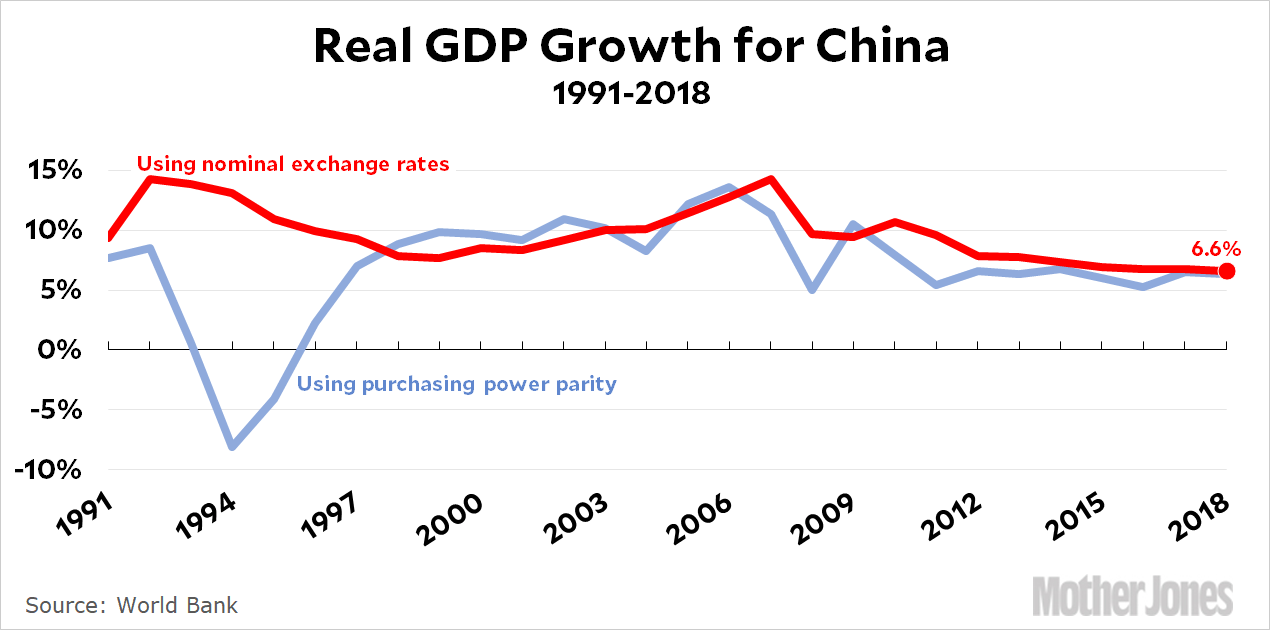
I have remarkable news today. President Trump tweeted that “China is doing very badly, worst year in 27,” and it turns out this wasn’t a lie:
China’s GDP growth using normal measures was 6.6 percent, slightly below the 6.7 and 6.8 percent of the previous two years. So kudos to Donald.
Of course, using the (probably) more accurate conversion to purchasing power parity, China’s growth was precisely average for the period following the Great Recession. China has some economic headwinds for sure, but their growth rate has been OK for the past decade.
In any case, the modest downward slope of the trendline began around 2005 and has nothing to do with Trump or Trump’s tariffs. He just can’t believe that China hasn’t yet caved in to his world-class negotiating skills, so now he’s telling his base that China is crumbling and victory is near!
Capital One, the Virginia-based bank with a popular credit card business, announced Monday that a hacker had accessed about 100 million credit card applications, and investigators say thousands of Social Security and bank account numbers were also taken….The hack appears to be one of the largest data breaches ever to hit a financial services firm. In 2017, the credit-reporting company Equifax disclosed that hackers had stolen the personal information of 147 million people. Last week, it reached a $700 million settlement with U.S. regulators over that breach.
You know what would put a stop to this? Put in place statutory damages for every personal record hacked. No excuses, no safe harbors. If you lose the records, you pay. I’ll be nice and suggest $100 per record.
I’ll tell you this: if Capital One had to pay $10 billion because of this hack, they’d take security a helluva lot more seriously. What measures would they put in place? I don’t know, but I know that after an endless pity party about how this would be totally unfair and there was nothing they could do and it would put them out of business—well, then they’d magically figure something out. That’s always how it works.
You know, it’s been a couple of weeks and I still can’t believe that Roger Federer had two match points on his racket at 8-7 in the fifth set, and then lost them both, eventually losing the Wimbledon final to Novak Djokovic. I mean, damn. That’s the kind of thing that can mess with a man’s head for a long time.
This is . . . a wee bit hyperbolic, no? I mean, the Fed is pondering a quarter percent rate cut that’s been long since priced in by the market. Whether you agree or disagree that this is the right thing to do, it’s simply not likely to have much effect, and isn’t really much of a gamble at all.
Now, if the Fed really wants to move the markets, they’ll surprise everyone and announce a half percent rate cut. That would get the chattering classes chattering.
When I took my trip to the Blue Ridge Parkway I didn’t have very much specific in mind. But there was one thing I wanted a picture of: a cardinal. I know, I know: to you eastern folks this is no big deal. They flit around in your backyards every day. But we don’t have cardinals out here in California, and I wanted a picture of one.
Unfortunately, they turned out to be skittish little things, always flying away when I caught sight of one. In the end, the best picture I got was from my car window. I was driving into Floyd, Virginia, for dinner, and found one sitting on a branch right off the road. I lowered my window and took a bunch of shots. Someday maybe I’ll do better, but for now this is the best picture I managed to get.
May 7, 2019 — Near Floyd, Blue Ridge Parkway, Virginia
After years of trying, T-Mobile is finally merging with Sprint thanks to approval from President Trump’s Justice Department. But something about this perplexes me. I thought about it again while reading Matt Yglesias’s piece about the merger over at Vox, and—well, I’ll just let him tell the story:
The reason that allowing the United States to go from four mobile phone providers to three providers is okay, according to the Justice Department, is that they have a plan to create a fourth competitor. Specifically, Dish, the satellite television company — which already owns the minor player Boost Mobile — is also going to acquire Sprint’s prepaid subsidiary Virgin Mobile. What’s more, the new merged T-Mobile has committed to giving Dish seven years’ worth of access to its infrastructure to resell. That means that while there will be only three companies with a national mobile phone infrastructure, there will be four sellers of that infrastructure. Boost, meanwhile, is supposed to spend that seven-year window building out its own infrastructure. So ultimately, there will be four players after all and everything will be okay.
As Yglesias says, this is an odd bankshot. If it’s important to have four carriers, why not just disapprove the merger?
But it’s odd in another way. If Dish wants to be the fourth carrier, why don’t they just buy T-Mobile (or Sprint) outright instead of taking seven years to build out their own infrastructure? That would get Dish what they want and it would keep four solid carriers around right from the start.
So why isn’t Dish buying T-Mobile? They’ve been part of the rumor mill forever, and it seems like it makes sense. What am I missing?
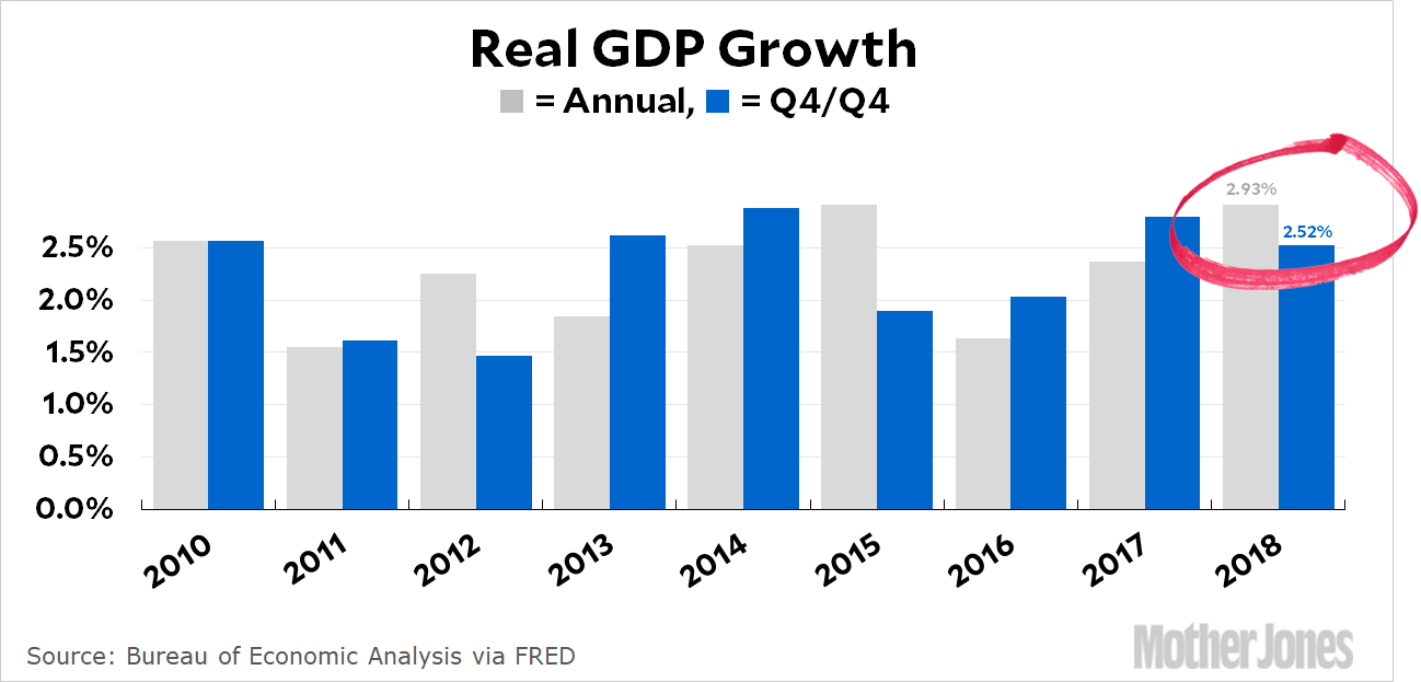
I’m a little late to this, but petty gotchas are always worth airing even if they aren’t on time. I would like you to cast your memories back to February 28, when the initial GDP report for 2018 was released. Sadly for President Trump, it showed GDP growth of 2.9 percent, just below his promised goal of 3 percent. But no problem! The White House simply used a different measure of GDP growth and insisted that it was the correct one:
How did they get 3.1 percent growth? Normally, you measure GDP growth year over year. That is, you calculate GDP in 2017 and GDP in 2018 and then divide to get the growth rate. But the Trumpies instead compared Q4 of 2018 to Q4 of 2017. Nobody ever does it this way, but any port in a storm. It produced the number they wanted, so they insisted this was the right way to measure it.
But Friday brought bad news. Apparently Q4 growth was a lot worse than we thought. Using the final GDP numbers, here’s what we get:
Oof. Growth was only 2.5 percent in 2018. This is the White House’s own preferred measure of economic growth, so I suppose they’ll just have to accept it. That goes for Fox News and everyone else, too. I’m sure their intellectual standards are too high to simply deny they ever used this metric and stick to their old numbers.
UPDATE: I orginally said the White House “invented” a new measure of GDP. That went too far. They simply chose to emphasize a measure that made them look as good as possible.
I would like to offer a comment on the hack gap this morning:
It’s remarkable the number of liberal economists who continue to favor an interest rate cut from the Fed. They are displaying intellectually honesty here: with inflation low, there’s no reason not to take out an insurance policy that could keep the current economic expansion going for a while longer, despite the fact that it would help Donald Trump politically.
Conservative economists, by contrast, have almost universally changed their opinions, favoring high interest rates when Obama was president and now favoring low rates when Trump is president.
I’m too lazy to create an actual list of liberal and conservative economists to see whose positions have changed and whose haven’t. Maybe someone can do it and prove me wrong. But I doubt it.
Harris, an early endorser of Sanders’ Medicare for all proposal, keeps many of the same elements of the Vermont senator’s plan. All medically necessary services, such as doctor visits, hospital stays, and vision and dental care, would be included in the plan with no deductibles and strict limits on out-of-pocket costs. The proposal, like Sanders’, would allow the government to negotiate prescription drug prices with pharmaceutical companies in order to curb rising medication costs.
But Harris outlined a longer transition time — 10 years — to implement the new program, gradually incorporating newborns and uninsured people through automatic enrollment and giving others more time to move to the government-run plan.
….The proposal offers new clarity on the role of private insurers, which Harris had been muddled about in the past. Unlike Sanders, who would curtail their participation almost entirely, Harris would allow corporate plans to offer competing Medicare plans, modeled on the Medicare Advantage plans available for older Americans now. Those plans would have to adhere to government-set requirements on benefits and costs to ensure access and limit insurer profits….Harris would limit [] tax hikes to those making $100,000 or more. Instead of taxing lower-income families, she would impose a fee on Wall Street transactions and make other changes to the corporate tax rate.
That’s fine, and it’s very on-brand for Harris: lefty, but not too lefty. Given the history of Medicare Advantage, which has never been a very efficient delivery vehicle, I’m not sure that’s a great model for the private insurance part of Harris’ plan, but it’s hardly the worst idea either. Overall, this plan sounds quite workable. You can read more about it here.
NOTE: Please see here for a critical update, including solid data going back to the start of the 20th century. It turns out that millennial homeownership these days really is substantially lower than it was on average during the pre-bubble era.
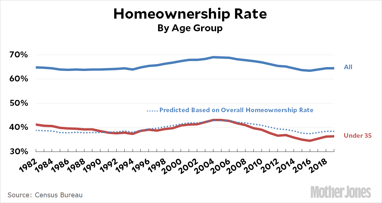
Yesterday I posted a chart showing homeownership among households headed by those under 35. It caused a stir on Twitter. Gray Kimbrough, an economist in Silver Spring, called it “bullshit” and “garbage,” I responded in turn, and things went downhill from there. I tried to sue for peace later on, but was unsuccessful.
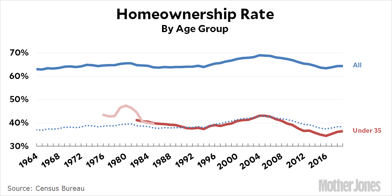
So let’s take another look at the data. First off, it turns out the Census Bureau provides an EZ spreadsheet of homeownership going back to 1982. I didn’t realize this because the spreadsheet is titled “Annual Estimates of the Housing Inventory by Age of Householder 1982 Present.” However, it turns out that it actually provides homeownership rates, and with that in hand I can provide a chart with more years of data than I did yesterday:
The heavy blue and red lines are actual data from the Census Bureau based on household data. For example, in 2019, 36 percent of households with a “reference person” under age 35 owned homes. The dotted line is simpler than the one I used yesterday: all I did was move the blue line down to see how closely it matches the red line. That’s it. As you can see, it fits fairly well.
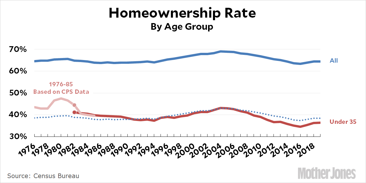
I’m not sure what to make of this. There’s a sudden spike in 1979 that’s far bigger than the modest rise in the overall data. What’s more, where the data overlaps in 1982, Kimbrough shows a homeownership rate about three points higher than the census spreadsheet. Maybe this is individual data, not household data? But after 1982 it goes back to matching just fine. So what’s up?
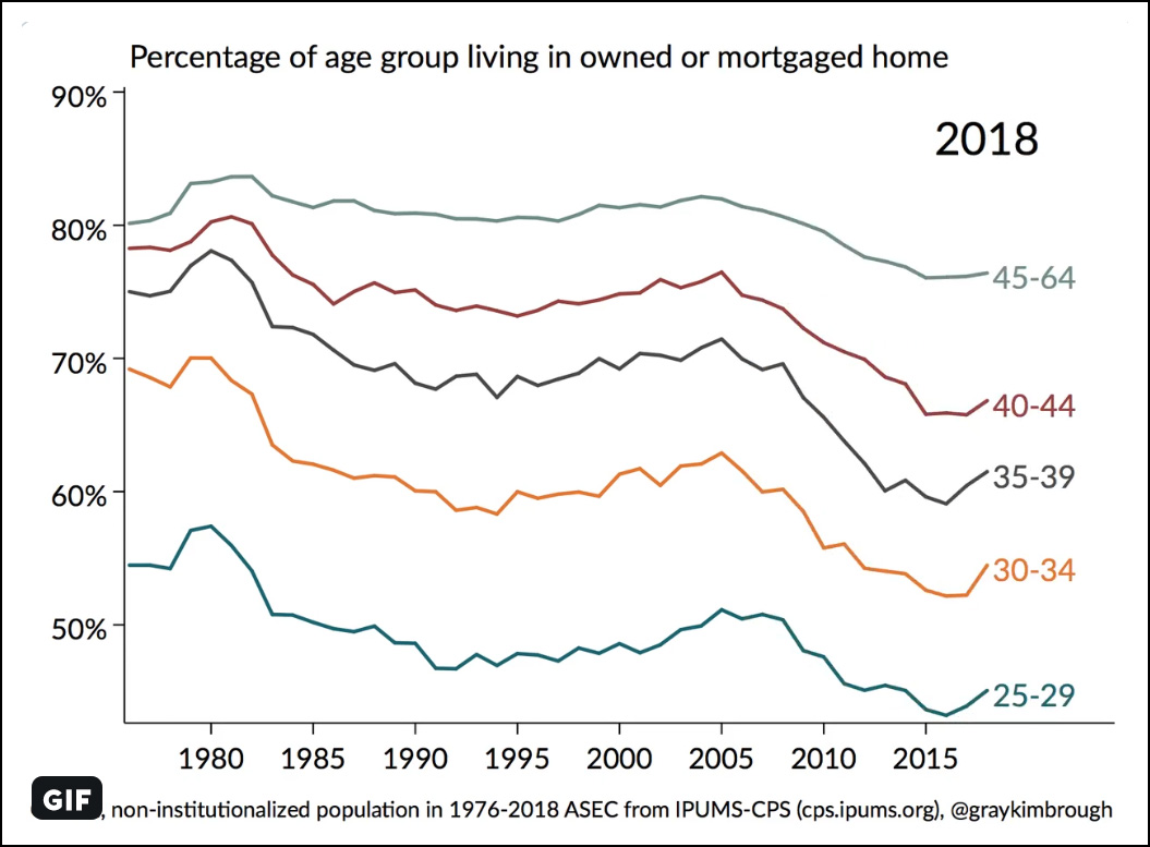
This is individual data, and shows the share of each group living in an owned home. That’s different from ownership data, but it does confirm one thing: age groups seem to move in pretty close sync, which has been my hypothesis. The mystery here is that we have firm data for the overall homeownership rate, and it doesn’t spike in 1979 even though Kimbrough’s chart suggests that every single age group did. We’re left with a riddle here, but it’s one I can’t solve at the moment. Perhaps Kimbrough will weigh in later.
In any case, using the same methodology as yesterday, here’s a projection back to 1964:
Is this bullshit? Maybe. It wouldn’t be the first time. But even if we take Kimbrough’s spike at face value, there’s still every reason to believe that homeownership in the under-35 cohort syncs up fairly well with other age groups. If that’s the case, the homeownership rate among young households has gone from roughly 37 percent in 1964 to 36 percent in 2019. There have been peaks and valleys in between during housing bubbles and interest rate catastrophes, but there’s little reason to think that the long-term trendline has changed a lot. (On the other hand, if you take my dotted blue line seriously—and I’m not demanding that you do—it shows that homeownership among young households is a couple of points lower than we’d expect. This suggests that millennials haven’t yet recovered fully from the housing bust.)
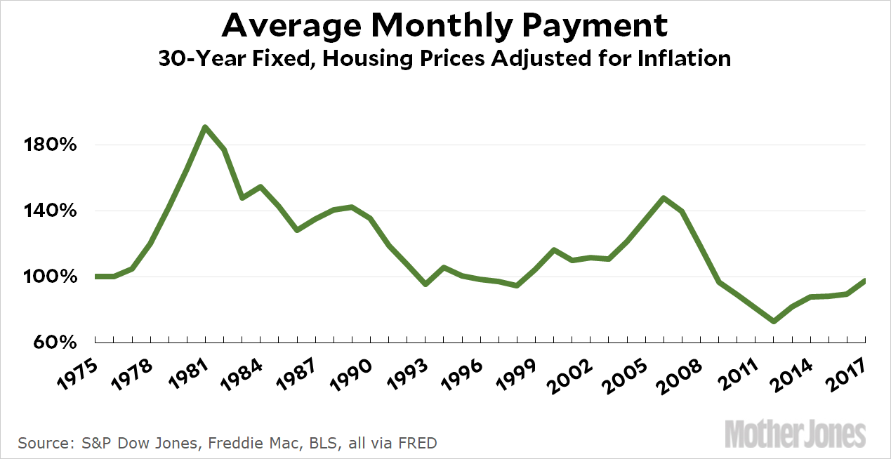
In one sense, the flatness of homeownership shouldn’t be a surprise. After all, the average monthly cost of buying an average house hasn’t changed much over the past few decades:
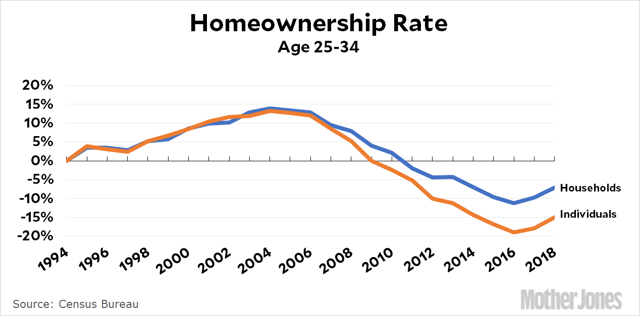
But wait! We’re not done yet. Beyond all this there’s a technical question of whether we should be looking at households or individuals. I’m using households because that’s the way homeownership is usually reported. But the Great Recession put a big dent in the rate of household formation among the young. This means that if you count individuals, the rate of homeownership has gone down more than if you count households. Here’s the growth and decline of homeownership for the 25-34 age group using 1994 as a base year:
Compared to 1994, the homeownership rate among young households is down a modest amount. But if you look at all individuals, it’s down by twice as much. I think these are both useful ways of looking at things, and I’m not sure you can say that either one is “right.” A lot of it depends on why household formation has fallen off (is it low incomes or changing preferences?).
With all this out of the way, my tentative conclusion is that homeownership among young households is probably down by 1-3 percentage points since the ’60s. It’s a real decrease, but not an enormous one. If I’m wrong, that’s fine. But we don’t have age-group data going back to 1964, so there’s nothing much we can do except extrapolate if we want to look at things over the long term.
And we respect that! But maybe you’re of a mind to support our work directly instead? We have until December 31 to raise the last $400,000 we need to keep our nonprofit newsroom running at full strength into 2026. Will you make a gift today?
We noticed you have an ad blocker on. Can you pitch in a few bucks to help fund Mother Jones' investigative journalism?
Billionaires own the media,
but they don’t own us.
At Mother Jones we know these aren’t conventional times, and they require unconventional coverage. That’s what deliver every day: fierce, independent journalism you can’t find elsewhere. Perhaps never in the history of our country has that been more necessary than now. But we can’t do it without reader support—your support. Please chip in today.