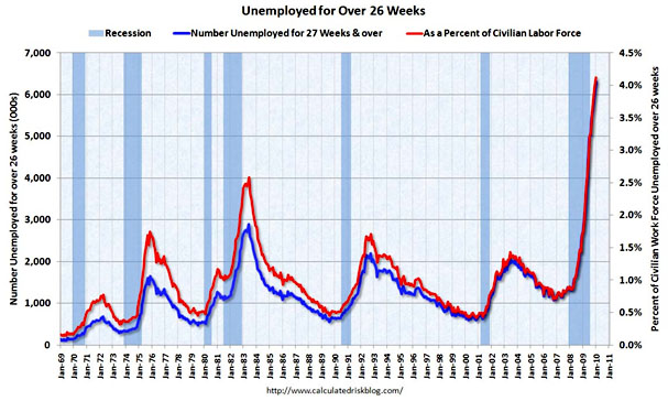
Lots of people have been talking about this for months now, and I don’t have anything new and unusual to add to the conversation. But it’s worth keeping this chart front and center at all times: it’s the number of people who are not just unemployed, but who have been unemployed for at least half a year. The red line is the key one, and it shows that the proportion of long-term unemployed during the current recession is nearly twice as high as it was during 1982, the previous record holder since the Great Depression.
What’s worse is that we can’t expect this to go away quickly. Paul Volcker deliberately created the recession of the early 80s by jacking up interest rates to unprecedented levels, and he dispensed with it just as easily by lowering rates in 1982. That’s not going to happen this time because interest rates are already as low as they can go. At best, we’re going to hit a plateau and then linger there before a slow, fitful recovery that takes years. At worst — well, things will get even worse.
Mass, long-term unemployment is one of the most corrosive things any country can go through. The fact that we’re basically doing nothing about it is not just disgraceful, it’s genuinely dangerous.