In my post this morning about government intrusion into our lives, I casually mentioned that we pay higher taxes than we did 50 years ago. I got some pushback on this, so I figured I should check my facts. That turned out to be surprisingly hard.
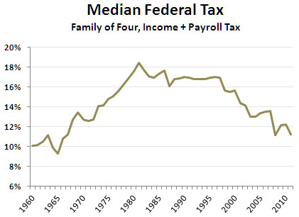
 First off: federal taxes. We all know that top marginal rates have gone down. They were about 90 percent in 1960, compared to 39.6 percent today. At the same time, payroll taxes have gone up. The Medicare tax, for example, didn’t even exist in 1960. So what does the median look like? The best I could find was a table from the Tax Policy Center that shows combined federal taxes for a family of four with a few specific assumptions. The chart on the right shows federal taxes for a median family of four over the past 50 years.
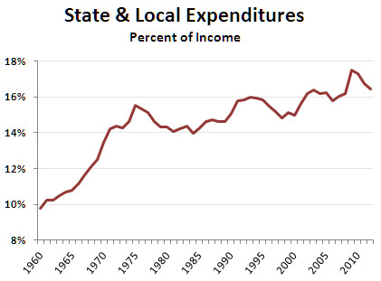
 Next: state taxes. I can’t really find anything reasonable here. The best I can do is the chart on the right, which shows total state and local spending as a percent of total income. Since states are generally required to run balanced budgets, this should correspond reasonably well to tax rates. What’s more, since state and local taxes tend to be either flat or regressive, this probably represents median tax payments fairly well too. Still, take it for a very rough guess, not gospel.
If you put these two charts together, they suggest that the average tea partier does, in fact, pay higher taxes than she did 50 years ago: a little more in federal taxes and substantially more in state and local taxes. Overall, the combined median tax burden has increased from about 20 percent to 28 percent.
If I can find a better estimate somewhere, I’ll let you know. For now, this provides a rough-and-ready tax picture of the past half century.
UPDATE: In the original version of this post I mixed apples and oranges by using federal tax rates and state spending as a percent of GDP. The state figures should be percentages of income. I’ve corrected the text and the bottom chart.


