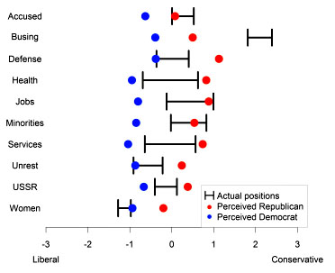
Andrew Gelman points me toward a new paper today that attempts to measure political polarization. The authors use NES survey data to measure (a) average positions from self-identified Democrats and Republicans on ten issues, and (b) perceptions of how big those differences are. They found that perceptions were consistently higher than reality: both Democrats and Republicans tended to overestimate how polarized we really are, and the more partisan you are the more you overestimate polarization. The full paper is here.
I’ve got a couple of problems with this paper, though. First, the dataset spans 30 years and ends in 2004. So even if the effect they find is real, it doesn’t tell us much about  polarization, both real and imagined, over the past decade or so.
Second, and more important, is the effect real? There’s an obvious problem with how the authors calculate polarization:
We calculated perceived polarization, for every issue and respondent, as the respondent’s estimated attitude of the “Republican Party” minus the respondent’s estimated attitude of the “Democratic Party.” Higher numbers indicated greater polarization. We calculated actual polarization as the mean attitude of all respondents who self-identified as Republican minus the mean attitude of all respondents who self-identified as Democrat. We then calculated exaggerated polarization as perceived polarization minus actual polarization for each respondent on each issue in every year.
The problem is that when people are asked to estimate the actual positions of Democrats and Republicans, they probably aren’t thinking about national averages. More likely, they’re thinking about the positions of national leaders with big megaphones: presidents, governors, members of Congress, etc., all of whom are likely to have more strongly partisan positions. If that’s the case, perceptions of polarization might actually be fairly accurate. The authors are aware of this, so they ran a test to see if perceptions changed depending on how the questions were worded:
To directly address this possibility, we conducted a Web-based experiment to ascertain whether different ways of phrasing the attitude questions would produce different estimates of perceived polarization.
….Democratic or Republican targets were described using one of the four following prompts: (a) Where would you place the Democratic [Republican] Party on this scale? (b) Where would you place those people who identify as Democrats [Republicans] on this scale? (c) Where would you place Democratic [Republican] Party officials (that is, Democrats [Republicans] who hold an elected position at any level of government) on this scale? (d) Where would you place those people who identify as Strong Democrats [Republicans] on this scale?
The authors found no difference in perceptions based on question phrasing. Unfortunately, I don’t find this especially persuasive. Only about 70 people responded to each phrasing, so this is a pretty small sample set. Furthermore, I have my doubts that most people really have clear beliefs about these differences in the first place. For example, the authors report “somewhat surprisingly” that when the attitude question referred to party officials, perceived polarization was significantly lower. As they say, that doesn’t really make much sense, and it suggests that respondents simply weren’t thinking very hard about this. I suspect that happens a lot when you pay people a buck or two to fill out a questionnaire using Amazon’s Mechanical Turk.
So….I’m a little skeptical of this. It’s interesting in a limited way, but the differences between actual and perceived polarization were generally fairly modest; the data set is old; and it’s unclear that the authors’ definition of “actual” polarization corresponds to the real world. I don’t really doubt that the media exaggerates partisan differences these days, but I’d nonetheless take this study with a grain of salt.


