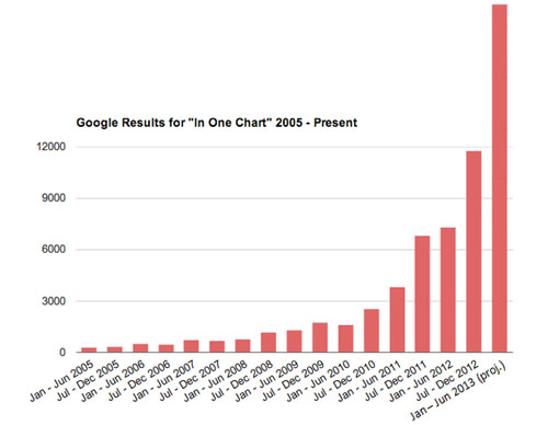
Over at the Atlantic, Elspeth Reeve charts the rise of charts in the blogosphere. In particular, she charts the rise of “In One Chart” posts. I’ve modified the final bar in her chart to show the true surge in these posts over the past year:
One correction, though. She credits Ezra Klein as the likely inventor of this phenomenon, and that might be true. However, she credits Arthur Delaney for the recent appearance of “signs of a rebellion” against “One Chart” posts, and that’s something I’d like to take credit for. It’s true that my rebellion last year was technically against “Everything you need to know about [xxx] in two charts,” but I think that’s close enough.
In case you’re curious, I’m only halfway joking about this. I love graphical information, so I hardly have any standing to complain about chart-heavy posts. But it really does seem as if they’re being overused these days. Sometimes they’re the best way to explain complex topics, but not always.