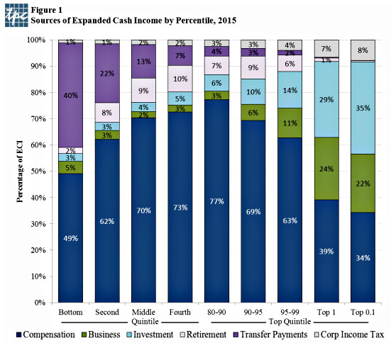
This won’t come as any big surprise, but the chart below from the Tax Policy Center does a very nice job of showing how the rich are different from you and me. Most of us earn money from our jobs. Even up at the 90th percentile (about $150,000 or so), ordinary income makes up 77 percent of all cash earnings. Business and investment income make up only 9 percent. But in the top 0.1 percent, the domain of millionaires and billionaires, business and investment income make up 57 percent of cash earnings. As Jared Bernstein says, this explains a lot about economic policy preferences:
Think about these differences the next time you hear a politician explaining why we need to cut taxes on corporate income or capital gains….The framing is invariably “trickle-down”—such cuts will lift everybody’s fortunes—but the real motivation is what you see here. Once you get up to the very top of the income scale—the top 0.1% in the bar furthest to the right (as it were)—you’ve got two-thirds of their income coming from non-labor sources.
Low corporate and capital gains taxes, as well as cuts to top marginal rates, are always framed as crucial to economic growth. Conversely, high payroll taxes are always framed as crucial to keeping Medicare and Social Security fully funded. And maybe so. But it’s quite a coincidence that all of these policies just happen to be precisely what benefits rich people the most, isn’t it? Keep that in mind the next time you hear the latest self-serving bit of richsplaining from some Wall Street titan about taxes and the economy. You know the drill: job creators, incentive effects, globalization, capital formation, etc. etc. Just don’t worry your pretty little head about the details, OK?


