I made a mistake a couple of days ago, and now all of you have to pay the price by listening to my explanation. Here’s what happened.
My intentions were honorable. The Robert Wood Johnson Foundation put up a chart showing the growth of health care spending over the past two years, but it wasn’t adjusted for inflation. You all know how I feel about that, don’t you? Spending over time should always be adjusted for inflation. So I did the adjustment and posted a revised chart.
But then I got persuaded that I had used the wrong inflation measure. Instead of overall CPI, I should use just the medical component of CPI. So I did that. Unfortunately, I somehow slipped a digit 
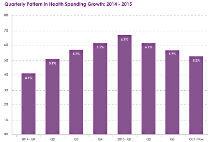
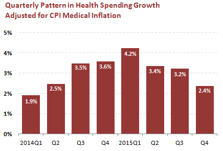
 and did it all wrong, which produced a rather odd looking chart. Long story, short, I’ve spent bits and pieces of the past two days trying to decide how to do this right. The answer is: CPI rather than PCE; medical rather than overall inflation; and year-over-year rather than compounded inflation. The original RWJF chart and the newly-corrected inflation-adjusted chart are on the right.
Ironically, what this ends up showing is…nothing. The numbers in the second chart are all lower, but the general trend is the same in both: spending growth peaks at the beginning of 2015 as Obamacare draws more people into the system, and then steadily declines as the flow of new consumers ebbs. The inflation adjustment didn’t change anything.
This is because inflation has been low and pretty flat for the past two years. However, that’s not always guaranteed. Sometimes inflation changes substantially over multi-year periods, and that can make trends in nominal dollars badly misleading. So even though it doesn’t matter much sometimes, always adjust for inflation! The statistical gods will look favorably upon you.


