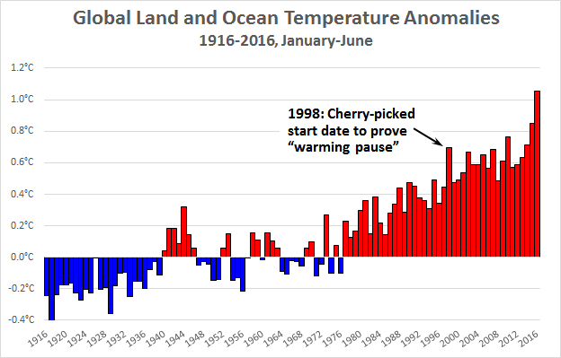
It’s been a while since I posted a chart showing the latest global temperatures, so let’s do one today. This is based on NOAA data for the first half of the year. As you can see, average global temperatures have risen about 1.3°C over the past century.
For years, climate denialists published charts starting in 1998 to show that warming had “paused” and might never increase again. Needless to say, an anomaly of +0.7°C looks kind of quaint these days as we blew right past +1.0°C during this year’s El Nino. Those old charts have, of course, now disappeared. But no worries. They’ll be replaced by something else, I’m sure.


