I’m annoyed that something like this could appear in the Washington Post:
The share of white millionaires in the United States has doubled in the last quarter century, with one in seven white families now worth more than $1 million, according to new Federal Reserve data. Fifteen percent of white families reported being millionaires, compared to only 7 percent in the Fed’s 1992 Survey of Consumer Finances.
….Much of the growth in white wealth during the past two decades comes from the doubling of financial assets, including stocks and bonds, as well as pensions and retirement accounts, according to a Washington Post analysis of Fed data.
Come on. The doubling of white wealth is primarily because of inflation, which has nearly doubled since 1992. And the reason that 15 percent of white families have a net worth of $1 million is because about 15 percent of white families had a net worth of $500,000 back in 1992.
CORRECTION: According to the Post, the share of white millionaires has doubled to 15 percent after adjusting for inflation. I didn’t notice the note in their chart, and assumed these were nominal numbers since median real wealth hasn’t increased nearly that much. The presentation here is confusing, but I’ll see if I can dive into it further tomorrow. And now, back to our story. More here.
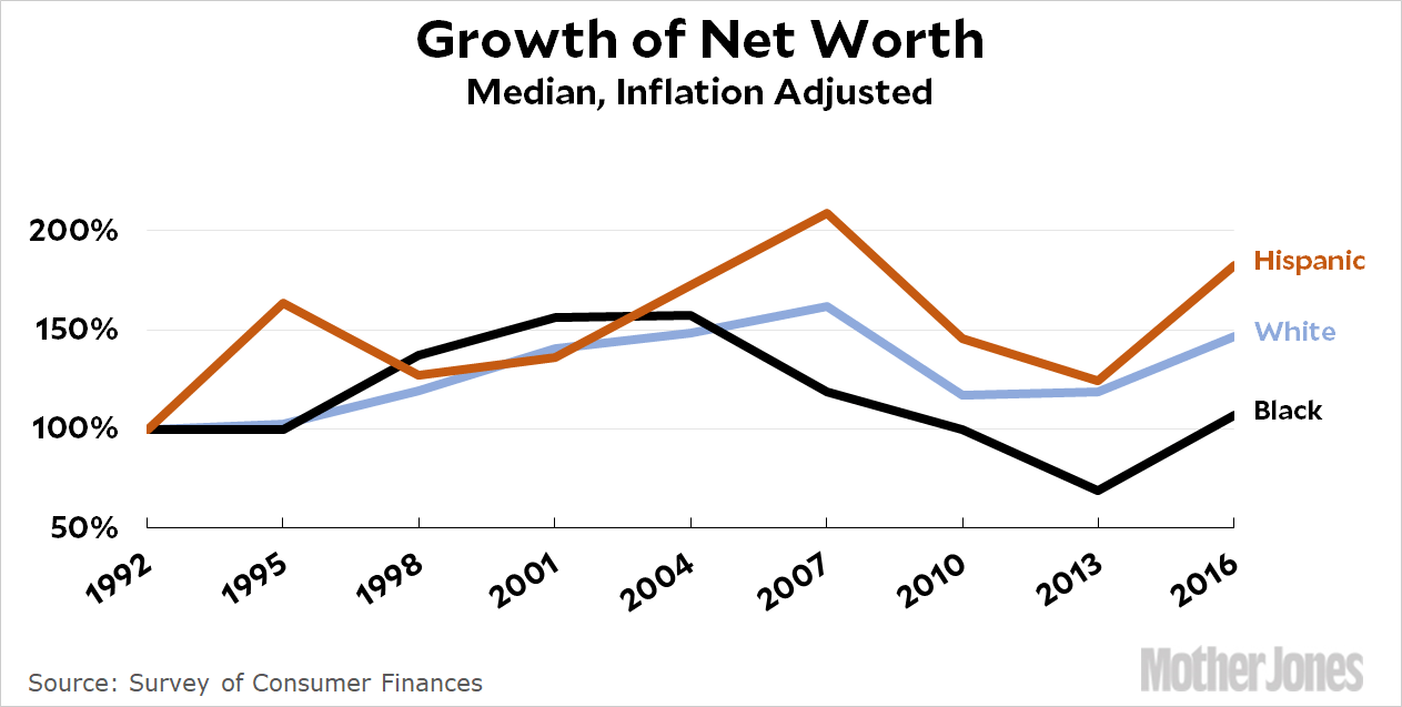
Not that this matters, since nobody uses average wealth for this kind of comparison anyway. Averages are heavily skewed by folks like Warren Buffett and Bill Gates, so you use medians instead. Here’s how wealth has really grown since 1992¹:

In the Post’s hands, the data on white and nonwhite wealth produces sentences like this:
Among American households invested in the market, the median value of white-owned investments rose to $50,000 in 2016, indicating a recovery from the Great Recession. The median value of black-owned and Hispanic-owned investments remained around $12,000, which was below 2007 values.
This could just as well be:
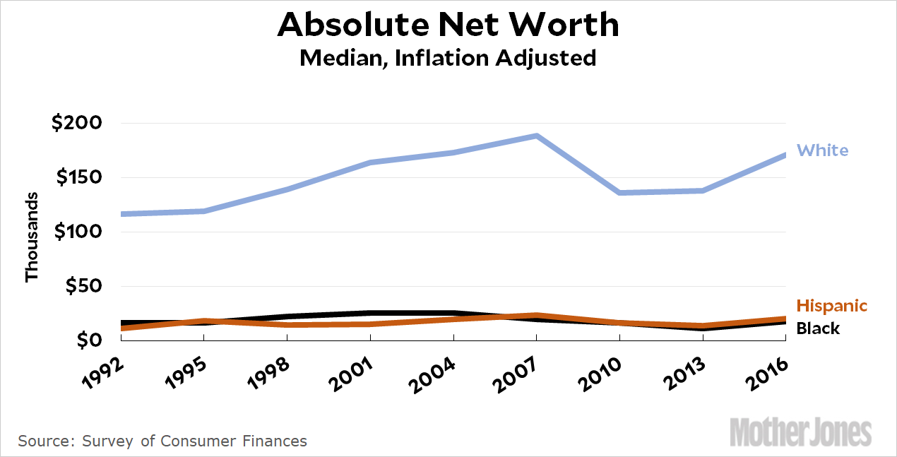
Among American households, black net worth rose more than 50% in 2016, indicating a recovery from the Great Recession. Median white net worth was about $170,000, which was below 2007 values.
What’s the point of all this? Why use nominal values to make it look like white net worth has skyrocketed? Why use averages to make it look five times higher than it is? Why cherry pick dates, comparing white growth since 2013 with black growth since 2007? None of it is necessary since the simple facts are all you need:

White wealth has grown by about half since 1992. That’s not horrible, but it’s not great. Black wealth has grown less and Hispanic growth has grown more. What really matters, however, is that over the course of more than two decades, the absolute wealth of both blacks and Hispanics has been so close to zero you can hardly tell the difference. You really don’t need to cherry pick anything or spin the statistics to make that point.


