There’s a chair in our living room near the fireplace mantel. It’s a two-foot hop from chair to mantel, but Hilbert treats it like a jump over the Snake River. He gets up on the armrest. He gets his footing. He looks up. He looks down. He thinks about jumping but then backs off. He shifts his feet again. He looks. He starts to jump. He stops. Finally, he either gets down or else makes the mighty leap up to the mantel.
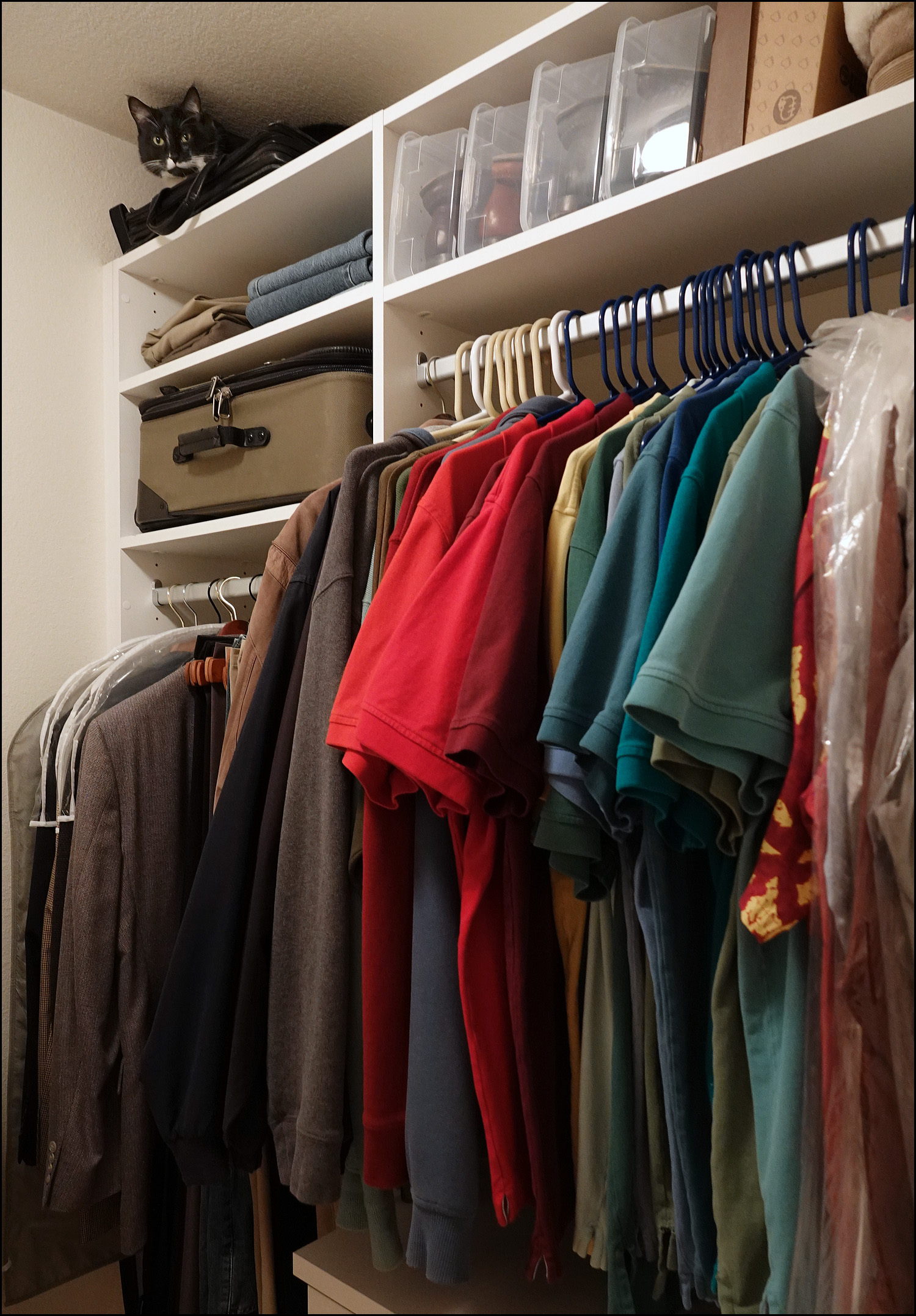
Is Hilbert a weakling? Not at all. As you can see below, one of his favorite new spots is at the very tippy top of our new closet. To get there, he makes a 4-foot leap onto the clothes hamper and then another 4-foot leap to the top. He does both without touching a thing on his way up. He does it smoothly and effortlessly. So what’s the deal with the fireplace mantel?
The European Union Friday made public a 10-page list of American products that are potential targets for retaliation if President Trump refuses to exempt the allied bloc from his new tariffs on steel and aluminum imports. The list offered the most detailed glimpse to date of the likely targets for E.U. action, including products selected for maximum political impact in the United States. Among them: Bourbon, a specialty of Senate Majority Leader Mitch McConnell’s Kentucky; cranberries which grow in House Speaker Paul D. Ryan’s native Wisconsin; orange juice from Florida and tobacco from North Carolina, two political swing states that are rich in electoral votes.
I think the EU is being too clever by half. Do they seriously think that Paul Ryan and Mitch McConnell are going to respond to tariffs that affect a tiny chunk of their electorate—especially when the EU has made it clear they they’re doing this deliberately to put pressure on them? I doubt it. And anyway, it’s Donald Trump they need to hurt, not legislators who are already mostly free traders.
If the EU wants to play this game, they need to play it the same way Trump does: big and simple. Just pick a large export category for the US—chemicals, maybe, or wood pulp or optical instruments—and slap a 20 percent tariff on it. Then make up some kind of transparently bogus justification and stick to it like glue. There’s really nothing else that will get Trump’s attention. You have to hit him over the head with the fact that (a) this is retaliation and (b) it won’t stop.
Keep it simple. Trump is not notable for his sense of nuance.
For the first time in recent memory, I’m actually having trouble finding stuff to blog about this morning. Is it the calm before the storm?
So let’s go back to a subject I wandered into a few days ago: if unemployment is so low, why isn’t there more pressure for wages to rise? The answer, presumably, is that the unemployment rate is no longer a very good indicator of whether the labor market is tight. So what is?
I was noodling about this yesterday, trying to come up with something that, by definition, indicates a tight labor market. I had a hard time coming up with anything, but eventually settled on job openings. If the number of job openings is, say, 2 percent of the workforce, then there aren’t many jobs to be had. The labor market is loose. If it’s 5 percent, there are lots of jobs out there and it should be a seller’s market. The job market is tight.
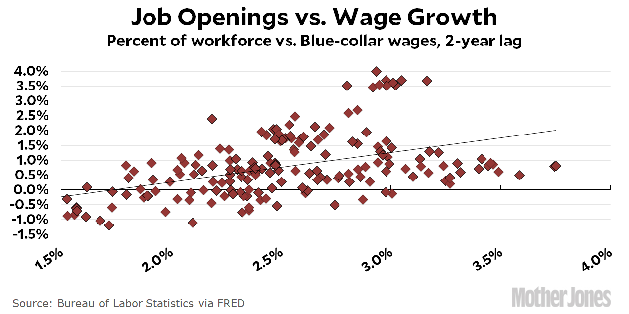
Now, I realize I’m wading around in the kiddie pool on a subject that other people have probably thought about far more deeply, but that’s never stopped me before. So I plotted job openings vs. wage growth to see if there was any correlation. There wasn’t. Not even slightly. I tried it with both nominal and real wage growth, and the regression line was dead flat in both cases.
That was odd. Even if the number of job openings isn’t a perfect indicator of labor market tightness, it should indicate something. You’d think there would be at least a mild correlation. So then I tried it with a lag of one year. And one-and-a-half years. And two years. And two-and-a-half years. The best correlation I got was using real wage growth and a 2-year lag:
That’s not the worst correlation in the world, but it’s not great either. To the extent that it means anything, it means that it takes two full years of labor tightness before companies begin to raise wages to attract workers.
That’s actually a plausible hypothesis, but my difficulties with this ended up leading me in an entirely different direction: Is wage growth simply not linked very tightly to the labor market anymore? We see anecdotal evidence of this frequently in news stories that feature CEOs moaning about how hard it is to attract qualified workers—but not raising wages to attract the workers they need. For one reason or another, perhaps companies these days simply don’t react to labor shortages by raising wages.
I have no idea if this is true. I’m posting this primarily because (a) it’s kind of interesting and (b) maybe it will spark an interesting conversation.
POSTSCRIPT: I should note that my interest is usually with blue-collar workers, not computer programmers and attorneys. For that reason, I look at the wages of production and nonsupervisory workers, who make up 70 percent of the workforce. Ideally, then, I’d look at blue-collar job openings vs. blue-collar wages, but I don’t have the data for that. So I’m comparing all job opening to blue-collar wages. It’s quite possible, of course, that a tight labor market in general doesn’t necessarily mean a tight labor market in semi-skilled jobs. It’s just one more thing that might be messing this up.
The California bullet train will have another slow segment of track as part of a new cost-savings measure, state rail authority documents reveal….The system would operate between San Jose and Gilroy at 110 mph on ground-level tracks on or adjacent to an existing right of way owned by Union Pacific. The route would make 32 highway crossings, requiring sophisticated barrier gates and sharing a corridor that carries freight and commuter rail.
The ballot measure that approved the bullet train mandated that it make the run from Los Angeles to San Francisco in 2 hours and 40 minutes. This requires an average speed of about 160 mph. The train’s top speed is allegedly 220 mph, but when you add in stops and slowdowns the average goes down. So are we still planning on a 2:40 trip time?
The decision is the third compromise the rail authority has made for money or politics that would create slower sections of track, each incrementally adding travel time to an alternative form of transportation promised to link Los Angeles and San Francisco in less than three hours….In total, there are about 91 miles of rail above ground that involve shared track or right of way that will restrict speeds to about 110 mph. Even that speed is questionable.
….Outside rail experts say it is improbable that the rail would ever meet the 2 hour 40 minute trip time in actual operations. In the business plan’s supporting documents, the rail authority lists a timetable “example” that shows the fastest full-length trip would be 3 hours and 30 minutes. Trains with more stops would take 4 hours and 5 minutes.
The problem here is obvious: the door-to-door travel time by plane from LA to the Bay Area is about 3-4 hours. If the bullet train can’t beat that, it loses a huge draw—and that in turn means the ridership estimates are even more of a fantasy than they already are. This is why lots of liberal transit experts—the kind of people who are generally huge fans of high-speed rail—opposed the bullet train in the first place.
The Washington Post, once again, regales us with an inside story about the Trump White House “based on interviews with 19 presidential advisers and administration officials.” This time the piece focuses on all the people who have been fired—or are about to be fired—and how it’s affecting the mood of Trump staffers. Here’s a quick rundown:
Staffers are gripped by fear and uncertainty … administration in turmoil … the mood inside the White House in recent days has verged on mania … anxious and nervous … characters in an absurdist farce … betting about which staffer will be ousted next … “Everybody fears the perp walk” … death watch for McMaster.
So who’s in danger? Just about everyone:
[National Security Advisor] H.R. McMaster … with whom he never personally gelled … Veterans Affairs Secretary David Shulkin has attracted Trump’s ire for his spending decisions as well as for general disorder … Housing and Urban Development Secretary Ben Carson, who has generated bad headlines for ordering a $31,000 dining room set for his office … Environmental Protection Agency Administrator Scott Pruitt, who has been under fire for his first-class travel at taxpayer expense … Interior Secretary Ryan Zinke, whose agency spent $139,000 to renovate his office doors … Education Secretary Betsy DeVos drew attention this week when she stumbled through a pair of high-profile television interviews … [Chief of Staff John] Kelly’s departure could be imminent.
Whew! The Post also reports that Trump is thrilled about finally ignoring all the Chicken Littles and just putting the damn steel tariffs in place. And everything turned out fine! See? So now he wants to do all the other stuff that he knows in his heart is right, but that his tedious advisors keep resisting with “facts” and “studies.”
So 2018 will be the year of Trump Unchained. We’ll finally get to see Trump being Trump. And just you wait. Everyone who says you “just can’t do” stuff like tearing up NAFTA and nuking North Korea will be proven wrong. It should be a fun year.
Whenever I put up a chart in which the vertical axis doesn’t start at zero, I always get complaints that I’m distorting the data. For shame! It happened again this morning, touching off a Twitter conversation that finally demands a response. So here it is. Two quick caveats first:
This will seem like a long post, but it’s not. It’s short! It just seems long because I’ve illustrated it with lots of charts, and modern technology requires me to display all charts in a very large size.
The golden rule of all charts is: don’t do anything to deceive the reader. This is something that everyone agrees about. As you’re about to see, however, this sometimes gets fuzzy in practice.
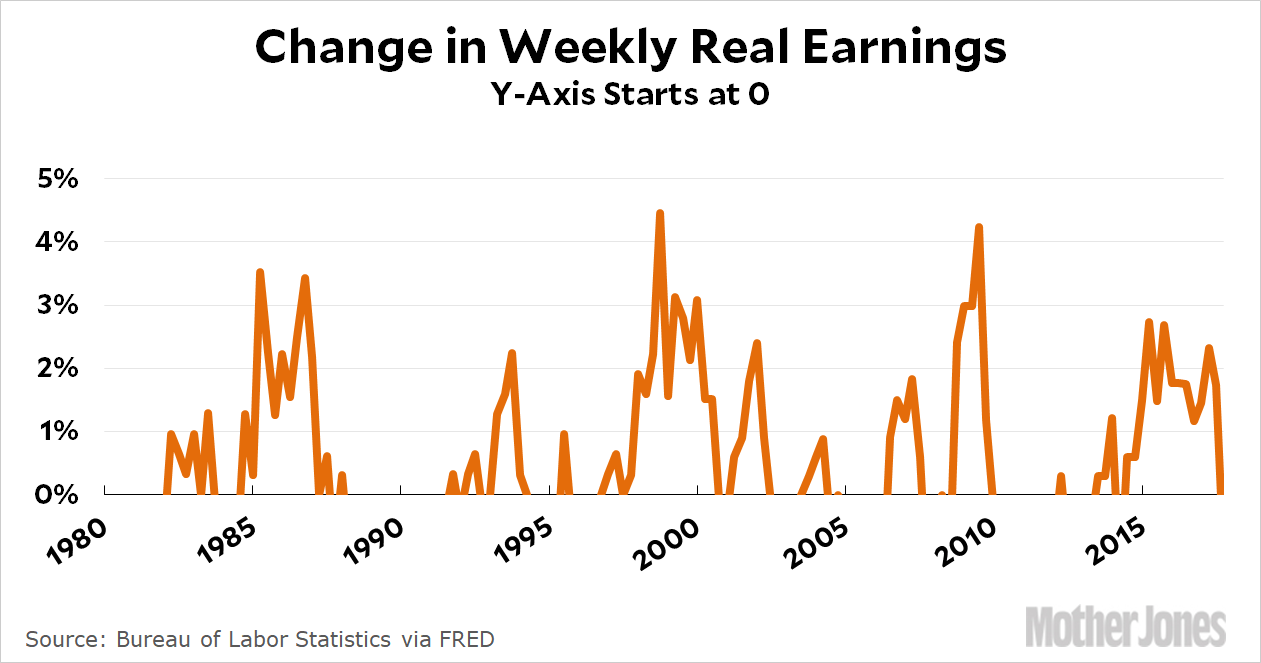
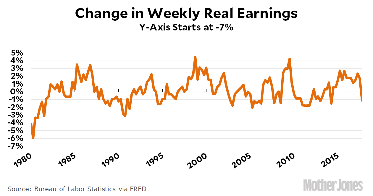
Buckle up, data nerds! This isn’t going to go quite the way you expect, though. Let’s start off with a chart of wages adjusted for inflation:
In this chart the y-axis starts at zero, but it doesn’t work because some of the values are negative. Now, before you get excited and claim that I’m cheating because no one is suggesting you should cut off negative values, just hold on. I have a point to make. Obviously this chart doesn’t work. So how about this one?
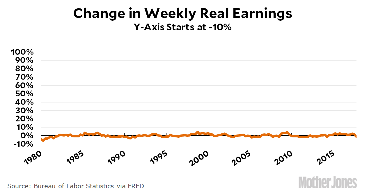
This barely shows anything: the line is just some tiny squiggles. That doesn’t work either. So how about this one instead?
Much better! But think about this: why did I choose a y-axis that goes from -7 to +5? I could have chosen anything, after all. Maybe -10 to +10. Or -20 to +20. Once we’ve decided that zero isn’t the right starting point, we’re in the wilderness.
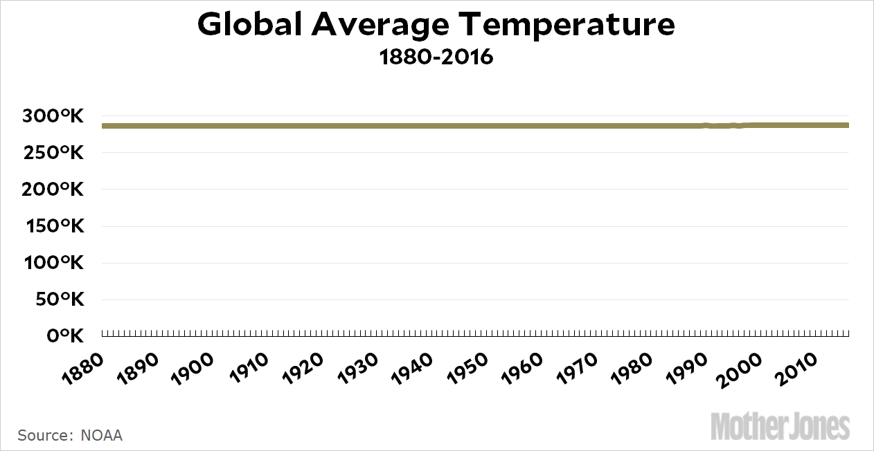
But we’re not, really. The obvious reason for choosing -7 and +5 is that these are the limits that display all the data without adding a lot of useless white space. In the second chart, it was white space above the line that was a problem. But if useless white space above the line is bad, then useless white space below the line is bad too—and that’s true even if all the data is positive numbers. Here’s a vivid demonstration using global warming as its subject:
Only an idiot would think this is an effective and truthful display of data. (This idiot, for example.) So we finally have a useful rule: use a scale that (a) shows all the data, but (b) doesn’t incorporate loads of useless white space that compresses the data into incomprehensibility. In the case of the global warming chart, that would mean a y-axis that goes from about 285ºK to 288ºK. It’s the only way to display the data in a way that properly shows the effect it’s trying to show.
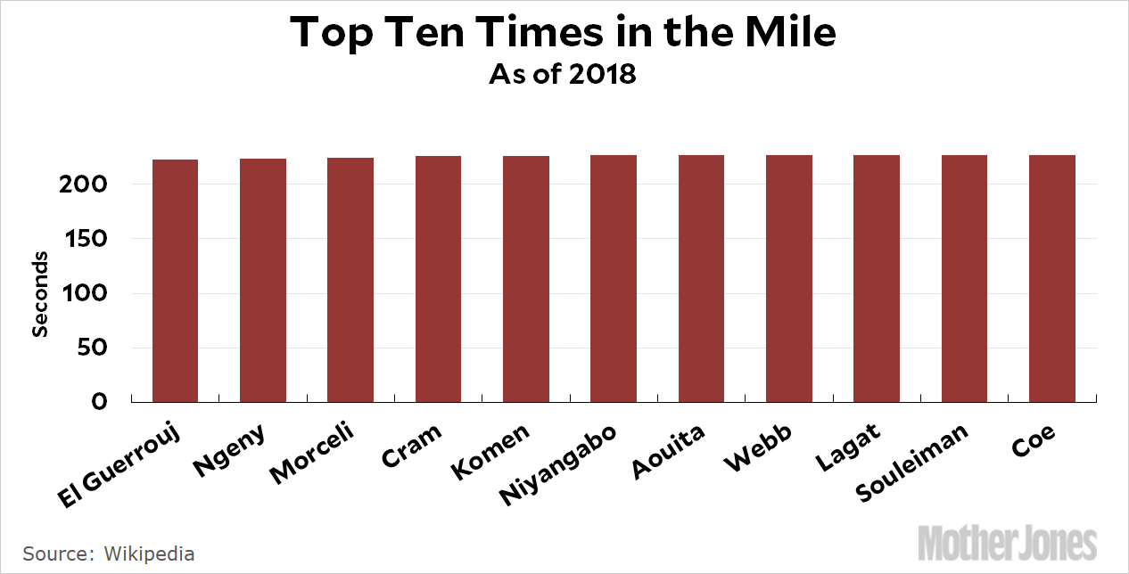
But wait! My more sophisticated critics all accept this. They have another complaint: what about bar charts? They should always start at zero, right? Well, how about this one?
You can’t do this as a line chart because it’s not a time series: it’s a chart showing ten individual people. And yet it’s nearly useless. The top ten milers in the world have times that range from 3:43 to 3:47. But here’s the thing: in the world of mile racers, four seconds is a lot. It’s huge. But if you want to display that, you really have to choose a range of, say, 3:40 to 3:50. Once again, what we’re doing is eliminating useless white space. The only difference is that since it’s a bar chart, the white space is (in this case) red space. See here for another example.
This is basically my case: regardless of what kind of chart you use, your goal should be to display the data in a way that shows the effect you’re trying to show. That means using whatever scale the effect works in. In the case of real wage growth, it’s -7 percent to +5 percent. In the case of global temperatures, it’s 285ºK to 288ºK. In the case of milers, it’s 3:43 to 3:47.
In other words, you can’t always use zero as your starting point. It would be dishonest—and as the chart with negative data was intended to highlight, zero is actually just an arbitrary number anyway, not some kind of natural boundary. The only real question is how best to make it clear to a casual reader that your chart doesn’t start at zero, and I’m not sure what the answer is. Some people like using a little squiggle at the bottom of the y-axis that represents, say, a jump from zero to 285ºK. I’m not a big fan of that because I don’t think most people notice it, but I suppose it does no harm. Mostly, I just think you should very clearly label your y-axis. But this is admittedly not a problem with a great answer.
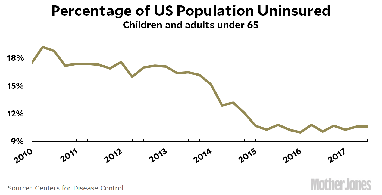
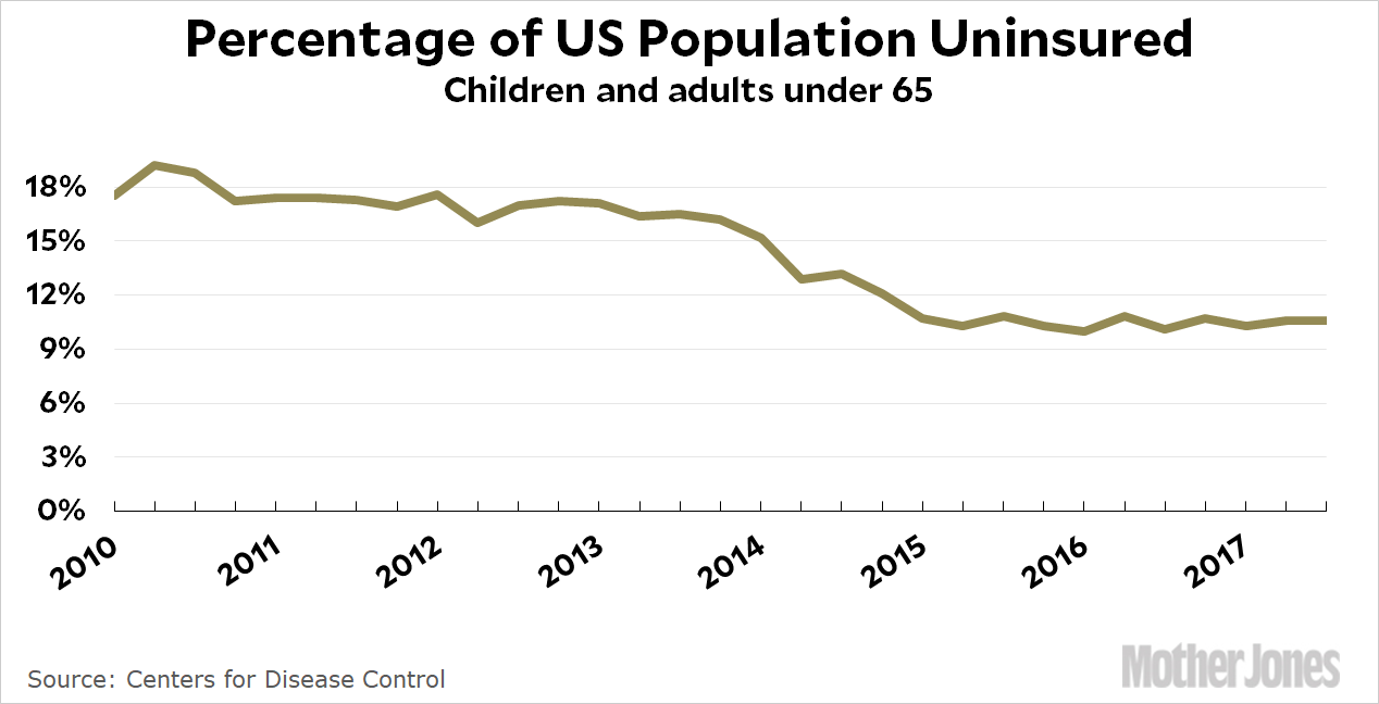
We’re almost done, but I want to put up two more charts to demonstrate that this can often be more art than science. Here are two charts I put up this morning showing the number of uninsured people since Obamacare was passed:
Which one is better? The top one eliminates dead space and shows the variations better. However, the quarter-to-quarter variations aren’t really that important, and someone skimming the post could easily think that it shows a drop in the uninsured nearly to zero. So maybe the bottom chart is better?
This is where it gets tricky. When the useless white space is 90 percent of the chart, it’s an easy call to get rid of it by moving the y-axis. But how about when the useless white space is only half the chart? Or 60 percent? Or 70 percent? What then?
There’s no easy answer. In this case, I’d probably give the nod to my critics and say that the chart starting at zero is better. You don’t really lose much, and it makes it clear how much further we have to go before we cover all the uninsured who are left. Luckily, the added white space in this particular chart isn’t huge, so we have the option of doing this. But there’s no hard and fast rule here. Your goal should be to display data so that your immediate sense of the scale of change matches the actual scale of change. Sometimes this can actually mean adding a bit of dead space, though I very rarely find a need to do that.
Bottom line: Your aim is to eliminate useless white space so that your data is front and center. The trick, however, is deciding exactly when white space is truly useless. Sometimes that’s easy, sometimes it’s not. But as long as you keep in mind that your primary goal is to never deliberately deceive your reader, you’ll probably be OK most of the time.
This is the only bowling ball test anyone has been able to uncover: a guest on the Dave Letterman show dropping bowling balls five stories onto an old car.
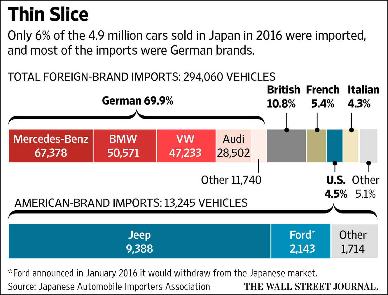
Yesterday we heard about the “bowling ball test.” According to Donald Trump, this is how the Japanese keep American cars out of their market: they drop a bowling ball on the hood, and if it makes a dent they refuse to let it in.
Today the White House tried to pass this off as a joke, but Trump pretty obviously didn’t mean it as a joke. He believes it, and he’s hardly the only one who believes that Japan deliberately sets up lots of red tape to keep out foreign cars. Perhaps you’d be interested in the truth about this?
First off, Japan did keep foreign cars out for several decades after World War II. But that largely ended during the 70s and 80s. There are currently no tariffs on foreign auto imports, and the safety and emissions rules are roughly the same as everywhere else.
Second, it’s true that the Japanese auto import market is small: about 6 percent of the entire market. It’s also true that American car companies sell barely any cars in Japan. But this is largely because they hardly even try:
So what’s the real problem? Let’s take a tour of Japan to find out why they buy so few American cars. First up, there are auto regulations that, fairly or not, American car companies complain about:
Japan, like the EU, uses a “type approval” system to clear cars for sale. This means the government certifies that the vehicles meet safety standards. In the United States, though, the automakers certify that their vehicles meet federal safety requirements — and assume the liability of meeting those requirements.
These are the dreaded “inspection rules” that keep American cars out: Japan insists on testing vehicles itself instead of letting automakers test them and then taking their word for it. But this is also how things work in Europe, and Ford and GM sell plenty of cars there. So this isn’t really much of an issue. In any case, Japan agreed to change these rules during negotiations over the TPP trade deal. But then Trump killed the TPP:
During negotiations over the Trans-Pacific Partnership, the Pacific Rim trade deal Mr. Trump abandoned after taking office, Japan agreed to recognize more American auto safety standards and streamline certification procedures for imported vehicles. But now that the United States has pulled out, those concessions are at risk.
Next up, there’s the build quality of American cars. About 20 years ago Toyota tried to sell GM cars as Toyotas, through the Toyota dealer network. It didn’t go well:
Refitted with right-hand drive and other changes meant to appeal to the Japanese, the Cavalier wasn’t the first American car to hit the Japanese market when it landed in October 1995, but it was one of the most-hyped ones of that era. The symbolic deal was touted as the wedge that would finally pry open Japan’s “closed” market for American imports. Instead, it largely reinforced Japanese preconceptions about American quality.
GM funneled Japan-bound Cavaliers through a special finishing line at its Lordstown, Ohio, plant to ensure extra-rigorous quality. That did not stop Toyota inspectors from rejecting droves of the cars and sending them back for fixes before granting final approval for shipment to Japan.
European brands advertise aggressively and have done more to customize their products for Japan, for instance by producing right-hand-drive versions of their vehicles — a seemingly obvious selling point, in a country where the driving lane is on the left, that American producers have long been criticized for ignoring. The best-selling American brand in Japan is Jeep, which last year accounted for close to half of all American auto sales there. It offers right-hand-drive vehicles — a legacy of the customized delivery vehicles it once made for the United States Postal Service, which let drivers step out onto American curbs instead of the road.
No right-hand-drive cars! And Trump is complaining about bowling balls. But we’re not done yet. Not by a lot. There are dealership issues:
The last time Shujiro Urata wanted to buy a new car in Japan…the dealer and a coworker showed up at Urata’s doorstep an hour later with two demo cars, which Urata and his wife test-drove around the neighborhood. The Uratas decided to buy a car from the dealer. The dealer also handles their car insurance, coming to their home whenever the insurance contract needed to be renewed. The Uratas bring in their car to the dealer every few weeks for a free car wash.
….Japanese customers also expect to receive services like free maintenance from their dealers after they buy their cars, Urata said. When their cars need a checkup, the dealer comes and picks them up, does work on them, and then returns them. American dealers don’t offer such services. “Developing this network is expensive, and maintaining it is expensive, and that’s one reason U.S. car makers decided to withdraw,” he told me.
I talked to a Japanese man named Hideo Ohashi, who has only bought Toyotas in Japan. He has considered buying a Mercedes-Benz, he told me, but he worried that it would be too expensive and lengthy to get new parts if his vehicle breaks down. A friend of Ohashi’s has a European car and it takes weeks to get parts from the maker, Ohashi said.
Speaking of family, my brother-in-law, freshly married, bought a Mini Countryman, 4WD. He bought it the Japanese way, he specced it at the Mini dealer, the order was placed, and the car is custom-built in Graz, Austria (so much for a British car.) With shipping, it will be delivered in three months. Japanese and European OEMs have been doing mass customization and built-to-order for decades. At the Ford dealer, it’s the American way, you get what’s on the lot, and the steering wheel can be on the wrong side, if you don’t mind.
There’s the problem that American car companies don’t want to make small, low-profit cars, so they mostly sell only luxury SUVs. But that’s not what Japanese buyers want:
Many Japanese consumers, faced with congested cities, favor tiny domestically-made vehicles, called kei cars, which make up more than a third of the market….Even Japan’s Toyota Motor Corp and Honda Motor Co cannot convince Japanese consumers to buy models that are popular in the United States. Small sport utility vehicles such as the Toyota RAV4 and Honda’s CR-V are seen by Japanese consumers as too big.
….“It would take a painstaking fine-tuning of vehicle specs to suit American cars to those driving and other conditions and develop a strong distribution network to be able to gain traction in Japan. It is nothing short of a 20-year effort,” said a Toyota executive who spoke on condition he not be named. Jaguar Land Rover Japan Ltd Chief Executive Magnus Hansson said the low sales of U.S. cars in Japan did not mean it was a closed market, but rather reflected “a total and absolute lack of effort over 50 years” by Detroit.
[Go] on a fact-finding mission to a Ford or Chevrolet dealer in Japan. Within minutes, [you] would condede that they aren’t really trying to sell anything. Detroit has boycotted any Japanese car show since 2008. No advertising.
“Of course American cars don’t sell in Japan,” said Mr. Masui, whose admiration for American vehicles does not extend to their manufacturers’ marketing strategies. “American cars have a bad image — they aren’t fuel-efficient, they break down,” he said. “That’s not really true anymore, but dealers don’t make an effort to convince people. I’ve never seen a TV commercial. You go to a car show, they’re not there.”
Are you bored yet? Do you now have an idea of why American companies sell so few cars in Japan. It’s not tariffs, which are zero, and it’s not really non-tariff barriers either. It’s the fact that the Japanese still build more reliable cars; they build smaller cars; they build right-hand-drive cars; they treat their customers better; and they advertise their wares. American auto companies don’t do any of this and have never even tried. Is it any wonder that they don’t sell very many cars there?
I’m still not really on board with the $15 minimum wage movement, but I’m on board with a federal minimum of $12. A lot of liberal economists will say that the EITC is a better mechanism for raising the income of the poor, and generally speaking that’s true. However, the EITC and the minimum wage tend to help different classes of people. A combination of a strong minimum wage and a strong EITC is really the best way to go.
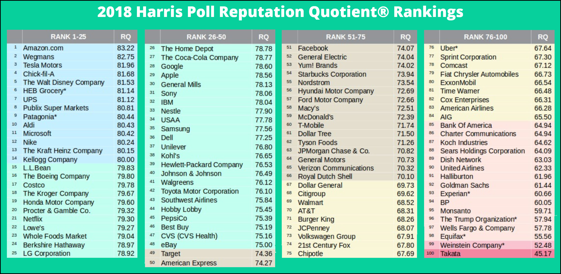
Things are a little slow today, so let’s take a look at the 2018 Corporate Reputation Poll from Harris. First, here’s their complete list:
There are a few interesting things to note:
Americans really love their supermarkets. They’re all in the top 25.
Americans really hate their cable companies. They’re all in the bottom 25.
Americans really love Amazon. And Wegmans. I have some friends who were bereft when their Wegmans closed down. What’s the deal with that?
The Trump Organization managed to avoid the last spot. They were beat out by (a) the airbag company, (b) the sexual harassment company, (c) the clueless credit reporting company that lost everyone’s personal data to hackers, and (d) the ripoff banking company. However, they scored worse than (a) the GMO seed company, (b) the oil spill company, (c) the other clueless credit reporting company, and (d) the vampire squid company.
The marcom folks who created this graphic used slightly larger fonts in the first two lists, which is why all four aren’t the same size. This is poor graphic design.
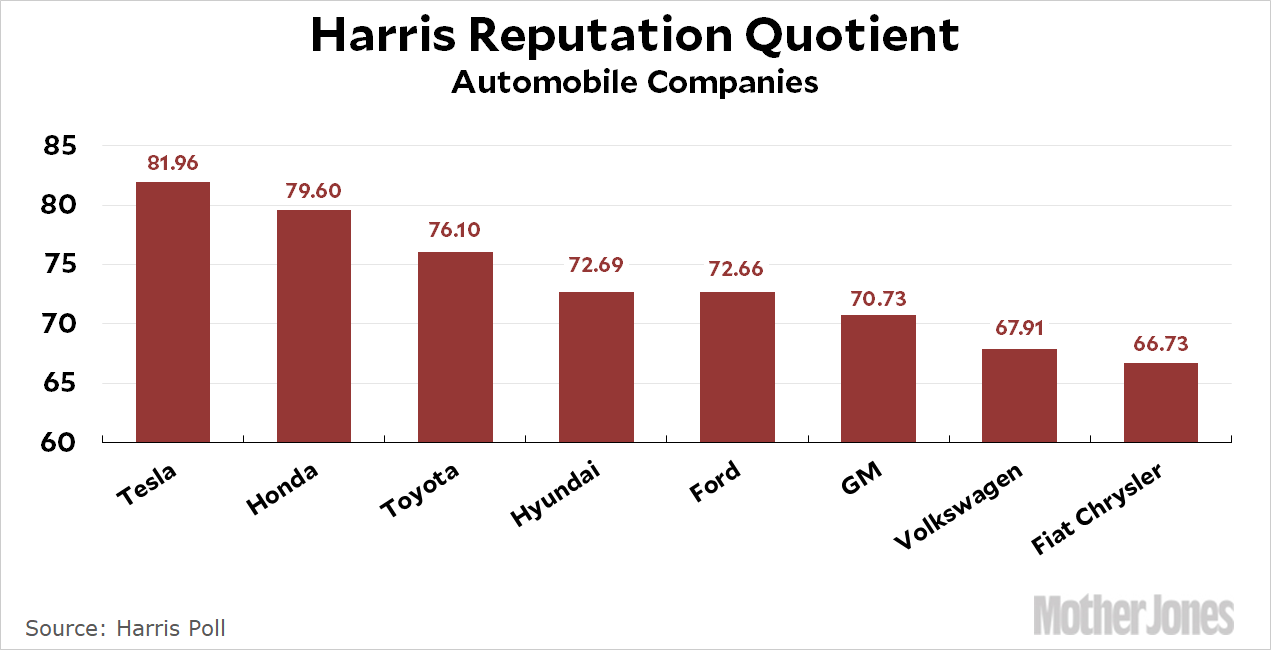
With that out of the way, let’s take a look at a few specific sectors. First up, car companies:
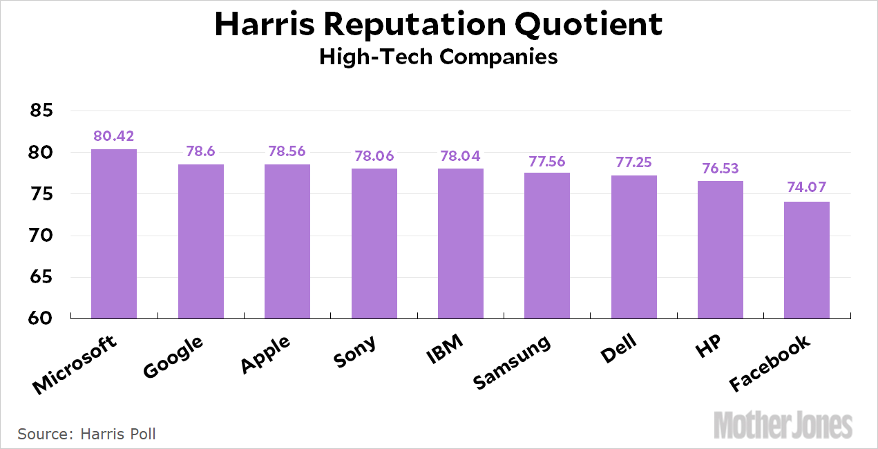
Tesla is on top, but that’s not going to last long if they can’t figure out how to manufacture the Model 3 properly. Also note that Fiat Chrysler has an even worse reputation than Volkswagen, which has been fined billions of dollars for the enormous con it pulled on its diesel cars. Nice work, Fiat! Next up is high-tech companies:
Are you surprised that Microsoft is #1? They may be boring, but apparently people think highly of them. (Amazon would be #1 if I counted them as a high-tech company, but I’m not really sure what sector they belong in these days.) Facebook, on the other hand, makes people pretty suspicious—and rightfully so.
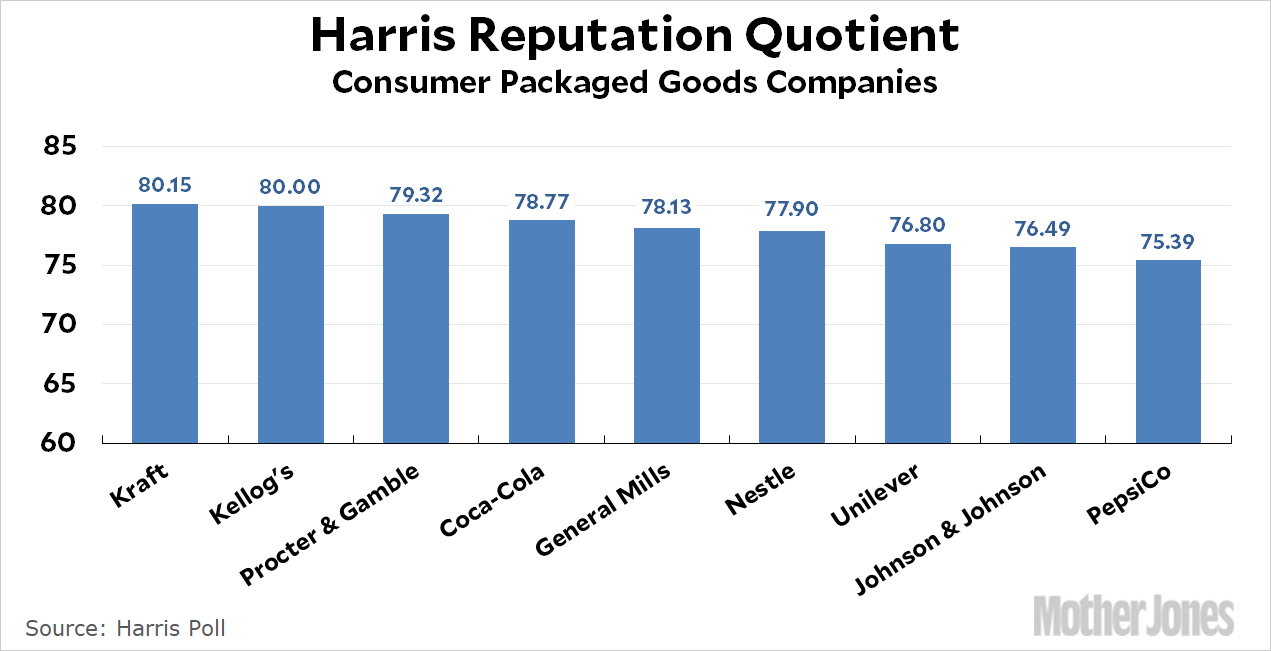
Finally, here’s the sector where reputation is truly the coin of the realm: consumer packaged goods.
I don’t really have an explanation for any of this. Why is Kraft #1? Why is Pepsi the lowest? Do most people even know what Unilever is?
And we respect that! But maybe you’re of a mind to support our work directly instead? We have until December 31 to raise the last $400,000 we need to keep our nonprofit newsroom running at full strength into 2026. Will you make a gift today?
We noticed you have an ad blocker on. Can you pitch in a few bucks to help fund Mother Jones' investigative journalism?
Billionaires own the media,
but they don’t own us.
At Mother Jones we know these aren’t conventional times, and they require unconventional coverage. That’s what deliver every day: fierce, independent journalism you can’t find elsewhere. Perhaps never in the history of our country has that been more necessary than now. But we can’t do it without reader support—your support. Please chip in today.