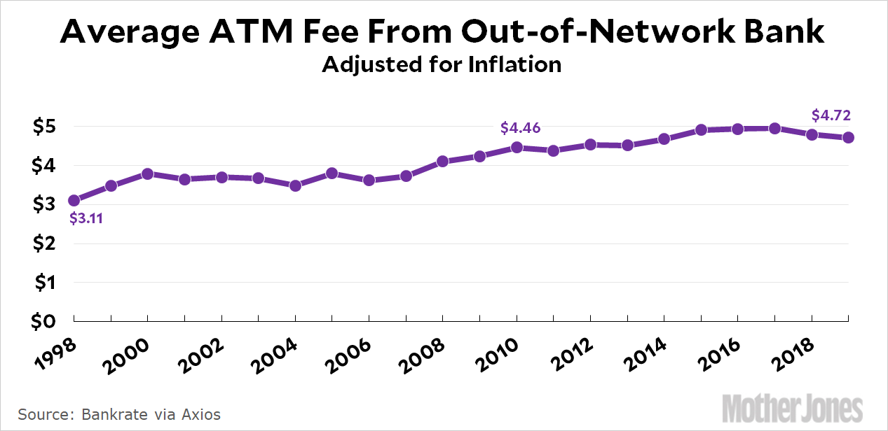
Axios published a chart today showing the evolution of ATM fees since 1998 and it’s been making the rounds. What do I have to contribute to this? Just the usual: adjusting it for inflation since it’s a time series of money. Here’s the real average ATM fee over the past couple of decades:

In this case, adjusting for inflation genuinely shows you something that you can’t really see in the original chart: virtually all of the increase came in the period 1998-2010. Over the past decade, ATM fees have risen only 6 percent. That may or may not be of interest to you, but it’s certainly worth knowing if you’re planning to mouth off about greedy banks or somesuch.


