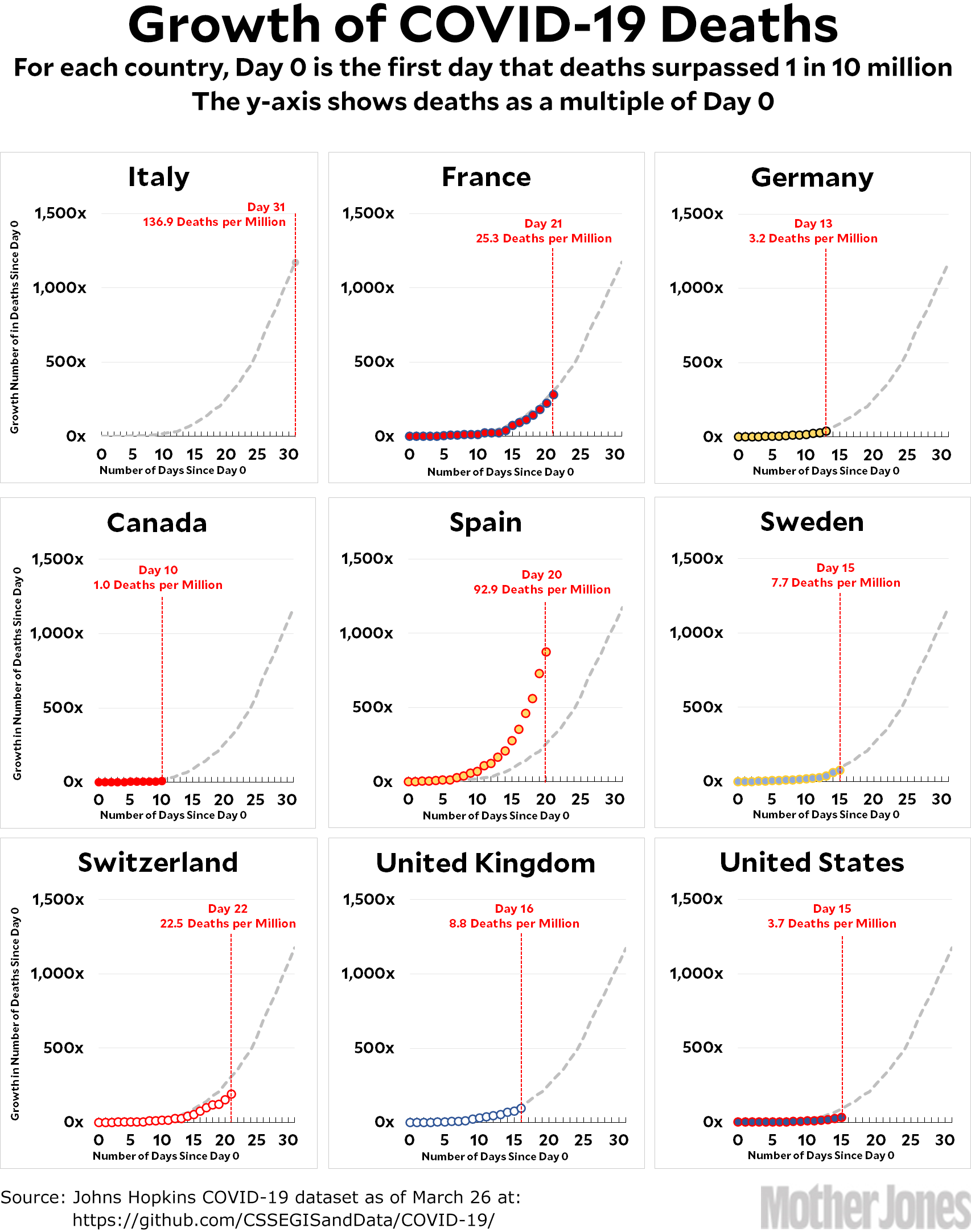
Here’s the coronavirus growth rate through Thursday. The chart for Canada was incorrect yesterday for some reason, but it’s been corrected today. The Italian death rate continues to decelerate on the same trendline as yesterday. The US death toll remains anomalously low, but I don’t know why. It could be a statistical artifact based on the choice of Day 0 or it could be something real based on how we treat coronavirus cases. The latter would be pretty intriguing, but right now it’s too early to tell.
Here’s how to read the charts: Let’s use France as an example. For them, Day 0 was March 5, when they surpassed one death per 10 million by recording their sixth death. They are currently at Day 21; total deaths are at 283x their initial level; and they have recorded a total of 25.3 deaths per million so far. As the chart shows, this is slightly below where Italy was on their Day 21.
The raw data from Johns Hopkins is here.


