• The Myths of Our Time: Homeownership Edition

    The Wall Street Journal, once again, is hellbent on claiming that young people can no longer afford to buy homes:

    Homeownership rates for younger Americans have fallen sharply over the last decade….People who came of age in the crisis and its immediate aftermath had no bargaining power when they entered the job market, crimping their earnings ever since. They started adulthood when the housing market was crashing and watched as banks foreclosed on their parents—and decided they weren’t interested in tying their fortunes to a piece of property. Now, as memories of the crisis fade, they want to buy homes but are finding themselves priced out of the market.

    ….Homeownership rates for young people are near their lowest levels in more than three decades of record-keeping. About 40% of young adults, ages 25 to 34, were homeowners in 2018, according to federal data analyzed by Freddie Mac. That is down from about 48% in 2001, when Gen X-ers were young adults.

    This is ridiculous. Of course homeownership rates have fallen sharply since the peak of the housing bubble. Homeownership rates for everyone have fallen since the peak. And homeownership rates had already started getting bubbly in 2001, so it’s hardly a surprise that homeownership rates are also down compared to then.

    But why cherry pick a few specific years? Here’s the homeownership rate since 1964:

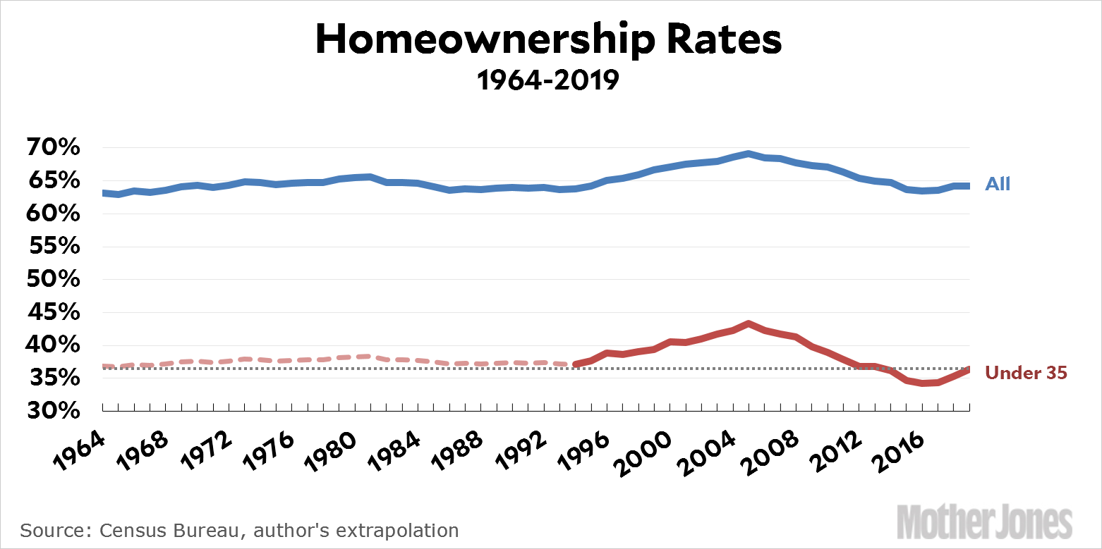
    I want to make clear what I’ve done here. The Census Bureau provides homeownership rates for young families starting in 1994. That’s the heavy red line. As you can see, it goes up and down at about the same rate as overall homeownership. In fact, the homeownership rate for those under 35 is roughly 58 percent of the overall rate. Using that number, I extended the line for those under 35 back to 1964. This is the dashed red line. It’s not precise, but I doubt that it’s off by more than a percentage point or two in any given year.

    The dotted gray line shows what happened. In short, homeownership rates for those under 35 have always been around 36 percent. The exceptions are 1995-2011, during the bubble, and 2012-18, during the bust. As of 2019, however, homeownership among young families is almost precisely at its historical average. In the second quarter of 2019 it clocked in at 36.4 percent.

    This is one of the many myths of our time that I’m sick to death of: the myth that young families can no longer buy homes. Add to this the myth of the retirement crisis. The myth that crime is down because of CompStat (or poverty or abortion or some other plainly ridiculous reason). The myth that illegal immigration is skyrocketing. The myth that American kids are getting dumber. The myth that American health care is the best in the world. The myth that millennials are lazy and self-absorbed.

    These aren’t politically-driven distortions, they’re myths that get passed along by folks on all sides without any real thought. They just are. Everyone knows it, so what’s the point of actually looking at the evidence?

  • Is China Still a Developing Country?

    Donald Trump is mad at Sweden for insisting on holding a fair trial for an American citizen accused of assault. He’s mad at France for instituting a new tax that would affect American companies. And he’s mad at China all over again because they continue to insist on being classified as a “developing country” in the World Trade Organization.

    That last one should be easy to sort out, no? Let’s just pop over to the WTO site and find out what the definition of developing is:

    There are no WTO definitions of “developed” and “developing” countries. Members announce for themselves whether they are “developed” or “developing” countries.

    Huh. That makes things tricky. In fact, not only does the WTO not define the term, they don’t even provide a list of developed and developing countries. I guess they don’t need the grief. In any case, the US has been griping about this for a while, and not without cause. Here’s what the White House says:

    While some developing-country designations are proper, many are patently unsupportable in light of current economic circumstances. For example, 7 out of the 10 wealthiest economies in the world as measured by Gross Domestic Product per capita on a purchasing-power parity basis — Brunei, Hong Kong, Kuwait, Macao, Qatar, Singapore, and the United Arab Emirates — currently claim developing-country status. Mexico, South Korea, and Turkey — members of both the G20 and the Organization for Economic Cooperation and Development (OECD) — also claim this status.

    This list leaves out Israel, for some reason, which is yet another high-income country that claims developing status. But I guess there’s no need to rock that particular boat at the moment. For now, the question is whether China should count as a developed country. So should it?

    There’s no question that China punches above its weight on the world trade scene. Still, the usual measures of whether a country is developed are their Human Development Index and their per-capita GDP. In China’s case, at least, it doesn’t much matter which you use. It ends up at about the same place regardless of whether you use HDI, per-capita GDP, or per-capita GDP at purchasing power parity. The last one is the simplest, so here’s a selected list of countries ranked by per-capita GDP (PPP):

    China ranks around #70, sandwiched between Turkmenistan and Algeria. It’s a judgment call whether this should place them in the developed category, but I’d probably say no. Historically, it’s difficult for countries to break out of the mid-low income category into the rich-country category, and China is nowhere near that yet. Add another $10,000 in per-capita GDP and it will be another story.

  • Friday Cat Blogging – 26 July 2019

    Here is Hilbert lounging around on an old briefcase from the 1990s—back when I had to pack more than just a tablet for a business trip. Something about this picture made me think that it deserved the Ansel Adams treatment, and of course Hilbert himself is blanketed in glorious black-and-white fur already. So black and white it is.

    And by the way, that fur is more glorious than ever. Hilbert’s latest favorite thing is to get brushed (Hopper is indifferent towards brushing), and when we go upstairs he now cannonballs after us, jumps on the bed, and start meowing loudly for his nightly brushing. Then the purring machine starts.

  • One-Eighth of Republicans Want to Abolish Medicare

    Pew Research has a new poll out about national health care. But they got the wrong headline:

    The key difference in health care provision is, and always has been, between universal and non-universal health care. If you’re in favor of universal health care, the difference between a pure government program and a mixed public/private program is trivial at best. They both work fine.

    But for a real surprise, check out the number of Republicans who think we should abolish Medicare. That’s a pretty sizeable chunk of the party. I wonder if that number has grown over the years?

  • Private Sector GDP Growth Is Kind of Anemic

    Today’s GDP report got me curious about something: how does private sector GDP compare to total GDP? That is, if you pull out government contributions to GDP growth, what does purely private-sector growth look like? Here it is:

    Private sector growth has been declining since the start of the expansion, and that decline has picked up speed over the past two years. It’s no wonder President Trump was so eager to agree to sizeable increases in the federal budget this week. He knows perfectly well that his tax cut has worn off and he needs all the help he can get from government spending to prop up an increasingly anemic private sector. For the next year, anyway.

  • Chart of the Day: GDP Growth in Q2

    Real GDP grew 2.1 percent in the second quarter:

    Personal consumption was up a healthy 4.3 percent, but business investment plummeted -5.5 percent. Exports were down and imports were flat. Federal government spending added more than usual to GDP by about 0.4 percentage points. State government spending was also higher than average, by about 0.2 percentage points. If government spending had been at normal levels, GDP would have increased 1.5 percent instead of 2.1 percent. Inflation was higher than last quarter.

    Overall, this is an OK but not great GDP report for the private sector, saved only by higher government spending.

  • Raw Data: E-Commerce Around the World

    Yesterday I posted a chart showing retail sales via brick-and-mortar outlets. Last night, while browsing for something else¹ I happened across a report showing the size of the e-commerce market in various European countries as a percentage of total retail sales. Here it is:

    Belgium and Ireland are way ahead of the pack. Conversely, Germans and Italians are apparently wary of the internet and prefer to schlep their goods home in their hot little hands. The United States comes in fairly average.

    I have no point to make about this. It just struck me as interesting. I wonder why all the Germanic-speaking folks are relatively apprehensive about the whole online shopping thing?

    ¹It’s amazing how often this happens. What’s equally amazing is that it almost always happens when I strike out completely on whatever I was looking for in the first place.

  • Lunchtime Photo

    I took this last night. It’s a pair of young lovers watching the sunset over our local lake. That’s nothing much, perhaps, or maybe it’s a modest little sign of hope for the world.

    July 24, 2019 — Irvine, California
  • Chart of the Day: Medicaid Saves Lives

    This chart compares the annual mortality rate in two groups of states: those that expanded Medicaid and those that didn’t. Prior to Obamacare, there was little difference between the two groups. After Obamacare, the group of expansion states experienced steadily declining mortality:

    The authors of the study say this: “We find a 0.13 percentage point decline in annual mortality…associated with Medicaid expansion for this population. The effect is driven by a reduction in disease-related deaths and grows over time. We find no evidence of differential pre-treatment trends in outcomes and no effects among placebo groups.”

    In the non-expansion states, they estimate that over a four-year period an extra 15,600 people died who didn’t have to. And it was all for the sake of ideology. Every one of these states was paying for Medicaid expansion whether they liked it or not, and participating would have cost them almost nothing. But they had a point to make, and if some people had to die to help them make that point—whatever it was—then that’s how it had to be.