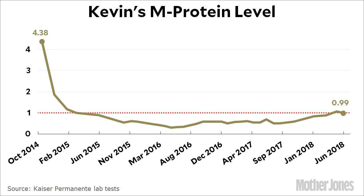
After one week of the new chemo regimen, my M-protein level has already dropped 0.08 points, getting me below the crucial 1.0 level. It’s good to see a positive response so quickly. In other good news, now that I’m off the Revlimid my white counts are starting to rise too. My immune system is back in the normal range (barely) for the first time in over a year.
But there’s a cloud for every silver lining, isn’t there? Since the new cocktail includes my old nemesis Velcade, my neuropathy is already getting worse. There’s a new oral version of Velcade that’s easier on the neuropathy, but my doctor thinks it’s not as well proven to work in combination with my other meds. Blecch.
Today is guest catblogging day. This lovely white cat lives across the street from Thomas Starr King Middle School in Los Angeles, my mother’s alma mater. Here’s a blurb about King for all you non-Californians who have never heard of him.
In the second picture, the freckled arm reaching out to scratch the cat’s head is, of course, my mother. Who else would it be?
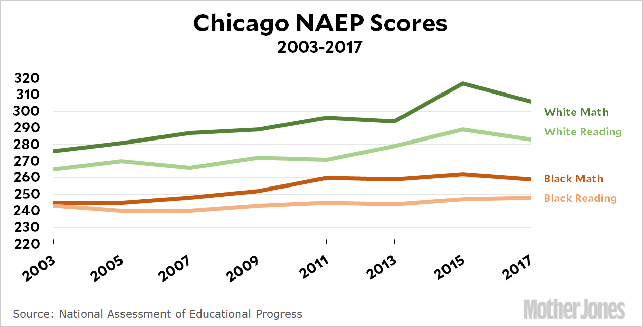
Bob Somerby has been highlighting education this week, and his main beef is with an article in the New York Times that says Chicago students have “learned the most” of any big-city school district. This is based on a study by Sean Reardon that shows Chicago students making great progress between third and eighth grades. I wrote about it a few months ago.
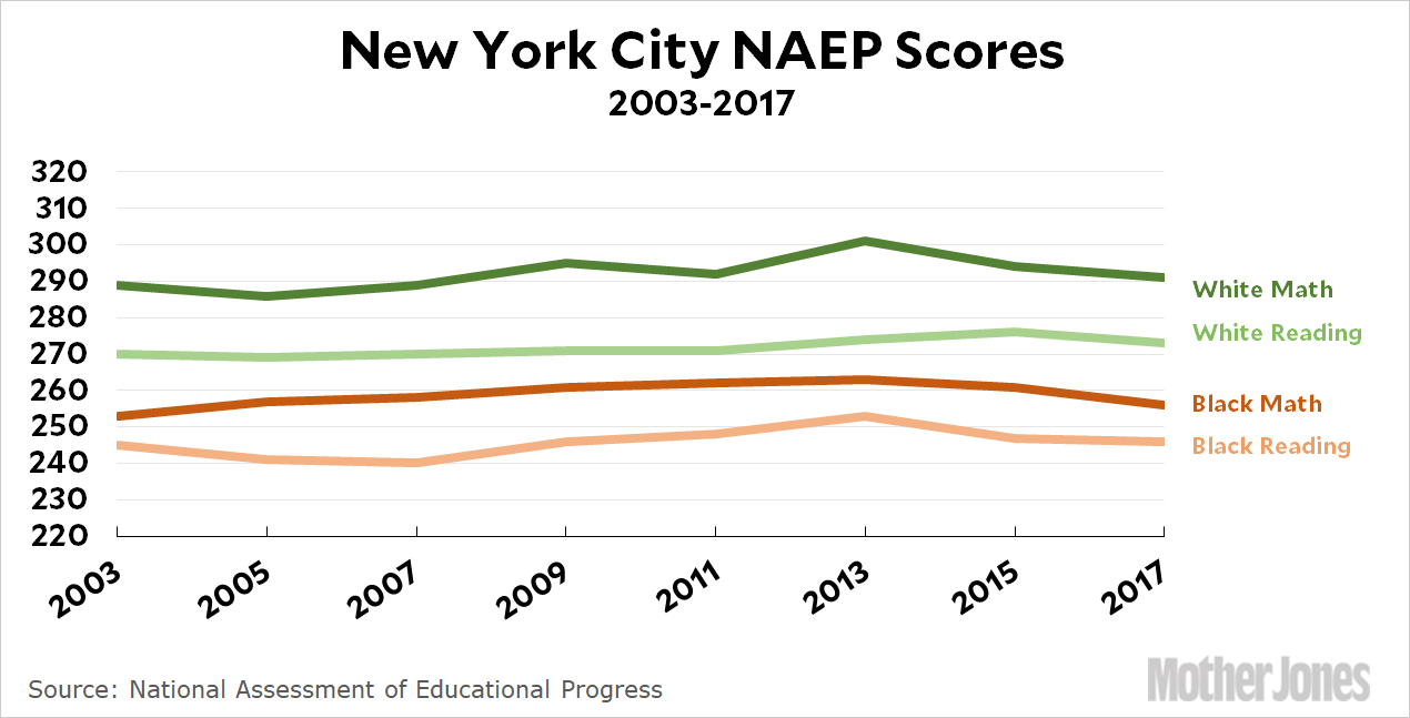
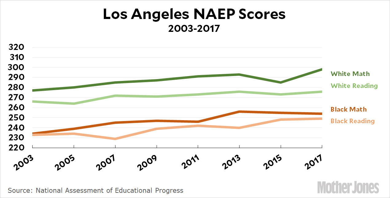
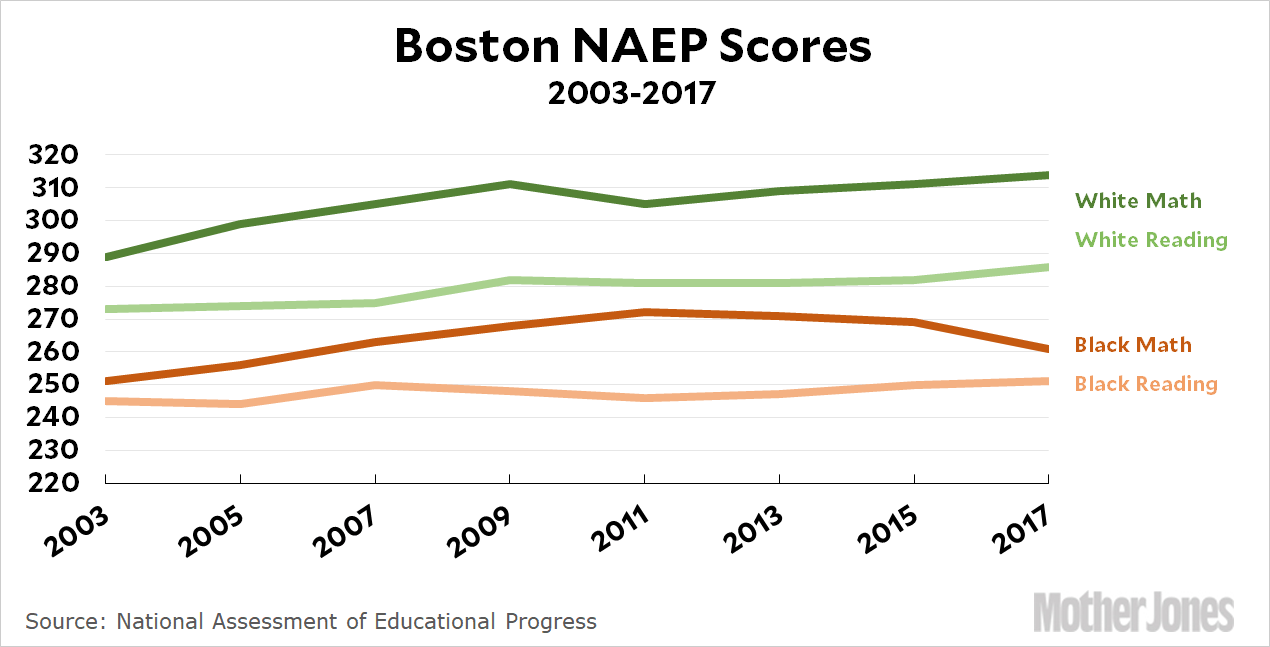
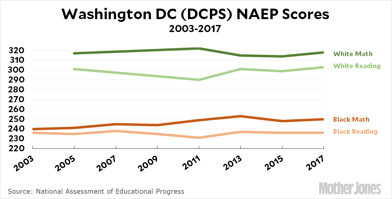
But the data in that study is for all students. What happens if you disaggregate white and black scores? You can guess how grim it looks. It also begs to be shown in chart form, which turned out to be far harder than I expected. I wanted to look at NAEP scores for a few big cities, and I ended up copying each year’s worth of data into a spreadsheet by hand. As bad as that was, when I was finished it really didn’t look like there was any great way to display the data. Eventually I decided to choose five cities and show each of them separately. Here they are for 8th grade students:
Obviously the main thing that jumps out at you is the huge gap between black and white students. But as big as the gaps are, some are way bigger than others. They range from about 30 points (three grade levels) in New York to an astonishing 60+ points (six grade levels) in Washington DC. This might be because New York does a more equitable job of educating its kids than DC, or it may be because the average income difference between whites and blacks is smaller than in DC. It’s not possible to jump to any conclusions based solely on this data.
Progress over time also varies a lot. New York has made zero progress in both reading and math for both blacks and whites. Ditto for Washington DC, with the exception of some progress in math for black kids. Chicago, on the other hand, really has done well: white kids have improved by 30 points in math and 18 in reading. Black kids have improved by 14 points in math and 5 in reading.
But it’s Los Angeles that’s shown the biggest progress across the board. White kids have improved by 21 points in math and 10 in reading. Black kids have improved by 20 points in math and 16 in reading. That’s the best progress among black kids among all five cities, and close to the best progress for white kids too.
Now, this is a very different thing from Reardon’s study. He was looking at progress from third grade to eighth. I’m showing you progress from 2003 to 2017. Both are useful. That said, the huge and persistent gap between white kids and black kids shows no real signs of improving over the past 15 years. In two cities the gap widened considerably and in two it narrowed a bit. (In New York, nothing happened.)
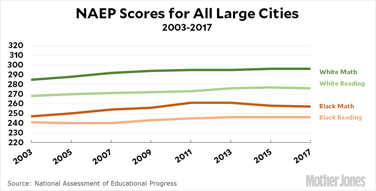
This is just a snapshot of five cities, but they’re five big cities from all over the country. And the story is roughly the same if you look at average scores for all big cities that NAEP tests: there’s been broad progress, but white kids have improved more than black kids. The black-white achievement gap has widened by about two points nationwide since 2003. We still have a disturbingly long way to go if we ever intend to give black kids a fair start in life.
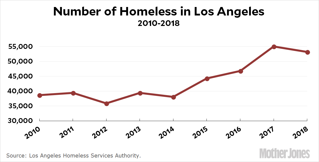
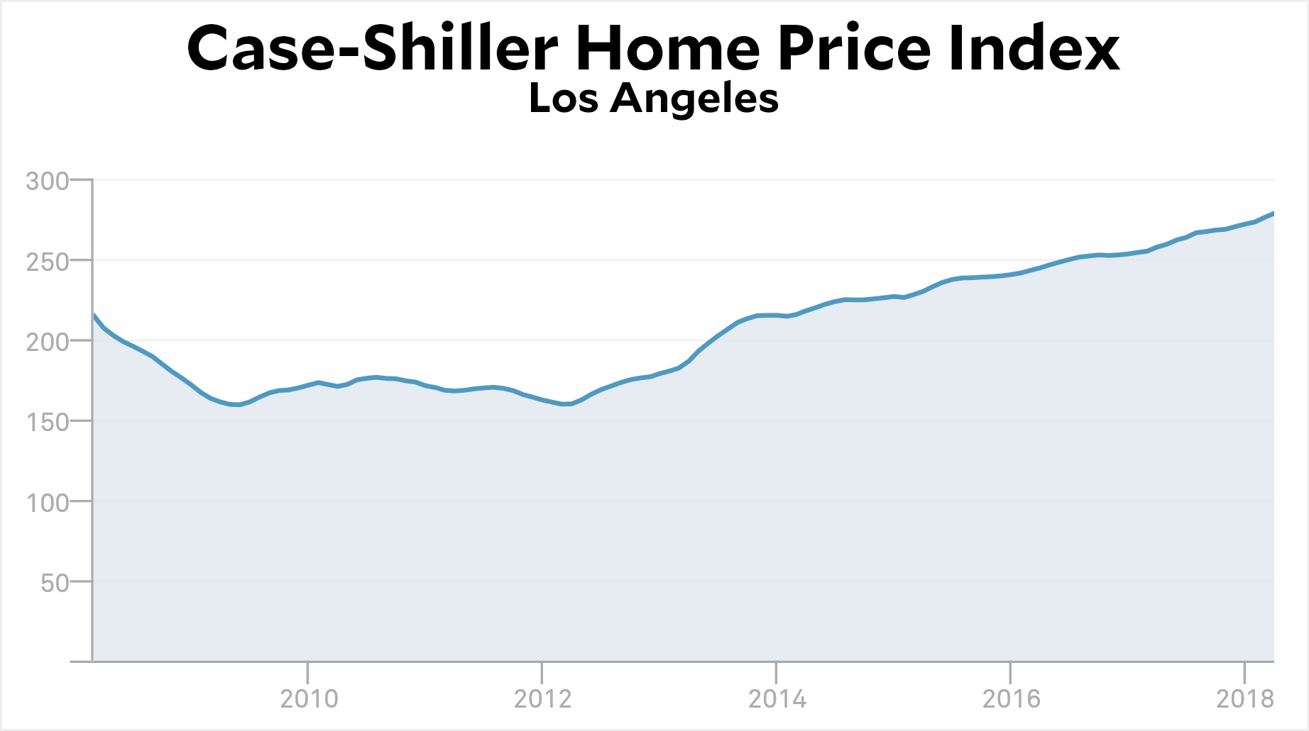
This data makes no sense. During the worst recession since World War II, the number of homeless people didn’t increase at all. Then, as the economy got into high gear, the number of homeless suddenly spiked. Why? Shouldn’t it be the other way around?
Is it because housing prices stayed flat during the recession and then started rising? Maybe:
This doesn’t quite fit the homeless data, but it’s close. And the Los Angeles Homeless Services Authority suggests it’s the problem: “Since 2000, median rent in Los Angeles County has increased 32% while median renter household income has decreased 3%.” I guess I can buy this, though it sure seems as if a greater likelihood of having a job would outweigh higher home prices, causing the number of homeless to go down during good economic times. Very strange.
Who is this man talking to?Pete Marovich/CNP via ZUMA
Once a month the Bureau of Labor Statistics releases new job numbers. The report is always released at 8:30 am, just like many other BLS releases, and before then it’s treated as extremely confidential, just like every other BLS release. How confidential? There are people who have built multi-million-dollar communications networks to get BLS numbers from DC to Chicago a few microseconds before anyone else. That’s how confidential.
A day ahead of time the numbers are shared with the Council of Economic Advisers, who often show them to a few members of the White House staff—including the president, of course. This is done so that the administration can be prepared to talk about them intelligently after they’re made public. Before then, everyone is very tight-lipped about things.
Until now. An hour before the May report was released, President Trump posted a tweet:
Looking forward to seeing the employment numbers at 8:30 this morning.
As Jason Furman notes, Trump wasn’t “looking forward” to seeing the employment numbers. He’d already seen them. He just wanted to telegraph that they were pretty good:
You should have gotten the employment numbers from the Council of Economic Advisers yesterday.
And if this tweet is conveying inside information about a particularly good jobs number you should never get them in advance from the Council of Economic Advisers again. https://t.co/Qd3ig89onT
In a mere three hours this has already been discussed to death, and I don’t have any unique insights to add. It’s pretty obvious why this is bad. It’s bad to telegraph a confidential report ahead of time. It’s bad to make people wonder if the lack of a tweet in the future means the numbers are bad. And it’s obvious to wonder if maybe Trump chatted with a few of his favorite friends about this during his copious executive time last night.
It’s equally obvious, I suppose, that Republicans will all rally around and insist that this is no big deal. And why not? They’ve already made it clear that as long as Trump gives them lots of conservative judges to confirm, they’ll defend anything he does. So this will disappear down the he-said-she-said rathole and a month from now we’ll all be glued to our Twitter feeds around 4:30 am to see if the president is going to give us a hint about the June employment numbers.
In the meantime, this has put Trump front and center, and that’s all that really matters to him. What a feckless cretin.
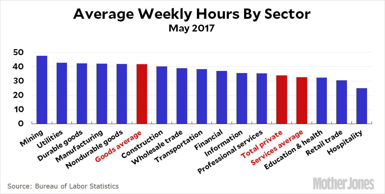
As I was browsing through the jobs numbers, I clicked on a table that I don’t usually pay any attention to: average weekly hours (including overtime) for production and nonsupervisory workers. These numbers don’t change much from month to month—which is why I don’t usually look at them—but this time I got curious about which sectors typically work the most hours. Here it is:
Miners (and loggers) work long hours! Hospitality, by contrast, averages 25 hours per week. How much of this is by choice I couldn’t say, but it’s still interesting to see how things shake out.
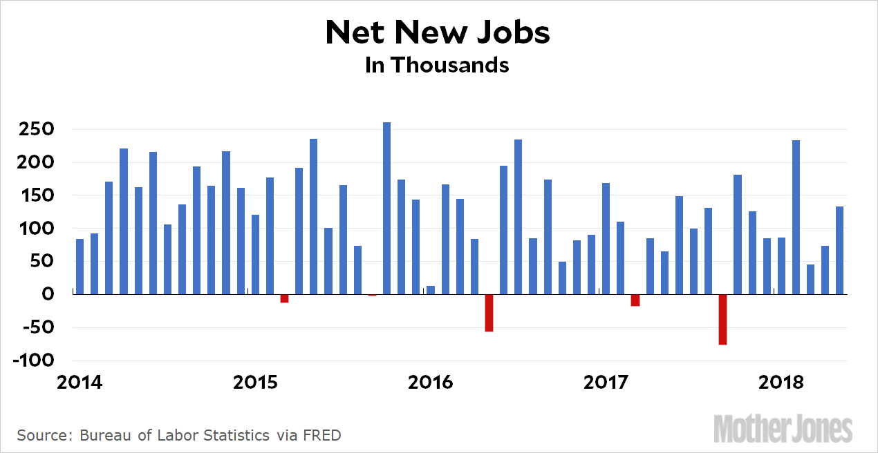
Thursday is evil dex day, which means I’ve been up all night. And you’re the winner! The BLS releases jobs numbers at 8:30 am, but I’m on the West Coast and I don’t roll out of bed until several hours after that. That means my take is usually dated before I even put it up. But not today: I’m awake and ready to give you the fresh take you need to start your day. Here we go:
The American economy gained 223,000 jobs last month. We need 90,000 new jobs just to keep up with population growth, which means that net job growth clocked in at 133,000 jobs. The headline unemployment rate dropped to 3.8 percent, but unlike last month this wasn’t due to people dropping out of the labor force. It was almost entirely due to lots of people getting jobs.
Wages of production and nonsupervisory workers were up at an annualized rate of 3.9 percent. With overall inflation running at about 2.4 percent, that’s a significant increase.
This is a very strong jobs report and it makes up for the disappointing April report. Our economic expansion appears to still be on track.
The second item that caught my attention as I was whiling away my day in the infusion center was this:
Investors on track to recoup entire investment in Chicago parking meters by 2021, thereafter enjoying 62 more years of gross revenue as pure profit https://t.co/XdILw1mywG
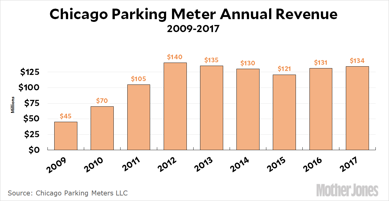
This is a famous and longstanding blunder that I’ve never bothered looking into very deeply. In a nutshell, Chicago sold off its parking meters to a private company back in 2008. In theory, there’s nothing wrong with this. A private owner might be more willing to invest in better technology and might be able to do some necessary but unpopular things that politicians can’t. Even if that’s true, of course, it’s still possible to waste the lump sum payment on operational expenses, which Chicago did, but that doesn’t mean the idea itself is stupid. It just means that you should do this kind of thing only if you have a genuinely good use for a big lump sum as opposed to a continuing revenue stream.
Aside from that, Chicago seems to have made one other big, fat mistake: they sold off their assets too cheap. This is where I’m stonkered. The street meters were put out to bid in 2008 and Morgan Stanley won with an offer of $1.2 billion—by far the highest. The city already had plans to raise hourly parking rates, so the potential revenue stream was pretty clearly set. Here’s how it’s turned out:
A revenue stream like this would generate a bid of well over $2 billion on the assumption of a normalish 6 percent discount rate. In the event, the Chicago inspector general figured that 7 percent was a more typical rate for other deals like this around the world, which still produces a value of $2.1 billion for the meters and suggests that Morgan Stanley’s winning proposal was nearly a billion dollars too low. Why weren’t there any higher bidders?
One possibility is that 2008 was just a terrible year to do this: it was right in the middle of a bank-driven financial catastrophe and the idea of monetizing revenue streams was in bad odor (remember CDOs and tranches and all that?). There were few investment funds that could toss around a billion dollars at the time, and Chicago was in such deep financial distress that they were way too eager to sell. Maybe that’s all it was. On the other hand, Chicago also seems to have gotten far less than fair value for a toll road they sold off in 2005. The recession sure can’t explain that.
There are lots of other complaints about the parking meter deal, some fair and some just griping, but this is the one I’m most curious about. Using such a wildly offbase discount rate is a Finance 101 kind of mistake. Was it just a dumb idea to do something like this at the worst possible time for monetizing a revenue stream? Or is there more going on here that I’ve never heard about?
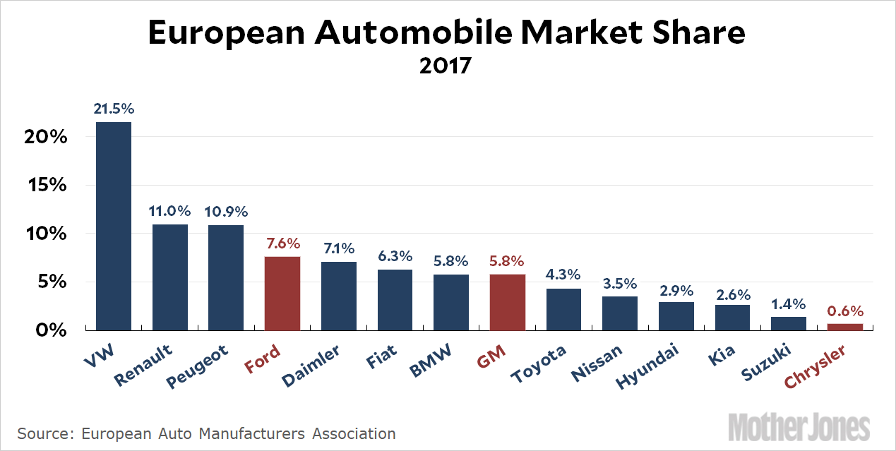
While I was being infused this morning, a couple of items caught my eye that I bookmarked for later research when I was back in front of my desktop computer. The first is American market share of the European auto market. Note that this has nothing to do with imports. Virtually all of the American cars listed here are manufactured in Europe itself:
For GM, I included the Opel badge that they sold to Peugeot last year. For Chrysler I pulled out the Jeep and Chrysler badges from Fiat/Chrysler.
Altogether, it adds up to 14 percent, nearly all of it from GM and Ford, which have been making and selling cars in Europe since before World War II. Despite this heritage, their European divisions have been disaster areas. Ford Europe has been rickety for long enough that selloff rumors are never far away; GM/Vauxhall was an enormous money pit for decades and finally did get sold off to Peugot, which then asked for half the purchase price back when they got a closer look at the books; and Chrysler has never had a presence at all (their current sales come almost exclusively from Jeeps).
So if you want to know why American car companies can’t seem to export cars to Europe, the first question to ask is why they can’t even sell cars that are made in Europe specifically for the European market. It’s not tariffs and it’s not regulations, since all EU carmakers operate on a level playing field. They just can’t seem to make good cars that Europeans want to buy. If they can’t do that, all the trade posturing in the world isn’t going to change things.
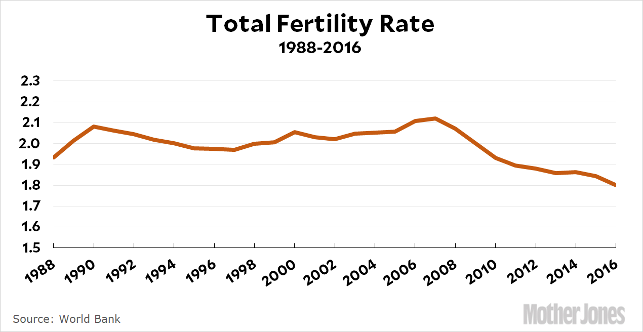
Over at Vox, Alex Press says that it’s not just teen birthrates that are down. Birthrates are down among all age cohorts. But why?
That brings us to the economics. Following a significant drop in the birthrate after the 2008 recession, women are continuing to have fewer children. Why hasn’t the rate recovered?
….Sociologists and economists agree that the economy plays a role. One study even found fertility rates to be a “leading economic indicator” — predicting downturns (and upticks) in advance — while another found the sharp decline in fertility rates to be “closely linked to the souring of the economy” that began around 2008.
One reason for the continuing low fertility rates, then, is that the economy hasn’t recovered. Sure, GDP may be back up and unemployment back down, but the economy isn’t just quantitative; it’s people, and quality of life is a critical measure of economic health. If women want children but think they can’t afford them, the lag in birthrates should raise alarm about just how much “recovery” the average American is experiencing.
OK, but what does the quantitative economy have to say? If a poor economy is really to blame, I’d expect to see a bigger fertility drop among working and middle-class women than among affluent women. The latter have experienced a more vigorous recovery, and they have less reason to worry about personal finances anyway.
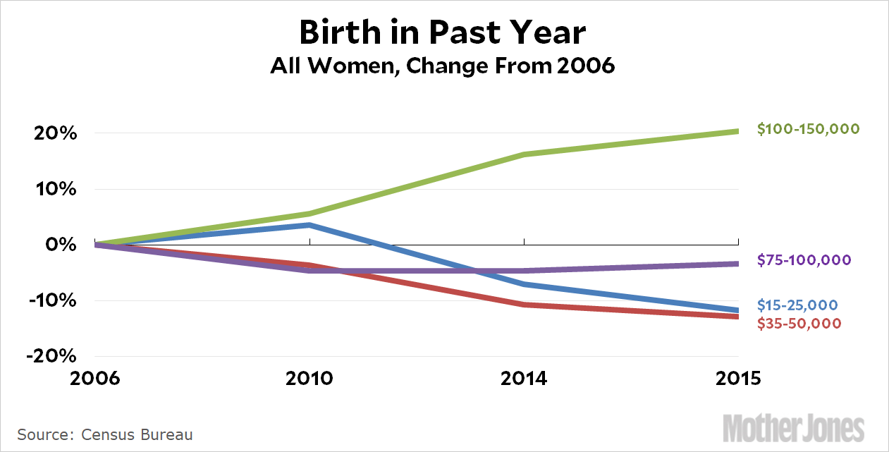
So what do we see in the data? Believe it or not, the Census Bureau has a fertility series broken out by household income. It only includes four years since 2006, but that’s enough to give us a rough sense of who’s having babies these days:
At a first pass, it looks to me like the story about the economy holds up. Among the upper middle class, the number of women who had babies in the past year has gone up—in fact, it never went down during the Great Recession in the first place—and among the middle-middle class the fertility rate has been nearly flat. However, among the working poor and the working class, fertility is down substantially compared to 2006.
This doesn’t prove that the Great Recession played a major role in the fertility downturn we’ve seen over the past decade, but it certainly makes the economic claim more plausible. And since millennials are currently the generation at prime babymaking age, it makes sense that it’s primarily a lousy economy for millennials that’s at fault.
And we respect that! But maybe you’re of a mind to support our work directly instead? We have until December 31 to raise the last $400,000 we need to keep our nonprofit newsroom running at full strength into 2026. Will you make a gift today?
We noticed you have an ad blocker on. Can you pitch in a few bucks to help fund Mother Jones' investigative journalism?
Billionaires own the media,
but they don’t own us.
At Mother Jones we know these aren’t conventional times, and they require unconventional coverage. That’s what deliver every day: fierce, independent journalism you can’t find elsewhere. Perhaps never in the history of our country has that been more necessary than now. But we can’t do it without reader support—your support. Please chip in today.