Australian ambassador to the United States Joe Hockey.Xinhua via ZUMA
Over the weekend the New York Times ran a story about the event that first sparked the FBI investigation of Donald Trump’s connection to Russia during the 2016 campaign. It turns out that campaign advisor George Papadopoulos got a little tipsy in London and told the Australian ambassador to Britain that Russia had lots of email dirt on Hillary Clinton. Sure enough, a couple of months later WikiLeaks released a huge cache of emails hacked from the DNC server.
Today, the Sydney Morning Herald confirmed the story and advanced it a bit:
The ambassador to the United States Joe Hockey personally steered Australia’s dealings with the FBI on explosive revelations of Russian hacking during last year’s presidential campaign….It is also understood there is now annoyance and frustration in Canberra that the High Commissioner to Britain Alexander Downer has been outed through leaks by US officials as the source of information that played a role in sparking an FBI probe into the Trump campaign’s dealings with Moscow.
So Papadopoulos told Downer, who reported back to Canberra, who then instructed Hockey to tell the FBI about this. And that’s when the Trump-Russia investigation started.
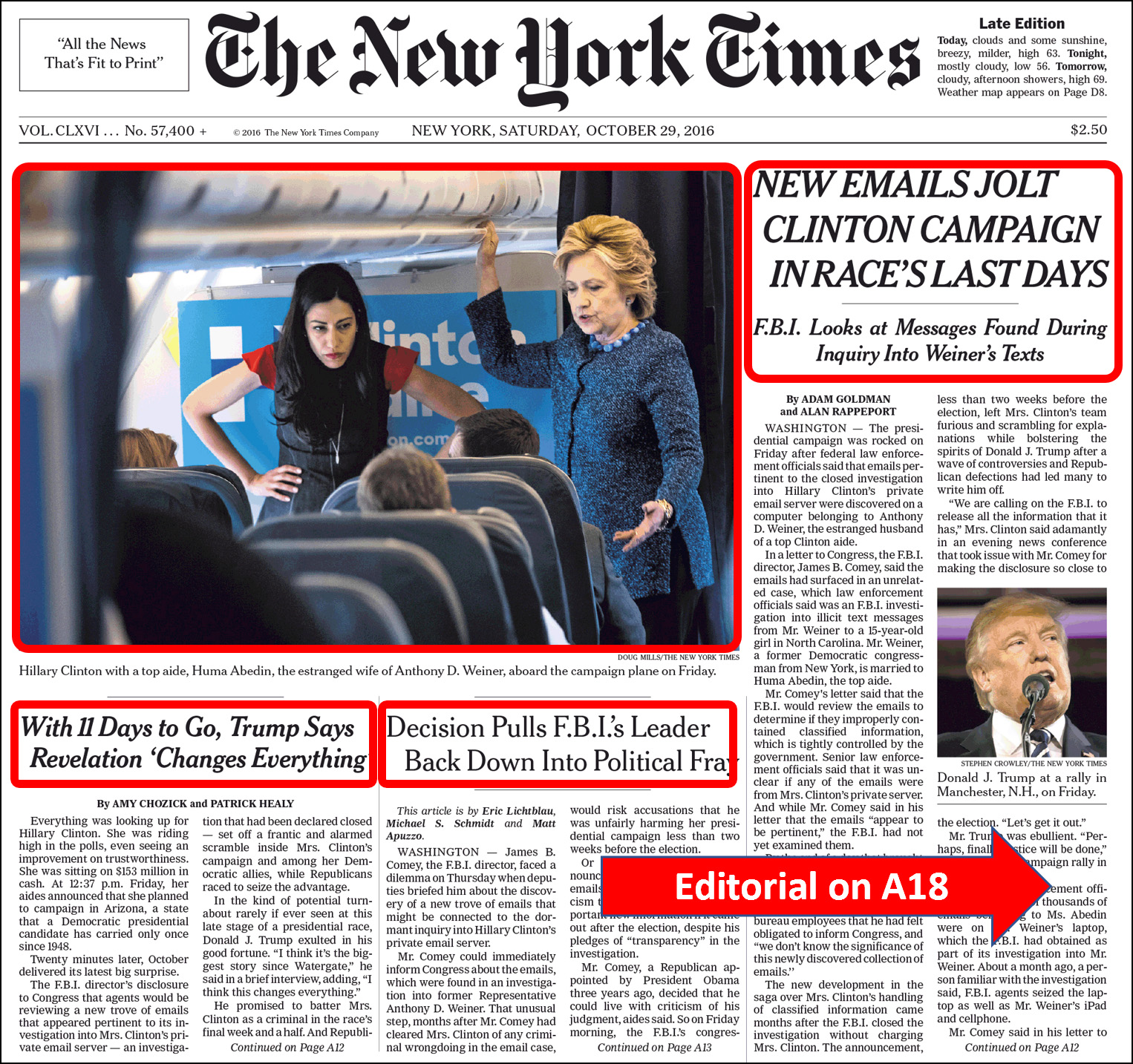
Unfortunately, we didn’t really know this when it happened. The Times was busy telling us the FBI investigation had found nothing and then giving over its entire front page to Hillary Clinton’s emails—even though there was zero evidence at the time that any new emails had been discovered. Oh well. Bygones.
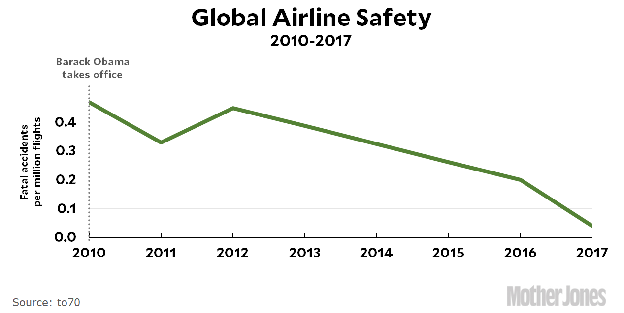
I’m just joking, of course. I don’t know if Obama had anything to do with this in the United States, let alone the entire world. But in Donald Trump’s latest tweet he takes credit for the 2017 number because he has been “very strict on Commercial Aviation.” Uh huh. I guess he must have heard about this on Fox & Friends this morning.
Monica Winston adjusts to her tent in a tent city set up in San Diego. A Hepatitis A outbreak is one of the reasons the tent city was created.John Gastaldo via ZUMA
In theory, the budget reconciliation process was intended to be used for passing budgets. But you only get one of them per year, and Republicans used reconciliation in 2017 for health care and in 2018 for taxes. That’s why they’re now stuck needing some Democratic votes for a bipartisan budget resolution. But what about next year? Will Republicans use the 2019 reconciliation process for the 2019 budget, or will they try to pass a two-year budget resolution that would free up reconciliation for something else? Yuval Levin has some ideas:
Both President Trump and Speaker Ryan have talked at various points lately about wanting to take up welfare reform….This question of whether there will be a 2019 reconciliation bill is crucial to the question of the 2018 Republican agenda because it would establish the boundaries of the possible. If they do pass a reconciliation bill, Republicans would probably use it to create room for a party-line welfare-reform effort. This would likely amount to a proposal for devolving funding and design flexibility over some of the major federal welfare programs to the states while attaching some work requirements to most of them.
I agree. Levin is a little surprised that with tax reform out of the way, Republicans seem at sea about what to do next. I’m less surprised, since the Republican Party has basically been the anti-tax party for years, with little more truly propelling them forward. But welfare “reform” could be the ticket. From Donald Trump’s viewpoint, it helps him with his working-class white base, which has always hated welfare because they think it’s just free money for lazy black people. From the viewpoint of fiscal conservatives who aren’t especially energized by racial animus, it’s a way of cutting spending. And for the neocon wing, perhaps it’s a way of freeing up some dollars for the military. Like tax reform—and unlike health care—it’s something that has a chance of bringing together every wing of the party.
Will Republicans do this? Like Levin, I don’t know. If Democrats make the budget process painful and refuse to pass a two-year resolution, Republicans might surrender and just use next year’s budget reconciliation process for the budget. But here’s a prediction: if Republicans do decide to go after welfare, they’ll target the parts of it that are disproportionately used by blacks and Hispanics. I don’t know what those are, but I’ll check into it later and come up with a more specific prediction.
These are not necessarily the top ten best quotes of the year. They’re just the top ten among those I happened to have posted as a Quote of the Day. They’re in no special order.
Responding to Barack Obama’s suggestion that it’s a good idea to have an “edit function” before you tweet: I mean, he should be brought back by the marshals. Isn’t there some law that says presidents shouldn’t be attacking sitting presidents?
When Trump was campaigning, he said that the country’s low unemployment numbers were fake. But now that he’s president and these are his numbers, he feels very differently: When we got those great reports, I kept saying—you know, those numbers were 4.2, 4.3—I said, for a long time, they don’t matter. But now I accept those numbers very proudly. I say they do matter.
Bannon explains to Joshua Green why the Trump campaign decided not to renounce white nationalism too strongly: We polled the race stuff and it didn’t matter.
Attorney General Jeff Sessions can’t believe that a federal judge in Hawaii has the same powers as any other federal judge: I really am amazed that a judge sitting on an island in the Pacific can issue an order that stops the President of the United States from what appears to be clearly his statutory and Constitutional power.
Away from the fog of the campaign, Patrick Murphy, owner of Bagel Barrel in Doylestown, Pennsylvania, sees the light on Obamacare: I can’t even remember why I opposed it. Everybody needs some sort of health insurance.
Trump explains that when he originally said NATO was obsolete, it was only because he didn’t know anything about it: Wolf [Blitzer] asked me about NATO, and I said two things. NATO’s obsolete — not knowing much about NATO, now I know a lot about NATO — NATO is obsolete.
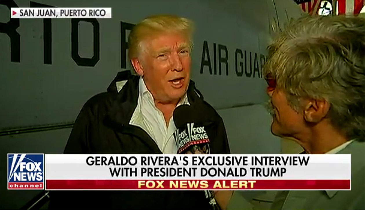
Trump to Geraldo Rivera: They owe a lot of money to your friends on Wall Street and we’re going to have to wipe that out. You’re going to say goodbye to that, I don’t know if it’s Goldman Sachs but whoever it is you can wave goodbye to that.
Mick Mulvaney to CNN, reinstating Puerto Rico’s debt after all: I wouldn’t take it word for word with that.
Donald Trump, bored and restless during a weekend alone at Mar-a-Lago, decides to liven things up. Terrible! Just found out that Obama had my “wires tapped” in Trump Tower just before the victory. Nothing found. This is McCarthyism!
Here are my ten favorite lunchtime photos of 2017. They are not in any particular order.
Have I mentioned before how much better they look on a 4K monitor? Not to mention that everything else looks better too. After using one for the past year, ordinary “his-res” monitors now seem like browsing the internet with foggy glasses on. If this is something you care about, run, don’t walk to your favorite computer dealer and get a 4K monitor. They’re less than $300 these days.
#1. Sunset at the old Tustin Marine Corps Air Station.
#2. Boy at Huntington Beach.
#3. Fireworks on the 4th of July.
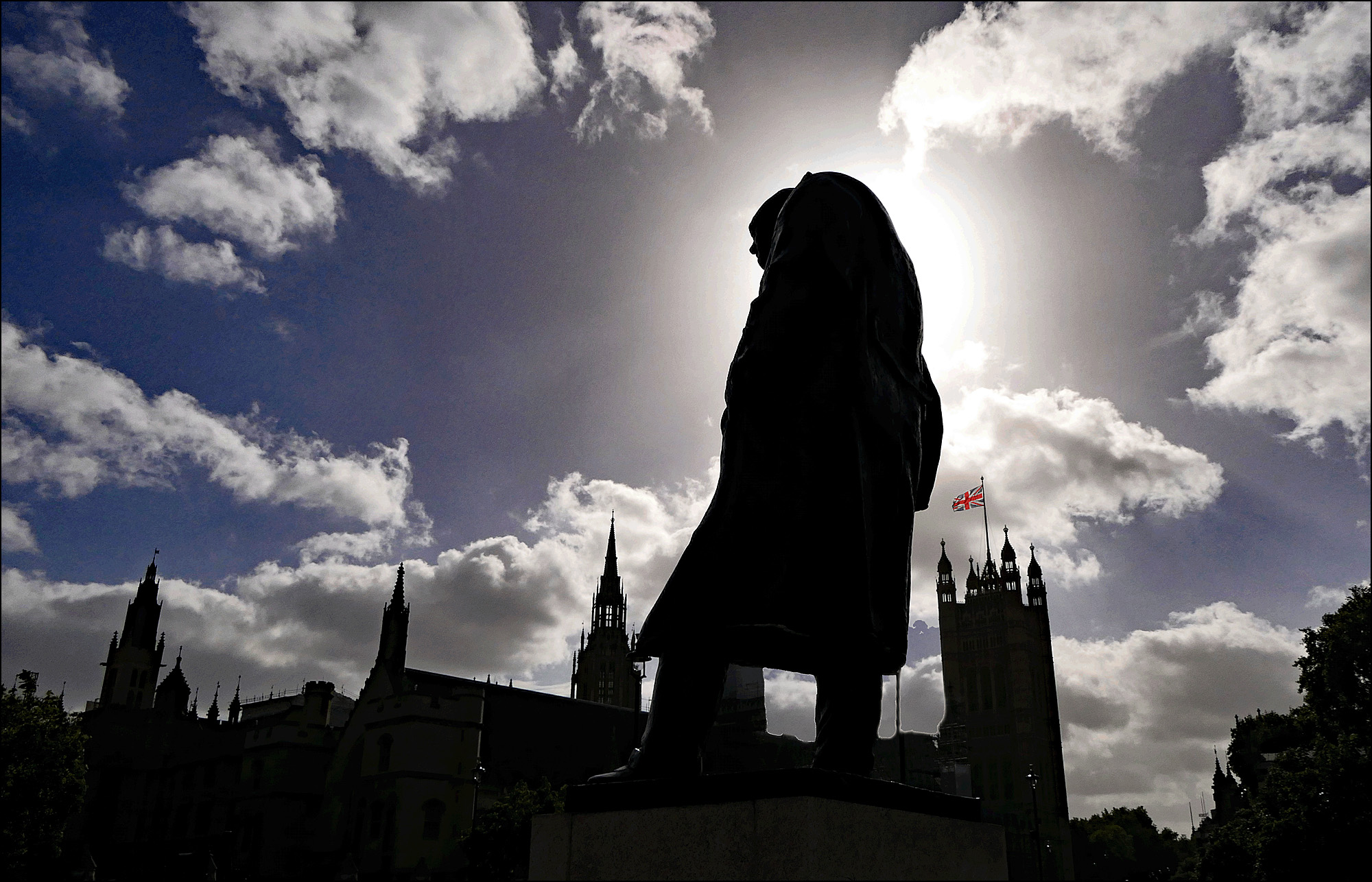
#4. Winston Churchill and the Houses of Parliament.
Here are my ten favorite charts of 2017. They’re in no particular order. Some are here because they represent something important, and some are just interesting tidbits. But they’re all things that are worth knowing.
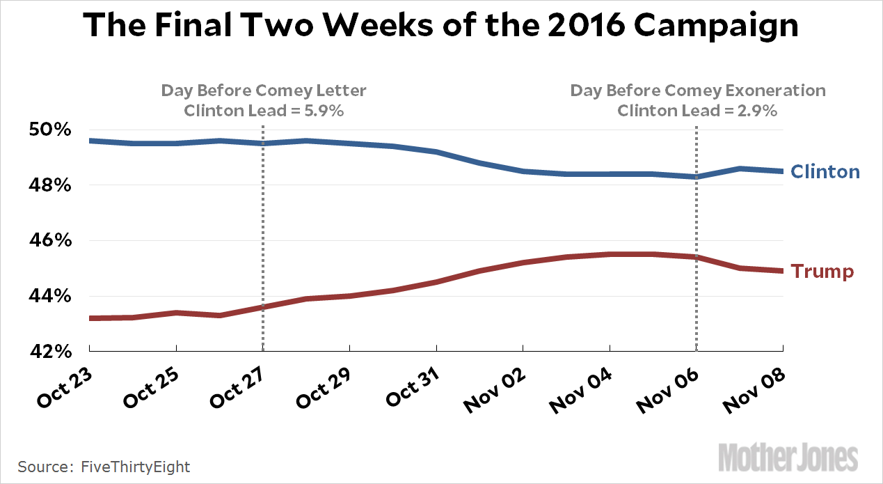
#1. James Comey.
Yes, it was James Comey who was responsible for putting Donald Trump in the White House. The whole, overwhelming case is here if you feel like reliving your worst nightmare once again.
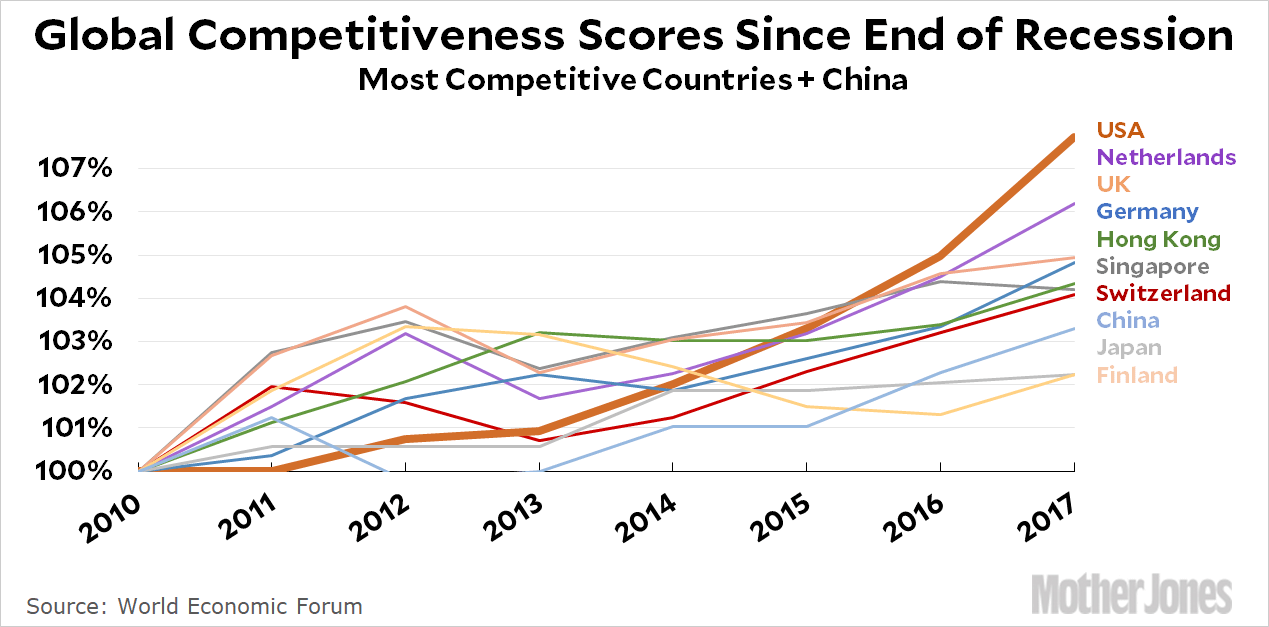
I don’t think anybody would say that the US response to the Great Recession was ideal. The stimulus was too small, homeowners were ill treated, bankers got off scot-free, and middle-class household wealth plummeted. That said, we probably handled it better than anyone else, thanks mostly to Nancy Pelosi, Barack Obama, and Ben Bernanke. Remember that.
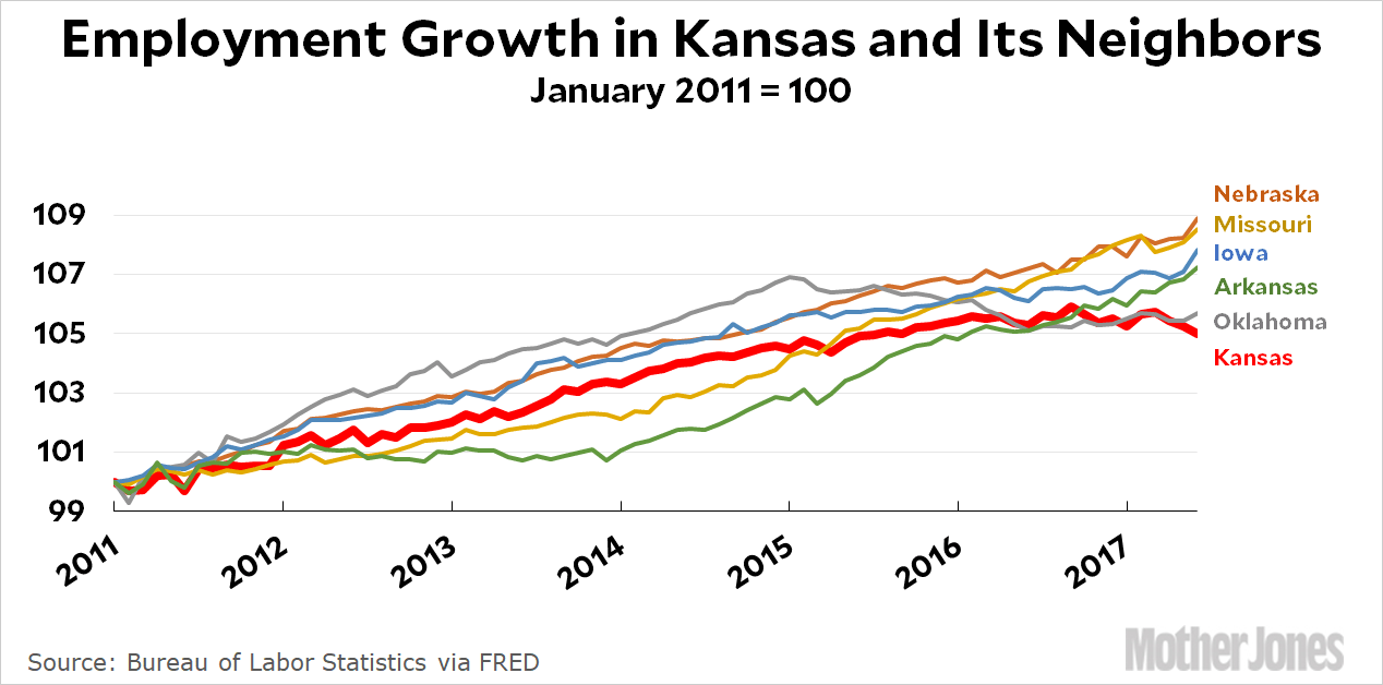
#4. Kansas.
It’s possible to run a real-world test of what happens when you adopt full-bore conservative economic principles, and Kansas did it. After electing right-wing zealot Sam Brownback governor, taxes on the rich went down; taxes on the middle class went up; and spending on social programs plummeted. “Our new pro-growth tax policy will be like a shot of adrenaline into the heart of the Kansas economy,” he said. It turned out to be more like a shot of cyanide.
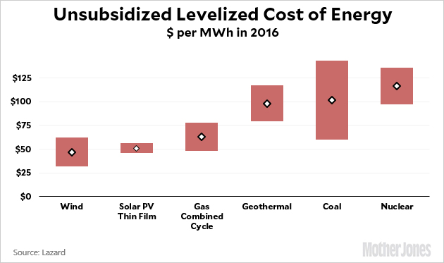
#5. Wind and solar power.
The true, long-term cost of wind and solar power has finally gotten to the point where it’s competitive with fossil fuels. In some areas it’s even cheaper, and for solar in particular the cost is going to keep coming down. To a certain extent, this means that Donald Trump’s plan to repeal Obama-era carbon regulations matters less than he thinks, since fossil-based power sources are rapidly becoming too expensive to bother with. This is already true of coal, and will probably be true of oil and gas before long too. In ten years, all newly built power plants will likely be based on renewable sources purely because they make the most economic sense. If we were smart, though, we’d use public policy to hasten that day.
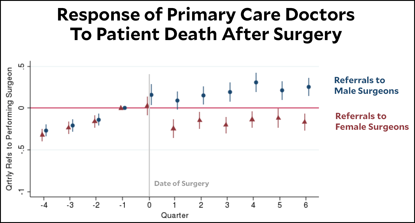
#6. Female surgeons.
When male surgeons unexpectedly lose a patient on the operating table, they suffer few consequences from their peers. After all, it’s one of those things that happens sometimes when you’re in a risky business. But when female surgeons lose a patient, primary care doctors take it as a reflection on their competence and reduce their referrals.
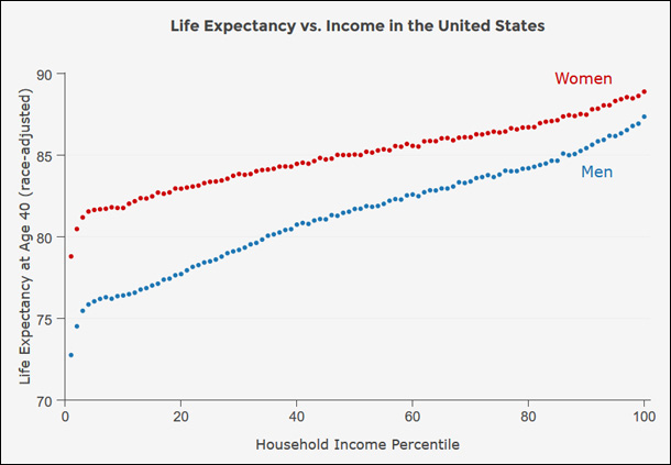
#7. Life expectancy.
In America, the rich live more than ten years longer than the poor. Keep this in mind the next time someone suggests that we should raise the Social Security retirement age. For the poorest Americans, it would mean they’d receive Social Security payments for only about six or seven years before they died. But the rich would barely notice it.
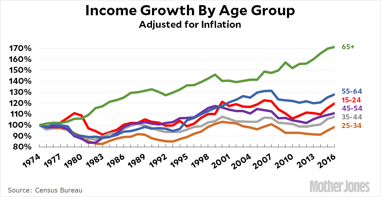
#8. Income by age group.
Over the past 40 years, the demographic group that has experienced the slowest income group is young adults. The elderly have seen the fastest income growth. It’s long past time that we focus a little less on seniors and a little more on why the young and middle-aged have done so poorly for four consecutive decades.
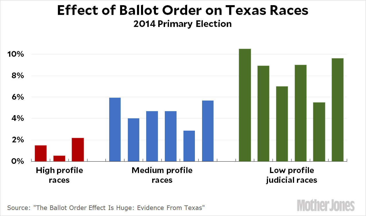
#9. Ballot order.
In high-profile races for offices like president or senator, it doesn’t much matter what order the names appear on the ballot. But for lower profile races, ballot order has a huge effect. The first name on the ballot can gain 4-10 percent more votes just for being first. Always randomize your ballots, even within precincts
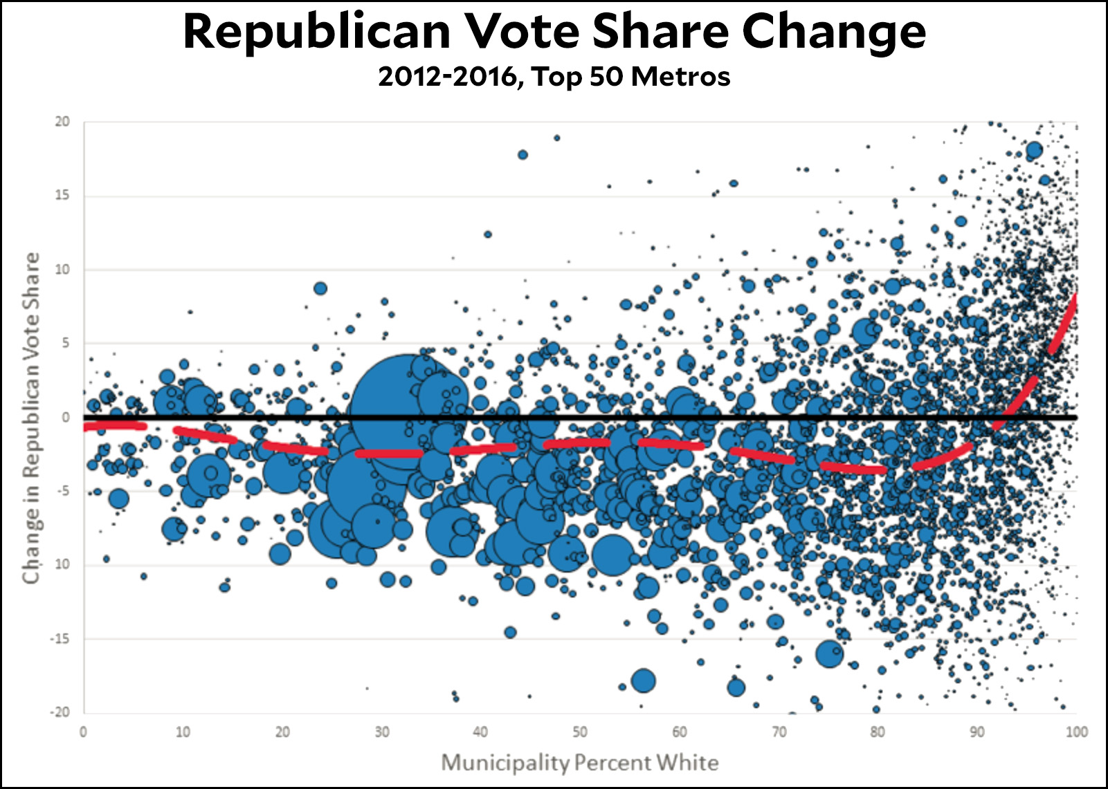
#10. White votes for Donald Trump.
Donald Trump won a lower share of the white vote than Mitt Romney did in 2012. This was true not just nationwide, but in most towns and cities within the top 50 metro areas. But there’s one place where Trump did really well with whites: in communities that are more than 90 percent white. As with so many other things, fear of minorities decreases when people see minorities on a regular basis. It’s in places where they aren’t visible that white fear can be most easily stoked by outfits like Fox News and demagogues like Trump.
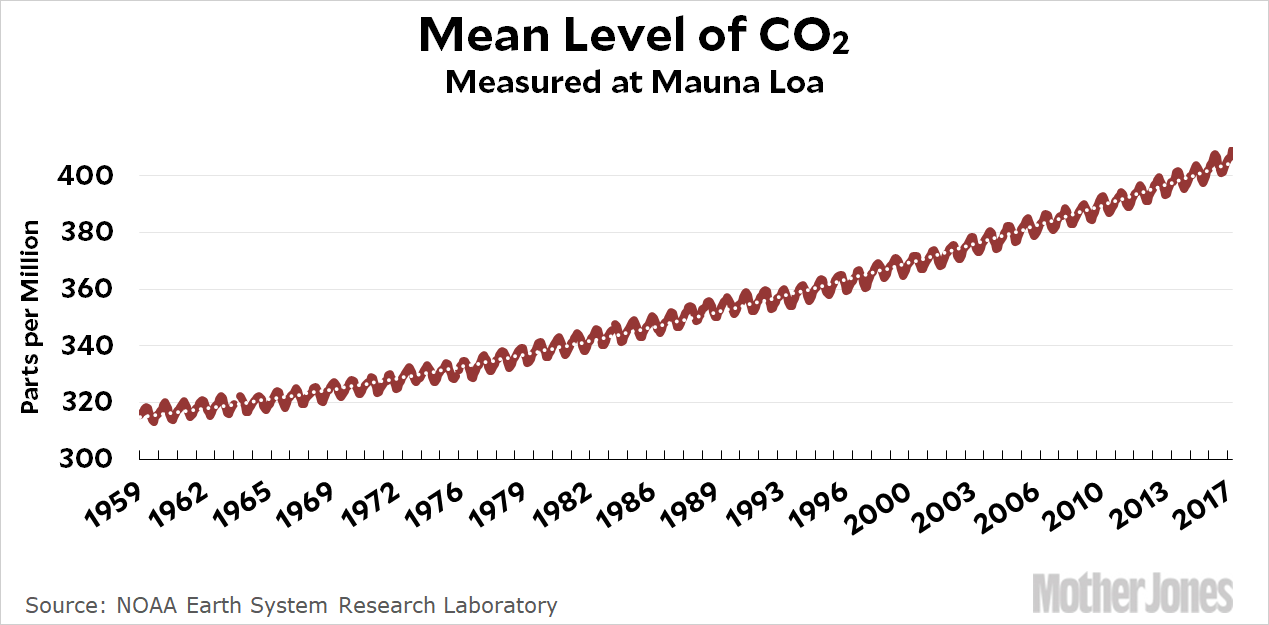
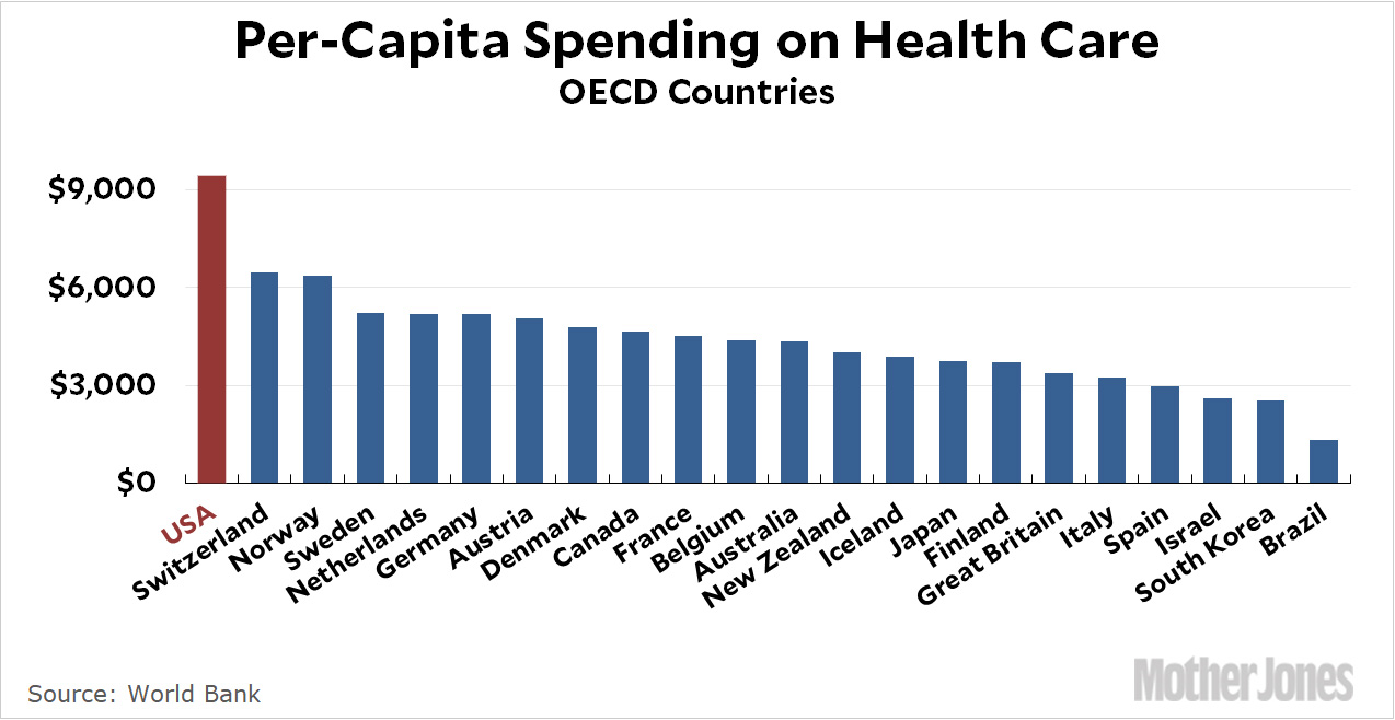
And two bonus charts.
These should be at the top of everyone’s mind all the time, every year. The first is CO2 emissions. The second is America’s astronomical cost of health care.
Earlier today I criticized Ross Douthat’s column acknowledging that he was wrong about deficits. That’s fine, some might say, but what about you, big talker? Any big mistakes you’d like to own up to this year?
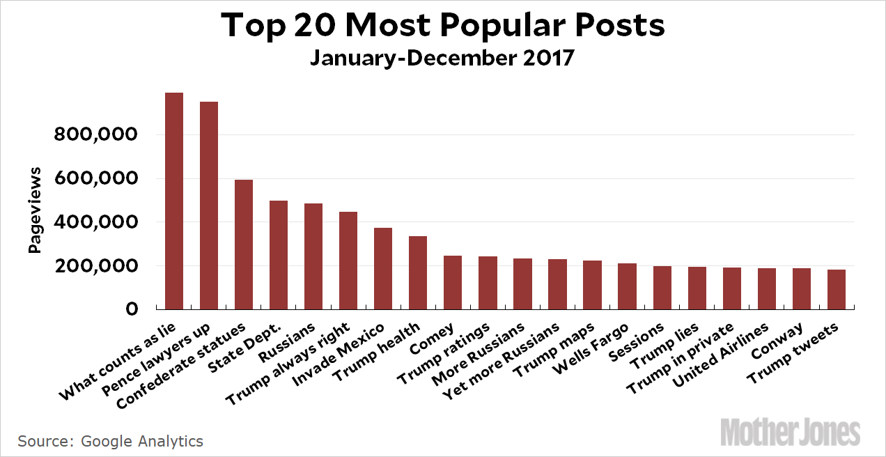
Sure. The problem here isn’t ego, it’s laziness. I don’t have even the haziest recollection of what I’ve written this year, and there’s no easy way to scroll through all my posts and scan them for my biggest bloopers. I suppose I could crowdsource this, but it’s a little late for that. However, I can get a list of my 20 most popular posts and then look through them to see how they hold up. How about that? First, here they are in chart form:¹
I got almost a million pageviews for my most popular post, but it topped out tantalizingly short at 990,000. Oh well. Here they are, one by one:
What Does It Take to Finally Call a Lie a Lie? We Have an Answer. On January 23, the New York Times wrote a story about Donald Trump’s claim that he won the popular vote and actually labeled it a lie in the headline. I offered up a test for judging the deceptiveness of a statement, and I stand by it as useful. As for whether the media is finally willing to label Trump’s lies as lies, I’d say (a) they mostly are, and (b) we’ve gone so far beyond this that it kind of doesn’t matter anymore.
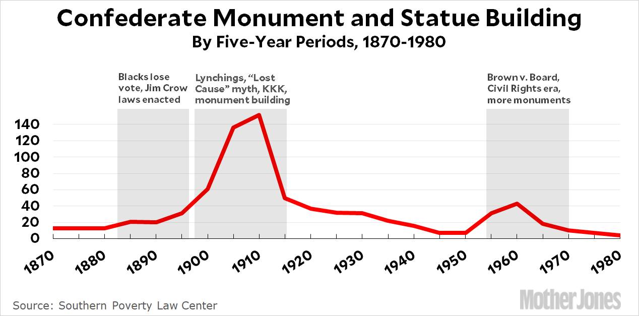
The Real Story Behind All Those Confederate Statues. They were erected long after the Civil War, mostly as monuments to Jim Crow and white supremacy, not really as memorials to the war dead. I think I revised some of the details of this as I wrote about it further, but I basically got it right.
Donald Trump Is Always Right. This is about one of those stream-of-consciousness Trump interview, the theme of which is Trump has been right about everything. He still seems to believe this.
President Trump Likes Graphics and Maps. Look, I like graphics and maps too. The problem is that Trump seems to like only graphics and maps, not any of the associated words that would help him understand the world at more than a sixth-grade level. As the year has progressed, it’s become more and more obvious that this is true and Trump almost literally knows nothing about anything these days.
Trump “Considering” Intriguing New Way to Lie With Statistics. This was about a Trumpian proposal to change the way trade deficits are calculated so it would make the trade deficit look worse and, I dunno, give him an excuse to kill NAFTA or something. In the end, this never happened. Trump appears to have decided that the best approach is to simply claim that things have gotten better (or worse) without bothering to provide any kind of evidence.
In Private, It Turns Out That Trump Is Pretty Much the Same. This one was about Trump’s meeting with German officials, in which he demonstrated appalling ignorance of just about everything. As near as I can tell, Angela Merkel’s response to this has been to simply try to ignore Trump as much as possible and hope that America comes to its senses sometime soon.
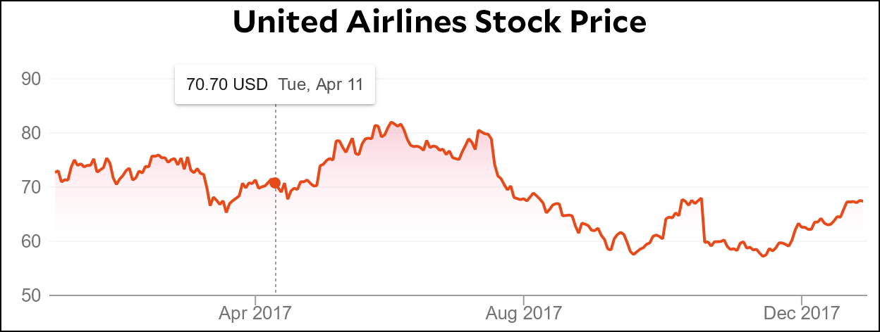
United Airlines Lost a Billion Dollars This Morning. This was about United’s stock market plummet the day after they dragged a passenger off one of their planes. They lost a billion dollars in market cap that day, but: “On the bright side for UAL, this will probably last only a day or so….Tomorrow some other airline will do something outrageous and we’ll all vow never to fly them ever again.” It looks like I was right about that:
Donald Trump Edits a Tweet. This was an exegesis of a tweet that Trump deleted and then reposted with a few edits. It was speculative, and I guess I’m still not sure why he did it.
Now, some of you are going to say I cheated because the posts where I got something wrong aren’t likely to be among my most popular. That’s possible. So let’s crowdsource this after all. Go ahead and nominate my worst howlers of the year. Depending on what I have going on tomorrow, maybe I’ll take on a few of them.
¹Because, come on, what kind of Kevin Drum roundup post would it be without a chart?
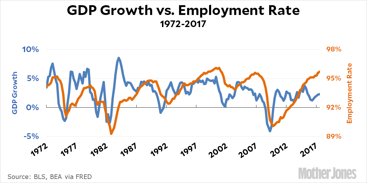
First, the choice of tick spacing and positioning makes no sense. If you’re making a political point, you should use four-year spacing aligned with presidential administrations. If you’re not going to use administrations, just label the decades and use tick marks between them. Five-year spacing on the twos and sevens is something clearly decided by software; it’s not how humans think.
Second, there should be vertical gridlines. If precision in reading the data is important enough to add a horizontal grid, it’s important enough to add a vertical grid as well. I’ve been seeing a lot of graphs with half-assed grids lately, so I assume this is the default in some graphing software.
Third—and I admit this is a personal peeve—there’s no point in tilting the x axis tick labels. It’s just an affectation. The years are tilted 30–35° from the horizontal, which means they take up over 80% of the space that untilted labels would. The savings isn’t worth it, and it draws attention away from the data.
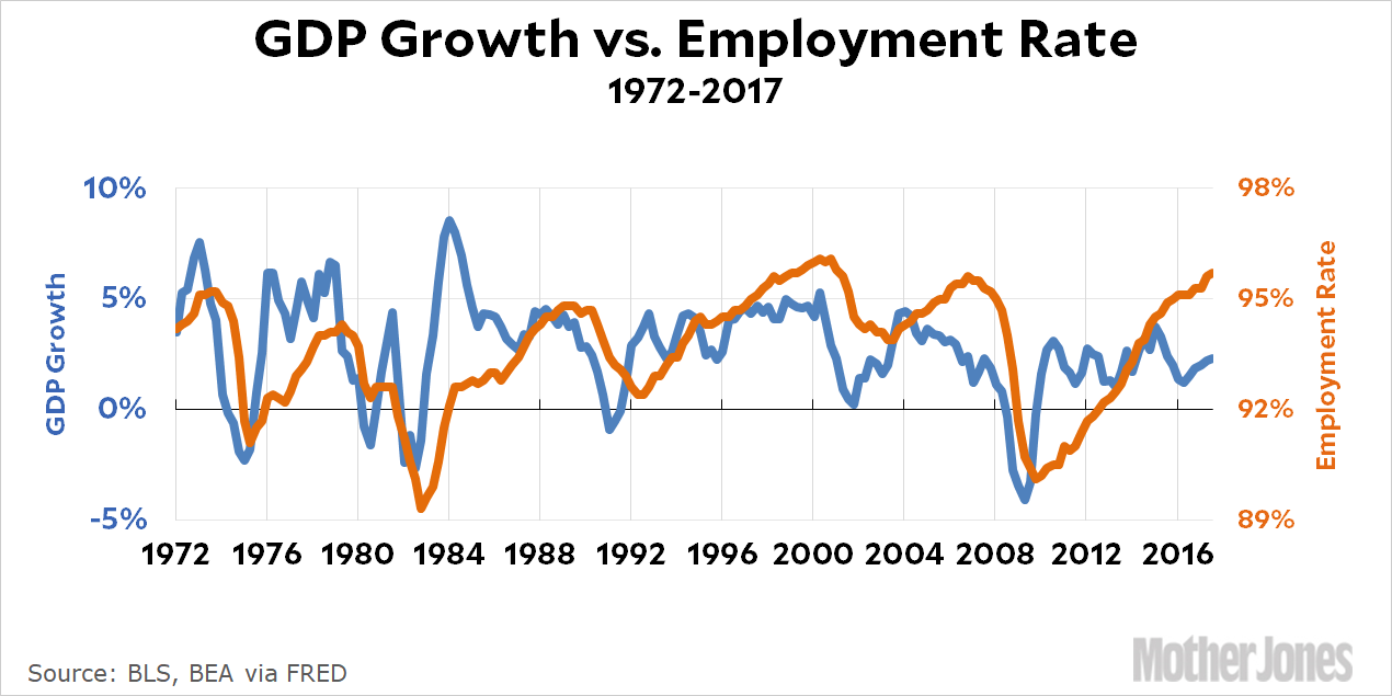
Here’s the chart replotted using Dr. D’s preferences:
And here are my responses to his three points:
I wasn’t making an explicitly political point in this chart, but yes, sometimes I use odd intervals. However, this is very much not a software default. I am constrained by the software to include the starting year, and what I normally try to do is pick intervals that allow me to show the final year as an endpoint. In this case, using 5-year intervals takes me from 1972 to 2017, which makes it absolutely clear that the chart ends at 2017.² Now, sometimes this means choosing odd intervals. Sometimes it means messing a bit with the start of the chart. And sometimes I just can’t do it because the starting point is important and the span from start to finish is a prime number. I hate when that happens.
Vertical gridlines, eh? Maybe. Visually, I’m not a fan of vertical gridlines, but they do help help readers who actually want to look at the data carefully.
I use tilted x-axis titles when straight titles won’t fit. The replotted chart above, for example, is hard to read with the numbers so close together. I could use a small font, of course, but I prefer not to since lots of people read this stuff on smartphones. If you watch carefully, you’ll see that I regularly use straight titles when I can. Usually, though, I prefer to show lots of year tickmarks (for the same reason Dr. D likes vertical gridlines), and that means tilting them to make them readable.
The rest of his post is about dual y-axes, and I’ll just say that I find it unconvincing. He basically suggests taking the chart above and making it into two charts, and then putting one right above the other. But that’s two charts, which is precisely what I’m trying to avoid.
So what is Dr. D’s real problem with dual y-axes? It’s the same as Kieran Healy’s: “The problem with this kind of plot is the freedom it gives the chartmaker to fiddle with the scales of the axes to make the items being plotted look more or less correlated.” It’s true that an explicitly dishonest chartmaker can take liberties with this stuff, but a dishonest chartmaker can do that with anything. Let’s worry instead about honest chartmakers. My response is simple: yes, you can stretch and shift the axes to make a correlation look better, but there’s nothing wrong with that. It just means you’re plotting a regression of the type y = ax + b, and that’s fine. Every regression involves constants. If you can make it work visually, you can make the algebra work too.
In any case, I think that charts like this are never meant to be anything more than suggestive. If you want to show a real correlation then you have to do the work to show a real correlation and then justify your belief that it means something. If you do, then a chart like this can be a nice visual illustration, but that’s all.
¹This is a joke.
²Is this worth it? I think so, because in a chart for a lay audience you really need to make everything explicit or else people will have questions. Did you include the most recent data? Is it adjusted for inflation? Etc. All of this needs to be as clear as possible in the chart itself, not just in the text.
In the spirit of the longer view, I want to use this confessional column to reach back to the early Obama years, and the arguments I made then that assumed the urgency of deficit reduction, the pressing need for honest liberals to champion major tax increases and for honest conservatives to go all-in for major entitlement reform.
….But now I think this reasonable view was wrong. Not completely, in the sense that many of the deficit-reducing policies I supported — means-testing entitlement programs, eliminating tax breaks for the wealthy and upper middle class — I still support, because I think the money involved is presently misspent. But I was wrong in the priority that I gave the deficit relative to other issues, wrong to discern a looming “fiscal precipice,” wrong in some of the criticism I leveled at both George W. Bush and Barack Obama for failing to care enough about balancing the nation’s books.
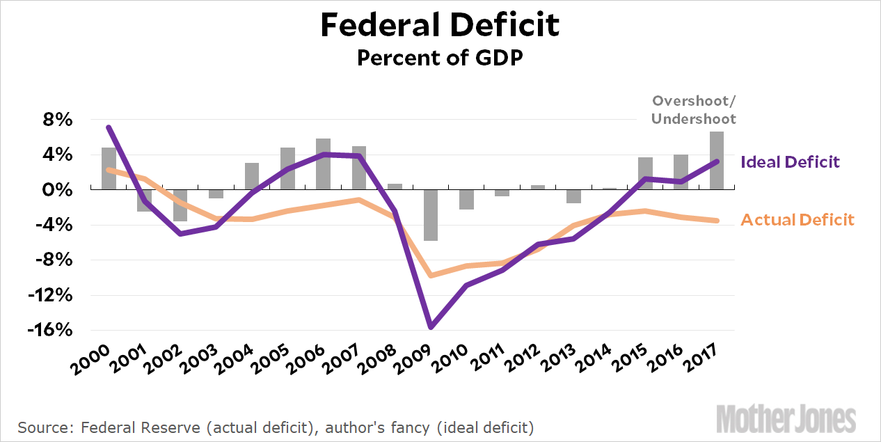
Paul Krugman approves, but I’m going to be more grinchy about this. The lesson to learn from the past decade isn’t that deficits are OK. The lesson is that broad fiscal policy is a tool, like anything else, and ideally it should be used to keep the economy on an even keel by running deficits during recessions and surpluses during good times. I have created my own “Kevin Rule” for the ideal deficit, which I am not going to share with you because it’s not to be taken seriously. This is for illustrative purposes only. But I think it provides at least the right sense of how we’ve been doing:
Roughly speaking, the gray bars show how far wrong we’ve been. During the Great Recession, we needed more deficits. We undershot. Starting around 2011 we did pretty well for a few years. But then we started overshooting on deficits. Right now we should probably be running surpluses of 2-3 percent of GDP.
Obviously you can argue about how high federal deficits and surpluses should be. In fact, that’s the whole point of this post: to get people talking about just what kind of targets we should have and what they should be based on. Inflation rates? Potential GDP? Bond markets? Or do you think the whole countercyclical theory of deficits is as antiquated as the gold standard, and monetary policy is all that matters? Douthat nods toward this in his column, but it deserves much more explicit discussion.
For conservatives, the hardest part of all this is understanding what this means in real life: the only practical way of controlling deficits is via taxes. Entitlement reform won’t do it because that’s permanent and long-term. Nor can permanent discretionary spending cuts do the job. You’ll have to argue for those things on their own terms. After all, the whole point of this exercise is that sometimes we need more spending and sometimes we need less. It would probably be a good idea to increase the size of spending stabilizers (i.e., things like unemployment compensation, which automatically go up during a recession), but there’s a limit to how much you can do on that score.
So that leaves taxes. We can still argue over the best long-term tax structure, but theological arguments about tax rates would have to end. Everyone would have to agree on temporary tax surcharges during good times as well as temporay tax rebates during recessions. This is really the only practical way to keep deficits in the ballpark of where we want them to be.
I know perfectly well that this change of heart will not happen anytime in the near future. But if you can’t dream on New Year’s Eve, when can you?
And we respect that! But maybe you’re of a mind to support our work directly instead? We have until December 31 to raise the last $400,000 we need to keep our nonprofit newsroom running at full strength into 2026. Will you make a gift today?
We noticed you have an ad blocker on. Can you pitch in a few bucks to help fund Mother Jones' investigative journalism?
Billionaires own the media,
but they don’t own us.
At Mother Jones we know these aren’t conventional times, and they require unconventional coverage. That’s what deliver every day: fierce, independent journalism you can’t find elsewhere. Perhaps never in the history of our country has that been more necessary than now. But we can’t do it without reader support—your support. Please chip in today.