Pascal-Emmanuel Gobry has a long thread on Twitter that starts off with the fact that homeopathy is subsidized by the national health service in France:
To be clear: the government’s independent health agencies don’t make stuff up about homeopathy. But it is a lie by omission. It is taken for granted by ordinary people that national insurance will pay only for “legitimate” treatments.
Doctors willingly participate in the conspiracy because it’s easier to prescribe a patient a placebo for a tummy ache than explain that they should just tough it out.
This reminds me of a story. About five years ago I developed an unexplained breathing problem, and in addition to a pulmonologist I also saw a GP. My regular GP couldn’t fit me in, so I ended up seeing one randomly selected for me by Kaiser. On my first visit, she gave me a tubelike thing and some instructions about breathing exercises to do with it. On my second visit, when I reported that I had been doing the exercises religiously but they hadn’t helped, she suggested (a) that I might have some kind of lung inflammation at the “submolecular” level that MRIs couldn’t pick up, and (b) that if I was so inclined, I might head over to the health food store and buy a homeopathic remedy. At that point I closed off the conversation as quickly as I could and left.
Later on, when I saw my pulmonologist and told him about the breathing exercises, he told me to stop immediately because they would only make things worse.
There’s no point to this story except to wonder if perhaps my GP had been trained in France. On my charitable days, I assume she didn’t really believe in homeopathy but was only suggesting it as a placebo. That’s a little hard to credit, though, since the medical record of my visits—not to mention five minutes of watching me—pretty clearly suggested a physical problem, not some weird mental reaction.
Anyway, in case you’re curious, my problem was eventually solved by prednisone and time. But it was never cured completely. It’s still a mystery.
Texas’s acting secretary of state, David Whitley (R), resigned Monday just months after leading the botched voter purge of nearly 100,000 suspected noncitizens that erroneously also targeted U.S. citizens, efforts that drew rebukes from a federal judge and numerous voter rights groups.
Whitley didn’t actually “resign.” The Texas legislature refused to confirm his appointment, so he had to go. It’s a small thing, I suppose, but it’s nice to occasionally see someone get what they deserve these days.
Speaking with reporters, after acknowledging the overall numbers are “great,” she said: “But they don’t reflect the experience of most Americans. Go around a room like this and for most people wages haven’t gone up in a generation. And yet the cost of housing, the cost of health care, the cost of child care, the cost of sending kids to college has all gone through the roof.”
So is this true? It’s almost impossible to say with any certainty because Warren is talking about the lived experience of her audience. But what is that lived experience?
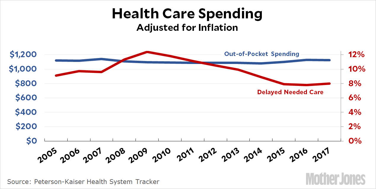
Let’s start with some simple charts showing how much stuff costs. Take health care. We’re all so accustomed to health care costs going up that it’s not widely understood that costs have settled down a lot over the past decade. Here is per-capita out-of-pocket spending on health care:
OOP has been flat since 2005—and not because people are putting off care. According to Peterson-Kaiser, only 8 percent of people report delaying needed care, down from 9.1 percent in 2005.
So why does it seem as if health care costs are increasing? Part of the answer is inertia: we’ve heard so often that health care costs are rising that we simply assume it regardless of what we’re actually spending. Part of the answer is bad memory: we don’t easily recall what we paid for health care ten years ago. We just know that it seems like a lot right now. Part of it is that we’re buying more than we used to: household expenditures on health care have gone up about 30 percent over the past few years. And part of it is inflation amnesia: OOP spending is actually up by about a third since 2005, and that’s what people see. They don’t realize that this is almost all due to inflation, which means there’s been no real rise.
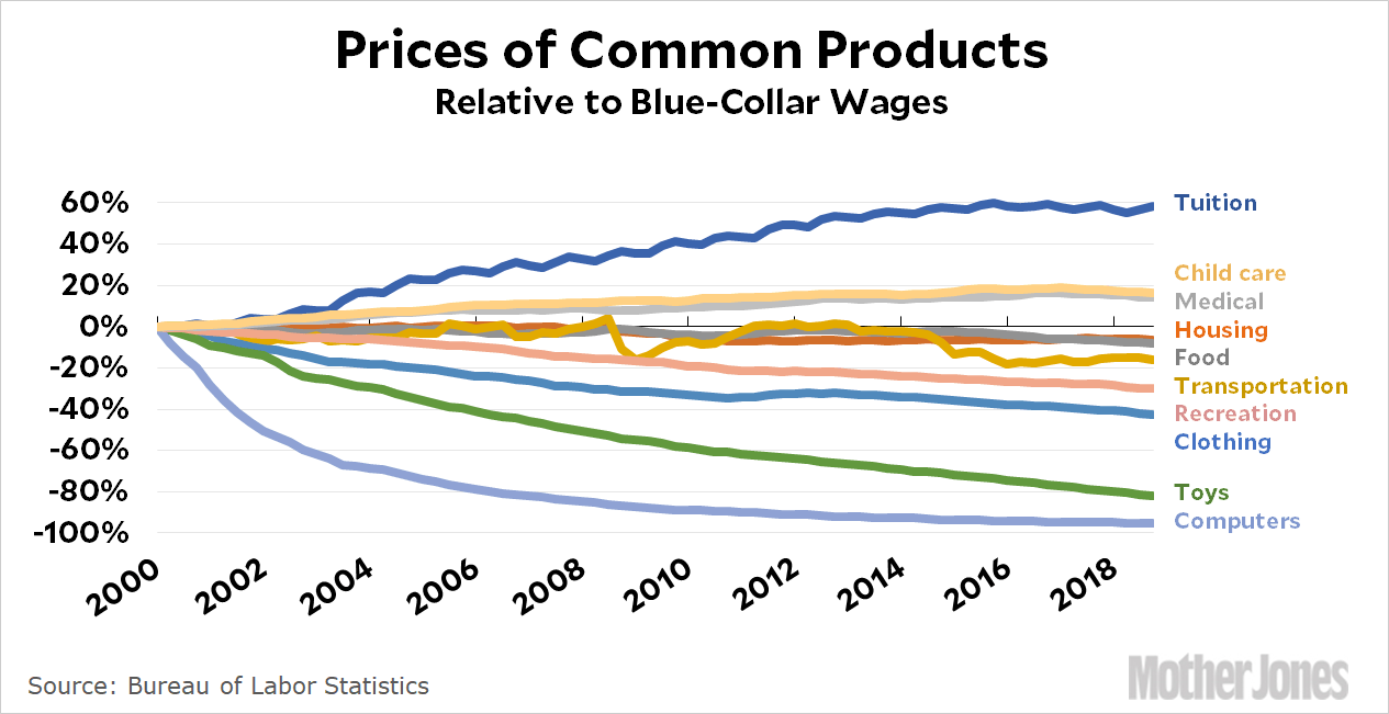
We’ll come back to all that. First, a few more charts. Here are the prices of various items since 2000:
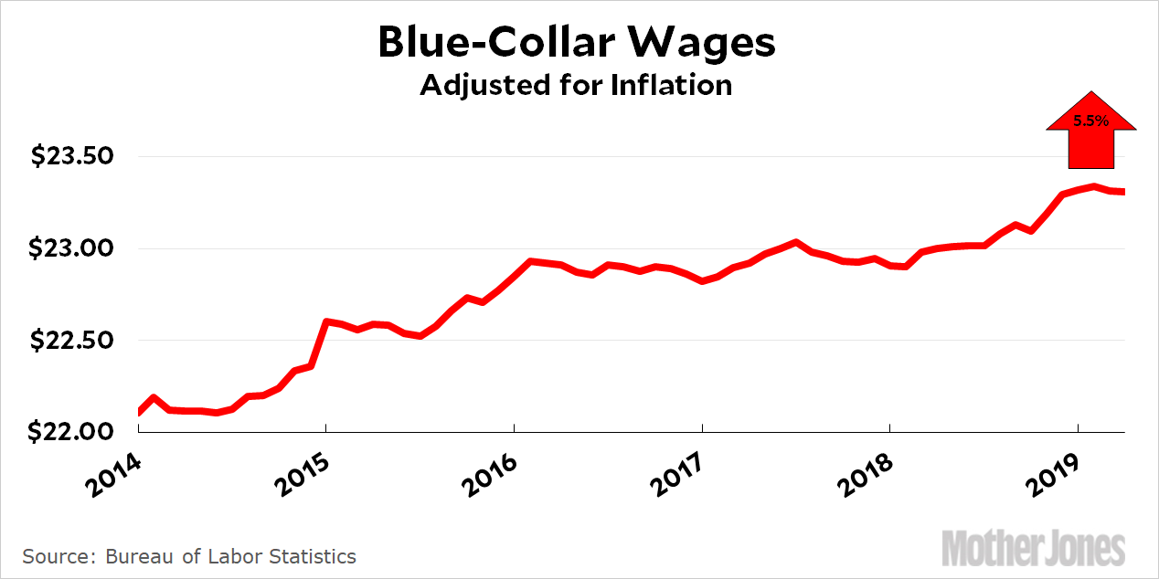
Tuition has skyrocketed for sure. Child care and health care are up moderately. But everything else is down. Now let’s zoom in on the past few years. Here are blue-collar wages:¹
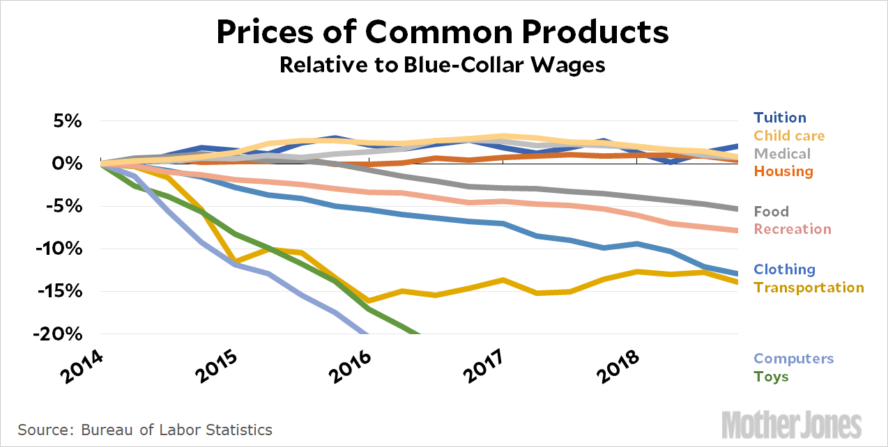
That’s not a huge increase, but it’s an increase. And here’s the inflation rate of various items since 2014:
Relative to wages, almost nothing is up. Even tuition is only up 2.1 percent, and everything else is either flat or down. But this is not how it seems to most people. Why?
There are all the things we discussed above, of course: inertia, bad memory, and inflation amnesia. But there’s also the fact that all of these wonderfully declining price indexes are calculated using “hedonic adjustment.” I mentioned this a couple of weeks ago: it’s the notion that if we’re paying the same price for a better product, then prices have effectively gone down. The price of computers, for example, hasn’t literally gone down 95 percent since 2000. They’ve probably gone down by about half, but we’re getting a whole lot more computer for that money. Roughly speaking, the BLS figures that a 2000-era computer (Pentium III, 32 MB RAM, 4GB hard disk, dial-up internet, etc.) that cost $1,000 back then would cost about 50 bucks these days if anyone bothered to make it. That’s where the 95 percent decrease comes from.
But that’s not our lived experience. Our lived experience is that computers cost less, but only somewhat less. It rarely occurs to us how much more we’re getting for that money. Likewise, cars “officially” cost about half of what they did a few decades ago, but in actual cash terms (adjusted for inflation) we pay about the same. We’re getting a lot more, but much of it we never notice (airbags) and the rest becomes standard so quickly we hardly remember there was a time we didn’t have it (nav systems). The bottom line is that although lots of prices really have declined, not all of the decline shows up in the price tag of common items we buy.
All of this has a connection with the urban-rural divide that I wrote about over the weekend: economically, it turns out, things aren’t really that bad in rural areas. The evidence suggests that on average rural areas aren’t struggling economically any more than cities are, and I think we should accept this. At the same time, there are other things that have nothing to with income and prices per se:
If you live in a rural area, your income might be comparable to that of a city dweller once you account for the cost of living. But you’re still surrounded by signs of decay. You’re still surrounded by the reality of your brightest kids fleeing every year after high school graduation because their opportunities are better elsewhere. You’re still surrounded (perhaps) by an opioid epidemic. You’re still surrounded by an ever-growing number of single mothers who struggle to raise their kids on one income. As a reader emailed to me about Ashland, Wisconsin, one of the counties I wrote about on Sunday:
Ashland Oredockers: the high school mascot name tells the story . . . the last ore dock was demolished in 2013.
Infrastructure: like living with early-to-mid 20th century ghosts. I grew up rural (age 0-18). Dilapidated train trestles, abandoned railstops (e.g., Minersville), the aforementioned ore docks, etc. But also highways: people compare local 2-lane, 55 mph infrastructure to larger freeways near Duluth/Superior, Madison, and Milwaukee….That’s Ashland County. My dad and his brother inherited a dairy farm and eventually gave it up. I moved to California in 2000. Some people still farm, but it’s been in decline.
This is all part of the lived experience in rural areas. It may well be that these places are doing better than we think strictly on a dollars-and-cents basis, but the subjective experience of living in a rural area is often genuinely depressing. Some of this is an illusion, but some of it is quite real—and that’s without even getting into cultural issues, where rural folks feel like they’re being overwhelmed by liberal city values and have no real chance to fight back. This too is something of an illusion—much of it ginned up by Fox News—but again, some of it is also quite real.
In a purely technical sense, then, I think Warren is wrong. It’s true that wages haven’t grown much, and that’s a big problem. But it’s not true that our standard of living has declined, even in rural areas. Taking everything into account, not just health care and child care, we get more for our hourly wages today than we did 20 years ago. But in a more subjective sense, Warren is right. The working and middle classes in small towns watch the lives of the top ten percent and see them getting more distant all the time. They can accept that millionaires live cushy lives—haven’t they always?—but now even the urban upper middle class seems to live in a bubble in which the problems of mere mortals barely exist. And it’s a bubble they have no hope of ever getting close to.
This is why growing income inequality is so corrosive. There’s always been friction between urban and rural communities. But especially in an era where TV and social media make the divide palpable to everyone, it can seem to rural residents as if America’s cities aren’t merely a little richer, but are practically a different country.
That’s wrong, of course, because it focuses too much on only a small sliver of urban life. Rural folks aren’t seeing what it’s like in big cities for the working class. That doesn’t show up much on TV or social media. Nor do they see much of the urban poor unless they’ve been glammed up for an action movie. And even if they did, maybe it wouldn’t matter. The black and brown urban poor probably seem as different from their rural white poor as the urban upper middle class does to the rural middle class.
Long story short, rural areas are actually doing OK but it sure doesn’t always seem like it. That’s because their problems aren’t mostly about money. It’s much more complicated than that.
¹As usual, “blue-collar” refers to the wage series officially called “Production and Nonsupervisory Workers.”
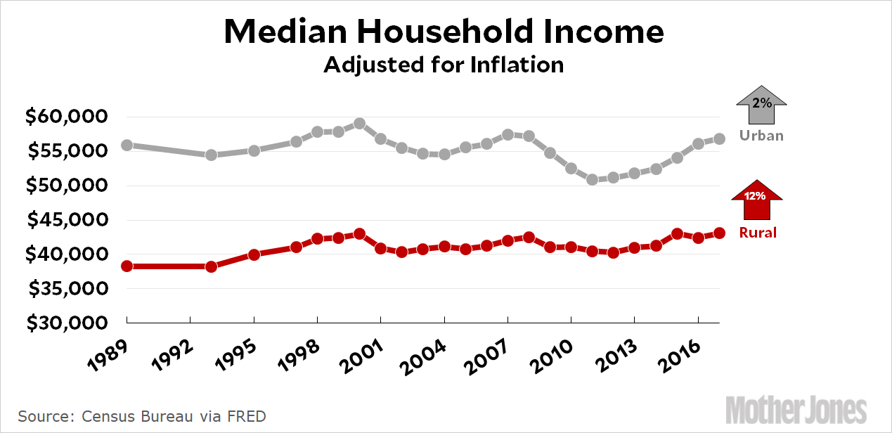
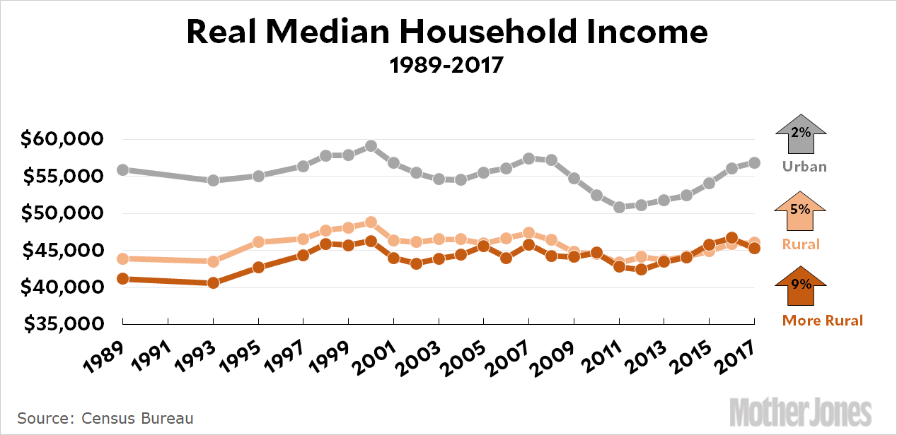
After a bit of Twitter conversation about the state of rural America, I’ve completed a new version of my income chart from yesterday. This time I used a population density of 15 per square mile to define rural. Why? First, this is the approximate cutoff point for the bottom quartile, so these are pretty rural places. Second, counties with a density this low mostly don’t contain any cities with a population greater than 2,500—which is another common definition of rural. Generally speaking, these are places that everyone can agree are really rural. As a bonus, choosing a cutoff of 15 gives me a sample that’s completely different from my previous one.
I expanded my sample to 30 counties in order to get more precise averages, and I also reduced the bias in choosing them. This time, I just started at the first county with a population density of 15 and then chose the next 30. In the end, I removed three outliers: Mohave in Arizona, because it includes Kingman; plus Morgan (Utah) and Storey (Nevada), because they were income outliers (i.e., not truly rural, but sparse places where California refugees buy themselves big ranches). This was done to ensure that rural counties weren’t looking artificially buoyant due to a couple of weird outliers.
In the end, then, I constructed a sample of 27 counties. Here’s how income growth looks:
I’ll confess to being pretty surprised by this. The rural counties in my sample are really rural. More rural than the ones in my original chart. And with a sample of 27, it’s unlikely that these results are seriously skewed. What’s more, these are median incomes, so they aren’t affected by the possibility of a few rich people moving into the neighborhood. There’s not really any way around it: the Census Bureau tells us that rural income has increased 12 percent since 1989, and that’s probably true. This may not seem like much—and it isn’t—but it’s better than urban areas are doing. In both cases, median incomes are fairly stagnant because all the growth is in the top ten percent.
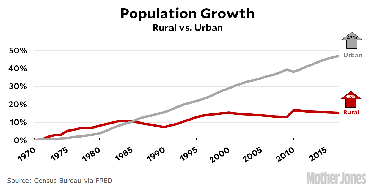
But what about population? If there’s one thing that appears to define “rural decline” more than anything else, it’s the fact that they’re losing population. So let’s take a look at that for the same sample of counties:
Rural counties haven’t been losing population. At the same time, it’s certainly true that they aren’t keeping up with the overall population growth of the country.
But I don’t think anyone denies that urban areas are considerably more vibrant than rural areas, on a whole bunch of different measures. This is no surprise: enterprising young kids have been leaving sleepy rural towns forever in hopes of making it in the big city. Big cities grow faster; they’re more diverse; they’re more educated; they have more cultural life; and they certainly have a much higher top end in terms of income. This is unquestionable, and it’s the way everyone likes it. People move to big cities because they want to live in a vibrant place. People stay in small towns because they prefer a slower, more traditional pace of life.
So where’s the decline? It’s certainly true that there are rural areas in trouble. Usually this is because they lost a manufacturing plant that served as their economic backbone. But that’s a very specific subset of rural areas, and tells us little about the vast bulk of them.
It’s also true that rural incomes are lower than urban incomes on an absolute basis. But this is nothing new. What’s more, when you incorporate the lower cost of living in rural areas (primarily in housing), their incomes probably maintain a standard of living pretty close to that of the average urban family.
That said, rural areas, on average, just don’t appear to be in big trouble. Their incomes are growing; their populations are stable; and their unemployment level is about the same as in urban areas. Unless I’m missing something—always a possibility!—we should stop pretending otherwise.
POSTSCRIPT: It’s worth noting the little spikes in the population chart following the 2010 census. What it shows is that the Census Bureau had been overestimating urban population and underestimating rural population from 2000-2010. So for ten years it really did look like rural areas were losing population. This spawned a lot of nail-biting commentary, but it was all based on a miscalculation. This is happening again right now, but we won’t know until after the 2020 census if it’s real, or just another miscalcuation.
In any case, there’s little question that rural population growth since 2000 has been flat or, possibly, slightly positive. That’s not great, but it’s not necessarily decline either.
A NOTE ON METHODOLOGY: My goal here was to avoid tautological definitions of “rural” that effectively define anyplace that’s growing as urban. At the same time, I wanted a sample of counties that were truly rural by anyone’s definition. I think I’ve done that here. These counties are truly rural and truly random. For the record, here are the 27 counties that made up my sample:
Maybe rural America is doing OK after all.Kevin Drum
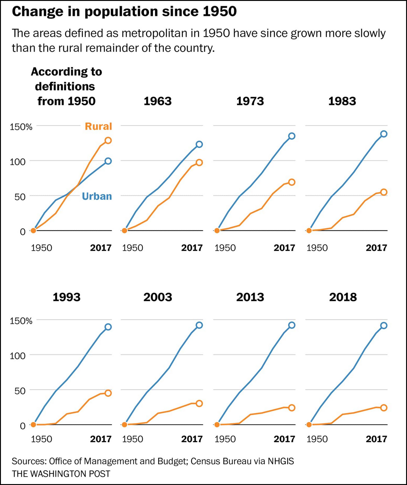
By coincidence, the Washington Post ran a piece yesterday making the same case that I did this morning: rural areas aren’t really in economic decline. The argument presented by Andrew Van Dam is simple and intriguing.
It has to do with the way the Census Bureau defines rural. Basically, it doesn’t. It defines urban, and then labels everything left over as rural. And that’s a problem: their definition of urban is any city (plus its surrounding areas) with a population of 50,000 or more. Regardless of whether you think this is a good definition, you can see one big problem with it: any rural area eventually gets reclassified as urban if it’s successful and growing. By definition, the only areas left over are those that are declining or growing slowly, and those are the ones we classify as rural.
Van Dam makes the case that if we applied the Census definition to the country in 1950 and then tracked all the areas defined as rural in 1950, it turns out that rural America is doing fine. But in real life, we reclassify these areas every few years and move the best performers into the urban column. Here’s what that looks like:
By 2018, we had reclassified so much of America that the population of “rural” America had barely grown at all because the only places left were the slowest-growing bits:
In a way, rural areas serve as urban America’s farm team: All their most promising prospects get called up to the big leagues, leaving the low-density margins populated by an ever-shrinking pool of those who couldn’t qualify….[But] the character of a place doesn’t necessarily change the moment a city crosses the 50,000-resident mark.
….About 6 in 10 U.S. adults who consider themselves “rural” live in an area classified as metropolitan by standards similar to those used above, according to a Washington Post-Kaiser Family Foundation poll conducted in 2017. And 3 in 4 of the adults who say they live in a “small town”? They’re also in a metro area.
Bottom line: the “decline” of rural America is mostly a statistical artifact. We keep redefining rural to exclude any successful rural areas, and by now the only rural places left are the ones that have been persistently bad performers for the past 70 years. But if “persistently bad performer for the past 70 years” is your definition of rural, it’s merely a tautology to say that rural areas are performing badly.
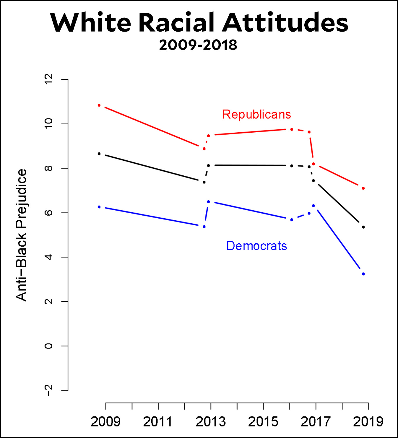
A few months ago I wrote a piece for the magazine suggesting that white racial resentment had steadily increased during Barack Obama’s presidency as a reaction against eight years of a black president. But when Obama left, the bubble burst and racial resentment returned to its usual levels. For this reason, Democrats have no reason to fear that a focus on things like immigration reform or racial justice will hurt them electorally in 2020.
A new study confirms this—sort of. It uses results from a panel survey that re-interviews the same people periodically. Here are the results:
What the authors find is that racial resentment stayed roughly steady during Obama’s presidency and then plummeted afterward. This is different from my theory but it has the same basic shape: a dam broke after the 2016 election and racial resentment declined compared to Obama’s time in office.
This is one smallish survey, so as usual I’d caution against taking it too seriously. But it matches a lot of other evidence that “the alienation of the white working class from the party associated with racial diversity was caused by the simple presence of a black man in the White House.” Now that he’s gone, that alienation is easing.
I’m continuing to poke into the urban-rural divide, and there are several ways to come at it. Here’s one:
Choose ten representative rural counties.
Choose ten big cities.
Compare median household income over time.
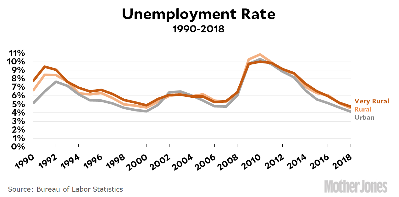
There’s no way to do this that’s perfect, but as a first cut to get a flavor of things, I created a list of ten urban counties, ten rural counties, and ten very rural counties. (See Postscript for details.) The Census Bureau has estimates of county-level median income since 1989, and I took the average of each list for each year. Here are the results:
Likewise, the Bureau of Labor Statistics calculates the unemployment rate by county. Using the same methodology, here it is:
Roughly speaking, rural income has grown slightly more than urban income while rural unemployment averages slightly higher than urban unemployment. Absolute income is higher in cities, of course, but given the higher cost of living in cities I’d guess that the median standard of living is roughly comparable between urban and rural areas.
Now, urban counties obviously have a much higher top end compared to rural counties. The top 10 percent of Los Angeles is probably substantially richer than the top 10 percent in any of the rural counties. On the other hand, urban areas also have a higher poverty rate. Overall, I suspect these averages are fairly representative of what we normally think of as rural and urban, and it suggests that average economic conditions between the two aren’t as different as we often make them out to be.
POSTSCRIPT: There are a surprising number of definitions of rural and urban, but the simplest and most intuitive is based on population density. So I got a list of counties by population density and chose the ten southern and midwestern counties that were closest to a density of 100 per square mile (but allowing only one county per state to maintain a bit of diversity). That forces a random selection, and a density of 100/sqmi is rural but not Deliverance rural, moderate income but not poor. I repeated this for a density of 30 per square mile to get ten very rural counties. For the urban income figures, I chose the counties containing America’s ten biggest cities, once again allowing only one city per state.
Here are the places I used for my averages. For the urban series, I used income figures for the counties containing these cities:
The grass outside our house has been growing tall, and for some reason it hasn’t been mowed for a couple of weeks. Naturally the cats love it. Hilbert in particular likes to stalk through it and then hunt down blades of grass to eat. He is a mighty hunter indeed.
Anyway, this turns out to be your lucky day. I took pictures, of course, and told Marian she had to decide between the two finalists. She couldn’t, so today you get two cat blogging pictures. In return, Hilbert would like you to please donate to our Corruption Project if you haven’t already done so. Just don’t dip into the tuna money to do it.
Small towns and rural areas, along with some Rust Belt metros, are falling ever further behind booming urban dynamos — leaving many heavily Republican regions in a deepening morass of economic deterioration, joblessness, substance abuse and declining life expectancy…..Yet the travails of America’s struggling red regions, and practical ideas about might be done to alleviate them, are barely mentioned in right-leaning policy circles….Worse, the Republican Party under Mr. Trump has blundered into a positively anti-rural economic agenda, leaving the soybean fields littered with $20 bills for enterprising Democratic presidential hopefuls to pick up.
….For decades, poorer areas had been converging economically with wealthier ones, but that stalled in the early 1980s….Since then, inequalities in regional productivity and living standards have been widening. The declining capacity of smaller towns and cities to bounce back from job loss — whether because of recession, automation or offshoring — means that the regional economic gap grows wider with every downturn, “disruptive” technological advance or uptick in global economic integration.
What’s weird about this is that I believe every word of it. I don’t have any real doubt that the economic divide between rural and urban America is getting worse and worse.
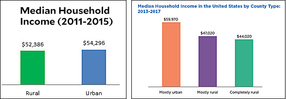
And yet . . . you can probably guess what’s coming next, can’t you? When I look for actual evidence of this, I have a hard time finding it. I wrote yesterday about farms and soybeans, for example, and found little to be worried about despite all the doomsday headlines. In the case of rural vs. urban America, the simplest and most obvious comparison is median income, but I can’t even find a time series of this. Hell, it’s hard to even find a decent definition of “rural,” let alone hard data. For example, here are the conclusions of two recent census reports (here and here):
In the first chart, it looks like rural and urban household income is actually pretty similar. But in the second chart, “mostly rural” income is more than 20 percent lower than “mostly urban” income. The difference is that the first chart is an average of actual households, while the second chart looks at county averages. Both have their value. But which is a better look at how rural folks are really doing? And how has this changed over time?
It’s barely possible that I could build a time series myself, and I tried last night. Once again, though, I failed utterly to figure out how to use the online tools to extract data from the Census Bureau’s American Community Survey. Maybe I’ll try again this weekend. But even if I figure it out, it’s hard to know how representative it would be of “rural” the way most of us think about it. A rural family in Kent, Connecticut, for example, is way different from a rural family in Harlan County, Kentucky.
There are other approaches to this, however, and I’ll cogitate over them this weekend.
And we respect that! But maybe you’re of a mind to support our work directly instead? We have until December 31 to raise the last $400,000 we need to keep our nonprofit newsroom running at full strength into 2026. Will you make a gift today?
We noticed you have an ad blocker on. Can you pitch in a few bucks to help fund Mother Jones' investigative journalism?
Billionaires own the media,
but they don’t own us.
At Mother Jones we know these aren’t conventional times, and they require unconventional coverage. That’s what deliver every day: fierce, independent journalism you can’t find elsewhere. Perhaps never in the history of our country has that been more necessary than now. But we can’t do it without reader support—your support. Please chip in today.